Just here to shop? If you're only interested in buying my picks, go straight to my Christmas Picks.
Don't Be Scared Of Pattern
You probably noticed: our board is full of pattern. Stripes, checks, plaid. And I'm really into it.
I think we got scared of pattern after all that wallpaper in the '70s, '80s and '90s. So we ran all the way back to black and white, simple and minimal. Minimal is calming, but all minimal, all the time, can get really boring. Live in it long enough and your home starts to feel like an empty shell.
So find a few patterns you love, and don't make everything pattern. A vintage touch with a modern stripe is perfect. Pattern is one of the easiest ways to show your personality. More in shapes, lines and patterns.
Into cottagecore or granny style right now? Christmas is perfect for it. Think pattern, pattern, pattern: ticking stripes, gingham, plaid, a little floral, in the more serious colors like wine, moss and cream. Your style doesn't have to stop at your everyday decor. The same goes for boho, retro, farmhouse, or anything else you love.
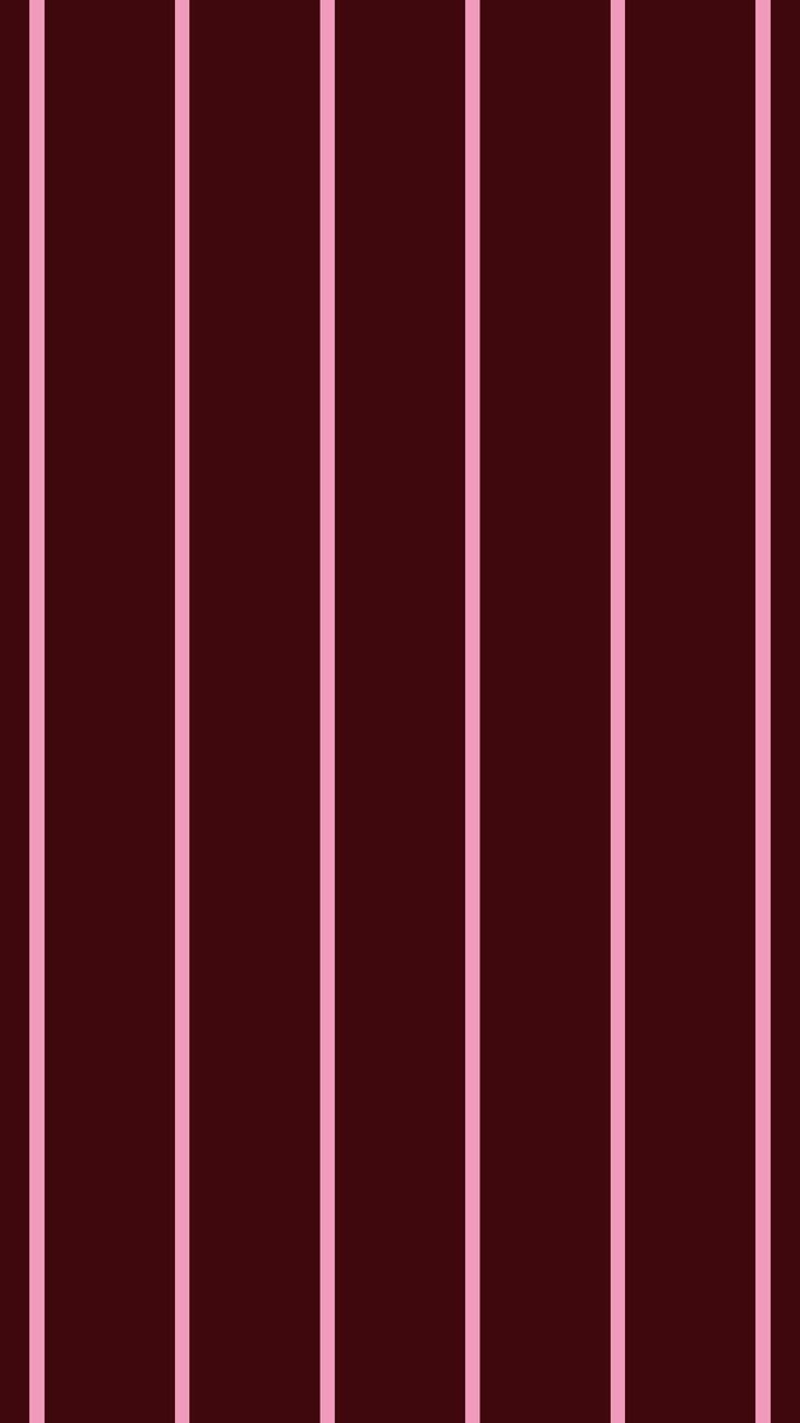
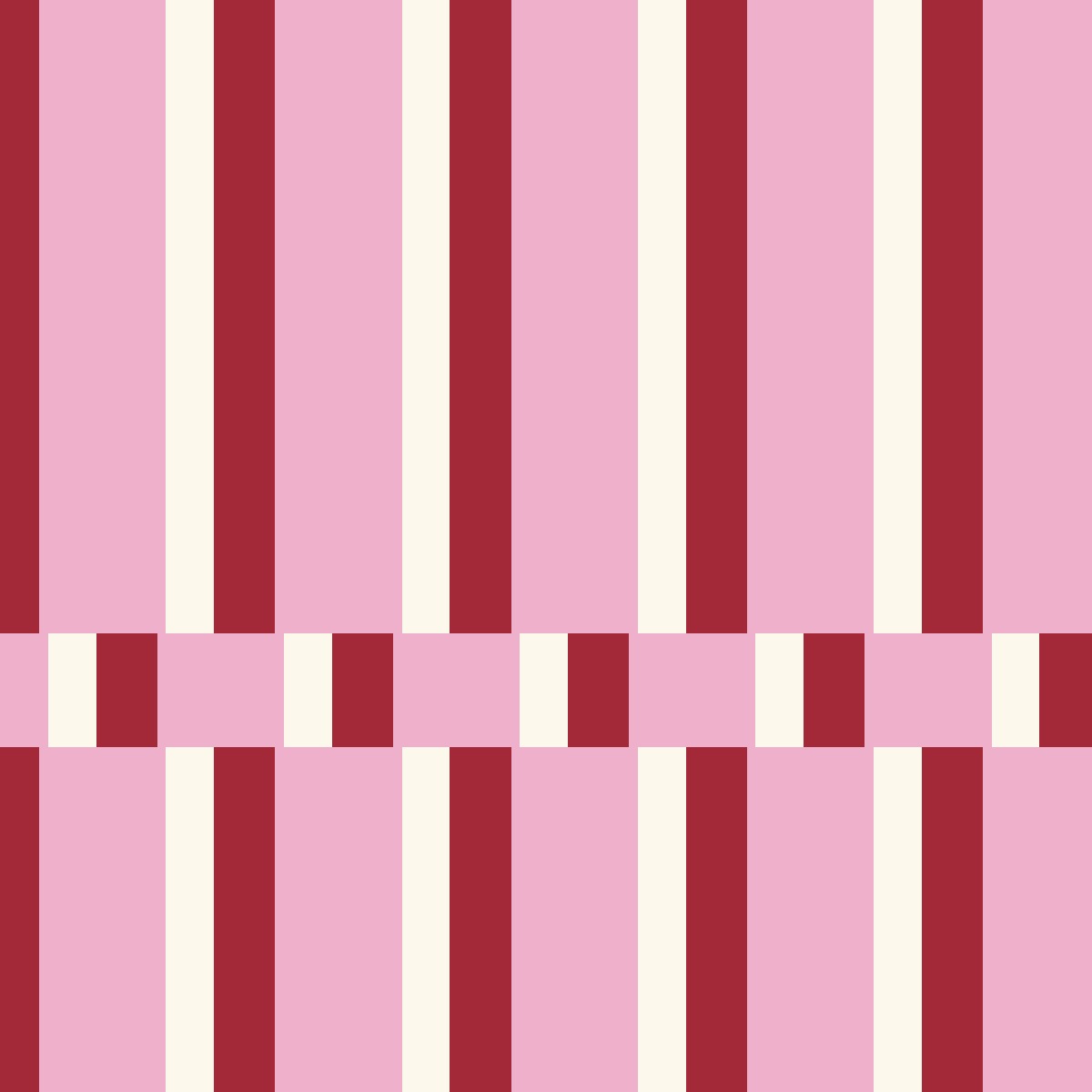
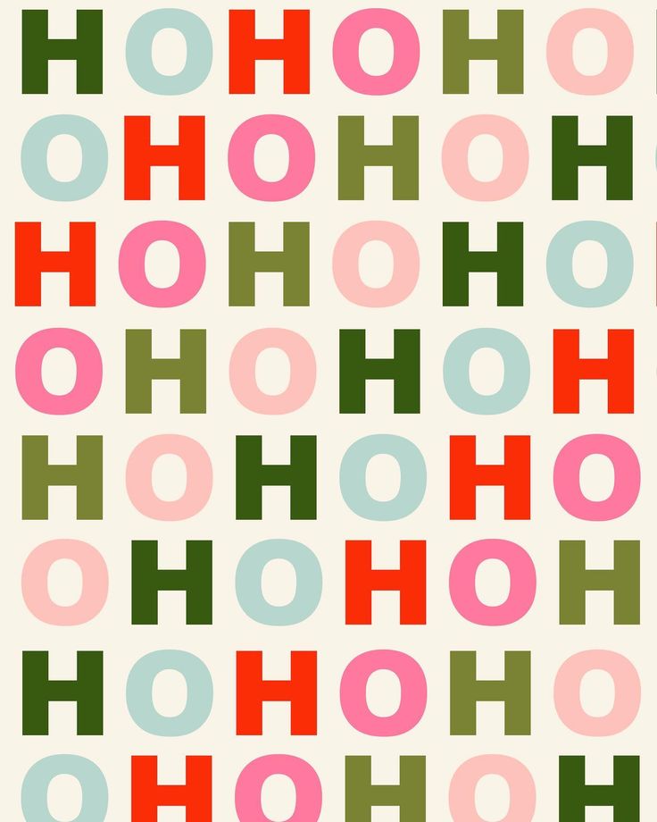
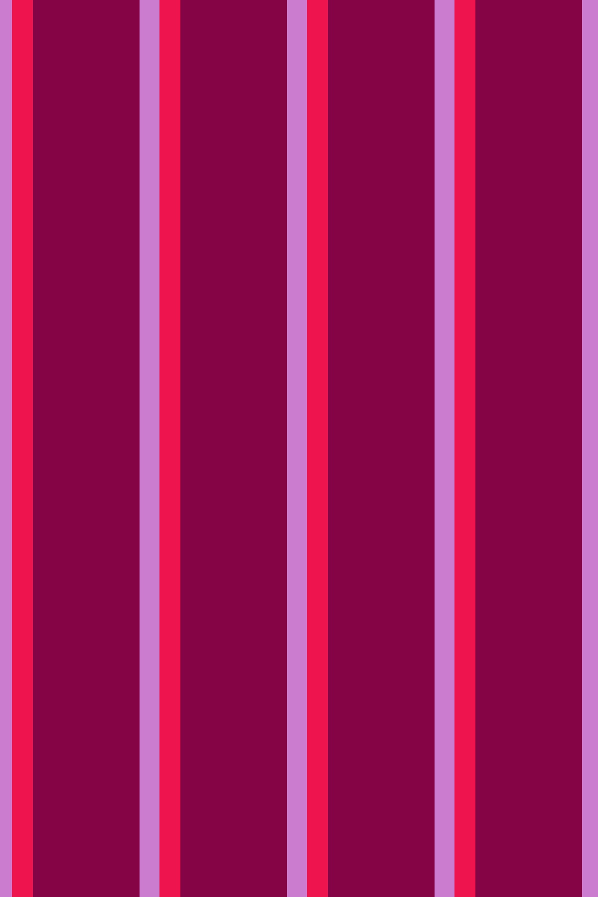
Look at the deep burgundy and pink stripe inspired by Iunikorn, block stripes in pink, red and cream, a berry stripe with hot pink and lilac lines (those three I made with AI), and Gale Switzer's HO HO HO in pink, green and red letters. Totally different patterns, and the same happy palette runs through all of them.
And if you only do one pattern, do a stripe.
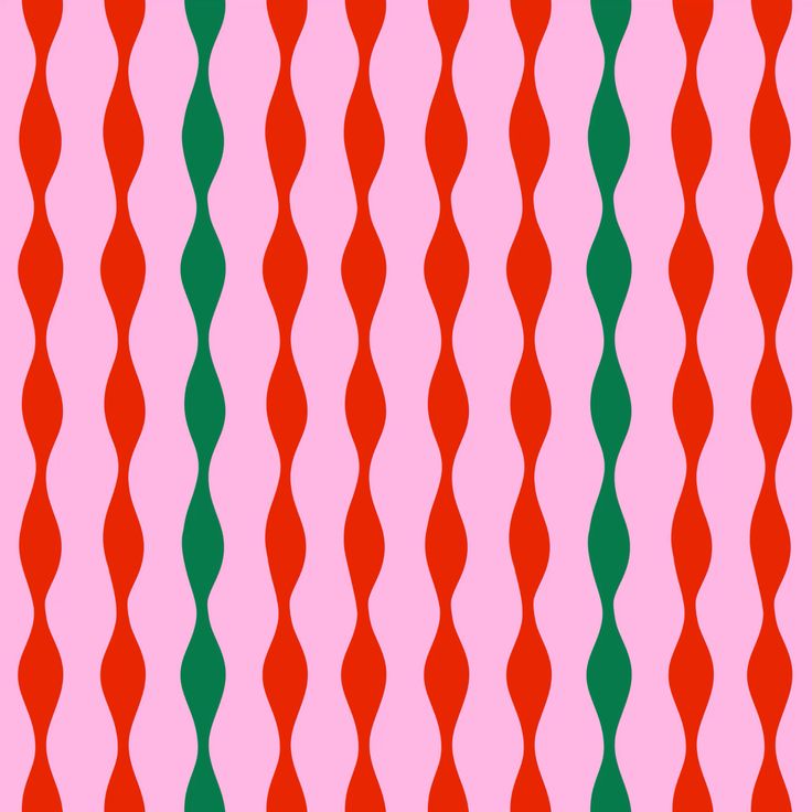
Or make your stripe funky, like this one by Carole Hillman, a surface designer in Lyon: wavy red and green lines on pink that look hand-drawn. It would be so fun as wrapping paper or a tablecloth.
Let Your Gifts Be The Pattern
You don't need to buy twenty striped things this year. Do the pattern and the color with your wrapping paper. Wrap your gifts early and they become part of the decor for the whole season. (Unless you have cats. Or you can try to train them. Good luck.) I said it in my 2020 post too: the gifts are one of the best ways to stand out.
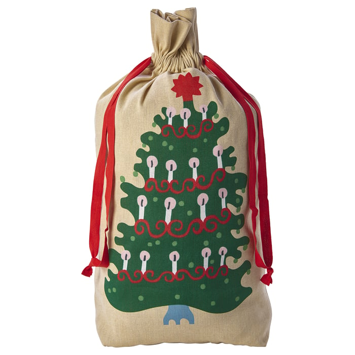
IKEA's wrapping this year is absolutely stunning. And keep some beige on hand, the kind that looks a little like a box. It goes with everything and it softens whatever you're trying to do. If color intimidates you, wrap in beige and add a bow in the color you're trying to get into. And when you want one pattern to be the protagonist, beige doesn't compete with it. That drawstring bag? Amazing for big awkward gifts, or for the lazy person who doesn't like wrapping. It looks curated, and it makes them look like they worked hard. They did not.
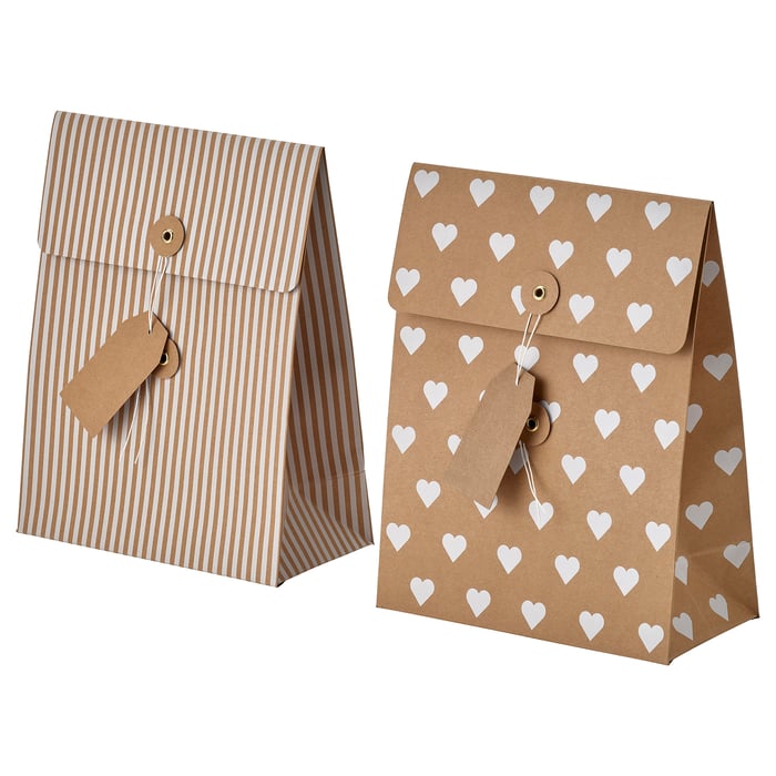
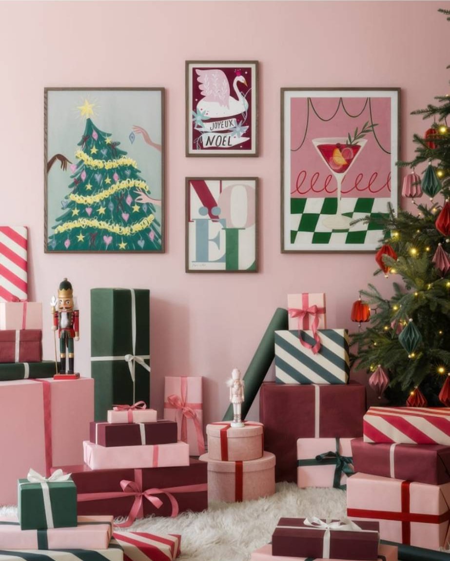
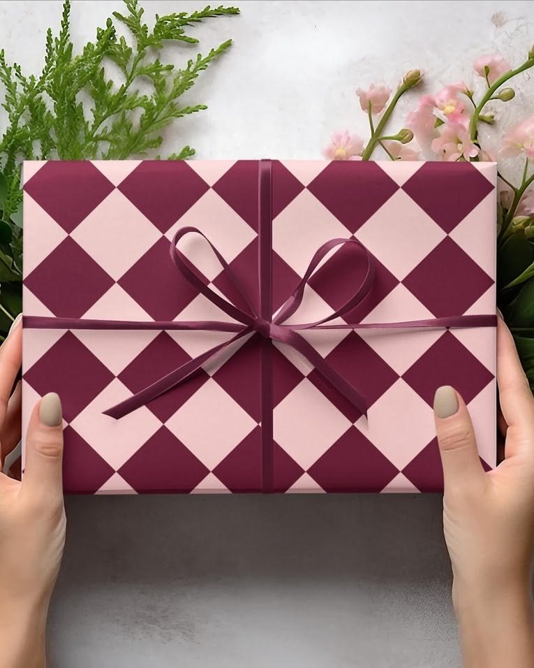
Here's my one rule for wrapping: pick two or three papers in the same palette and repeat them. Olive, pink and burgundy with satin ribbons. Stripes in pink, red and green. A harlequin in pink and burgundy with a burgundy bow (that one is my favorite, and it's what inspired my little donut ornament up there). Mix a stripe with a solid and a harlequin, and the pile under your tree looks curated instead of random.
A gift inside a gift. I love a candle in a pretty tin, like these A Dopo candles by Paddywax in checks and stripes (via Azalea). Give the candle, and once it's burned, the tin becomes a little box. Or give an empty tin: tuck a little gift card inside and fill the rest with candy or a few cookies. Once the treats are gone, it holds whatever they want, from old credit cards to bobby pins. Get creative. It's perfect for Christmas, and it works for every other day of the year too.

The same idea works on decor too. Look at xo, Fetti's acrylic trees in pink, red and green checks: a few colors, repeated, and it already looks like a set.

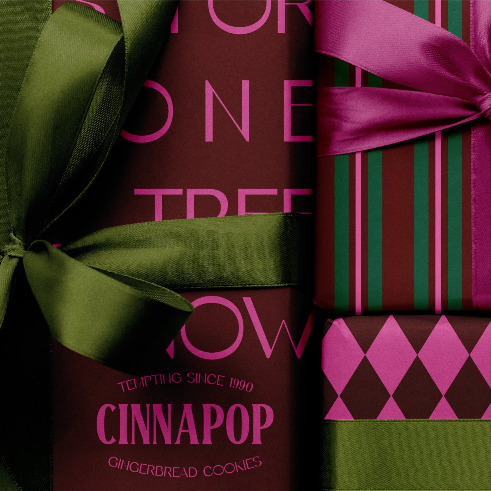
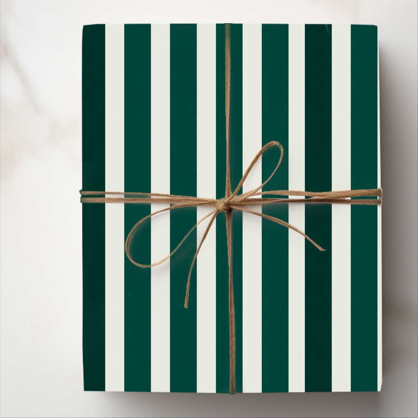
And here's my rule in action. Ameera Noor designed the branding and packaging for Cinnapop's gingerbread cookies, wrapped in burgundy, pink and green with olive satin ribbons, and it's just gorgeous. March's Mingle wrap does pink, red and green stripes with a white bow. Daily Regina Designs and OceanChildGoods both went pink and orange, one in soft curves and one in stripes. The pink and burgundy harlequin I told you about, the one behind my donut ornament, came from Lil Haus Studio's paper. I couldn't reach them, so this one is my own AI version in slightly different tones. And Lagom Design kept it fresh with green and white stripes and a green bow. And Mindy at ErmindaKDesigns (her retro tree paper is further down) does pink and burgundy in simple vertical stripes, tied with plain twine. Different papers, and every pile still looks planned.
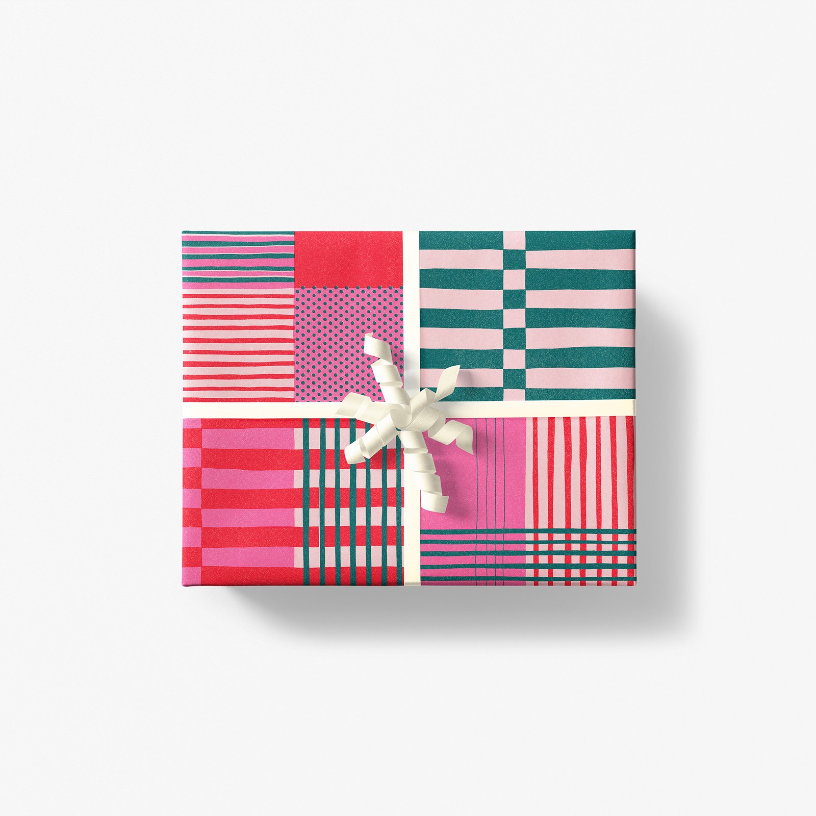
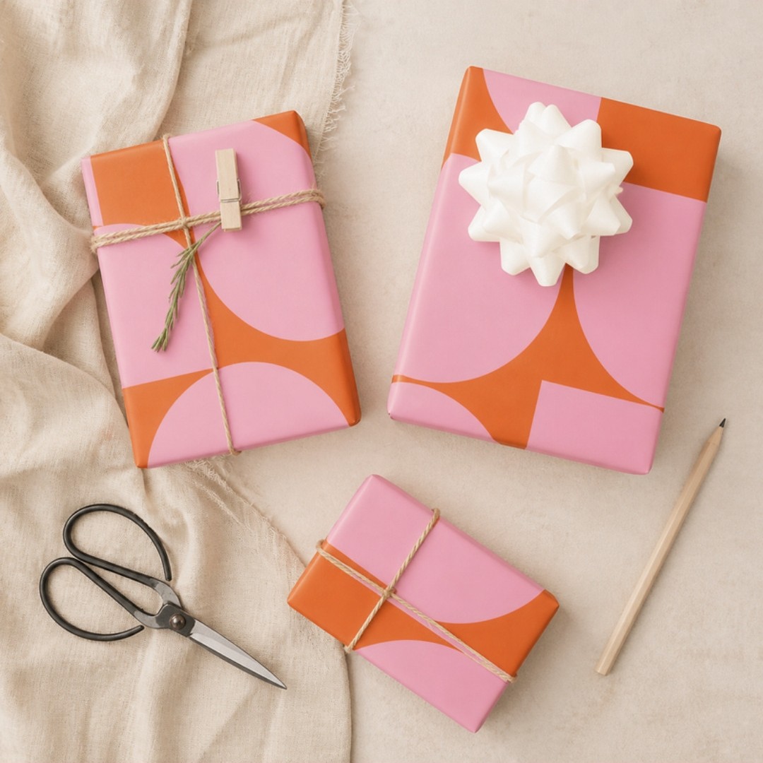
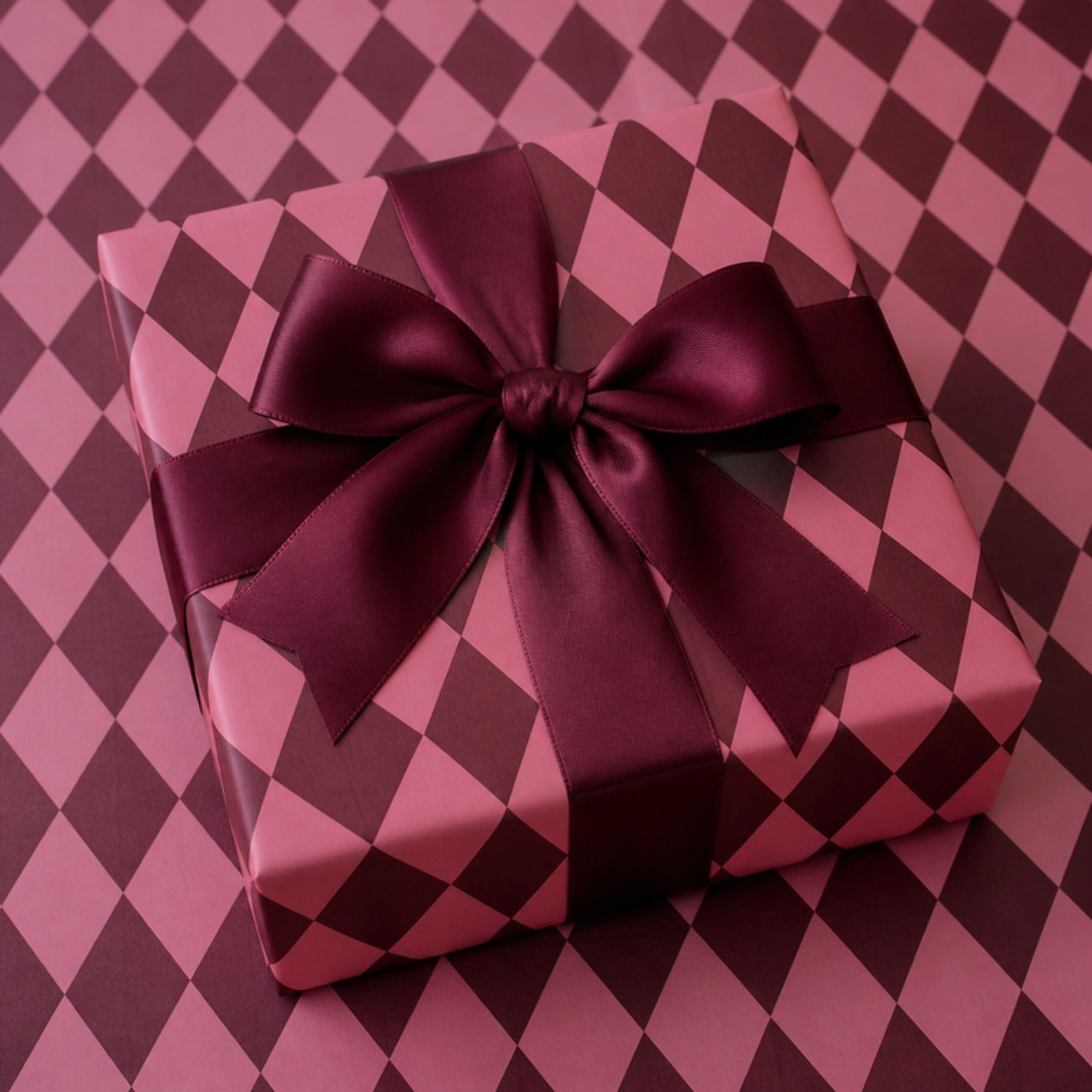
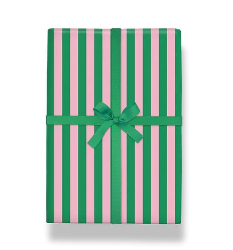

And look at OceanChildGoods' two papers side by side: a candy stripe in pink and orange, and a checkerboard in pink, red and green. Two different patterns from the same little shop, and they'd look so good in one pile.
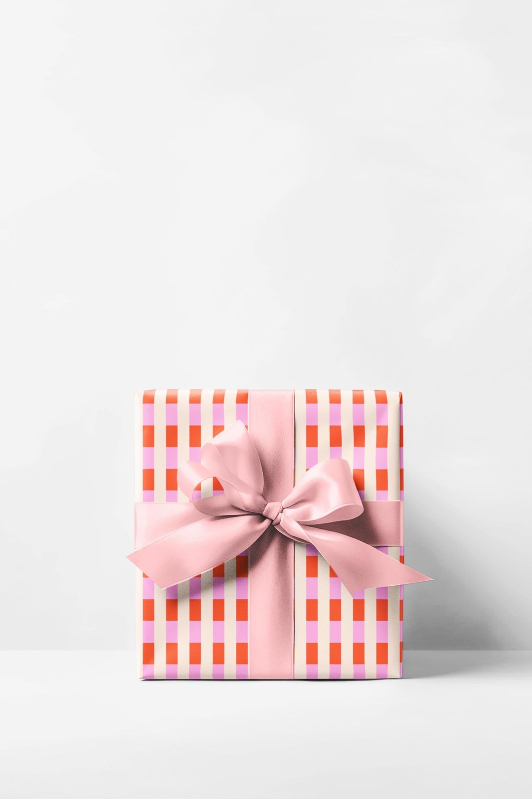
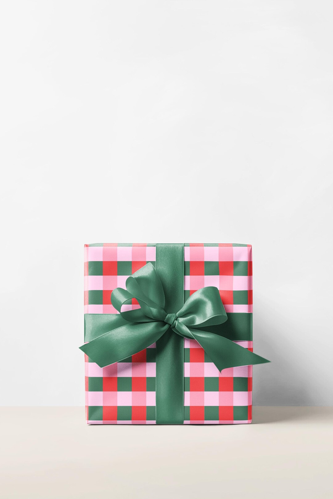
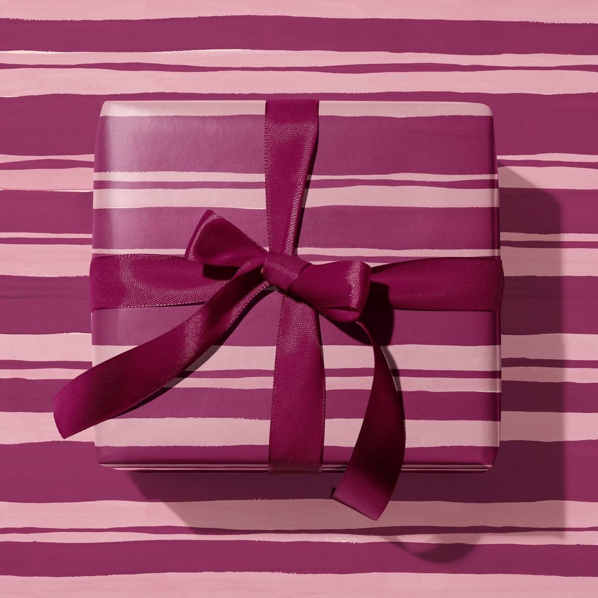
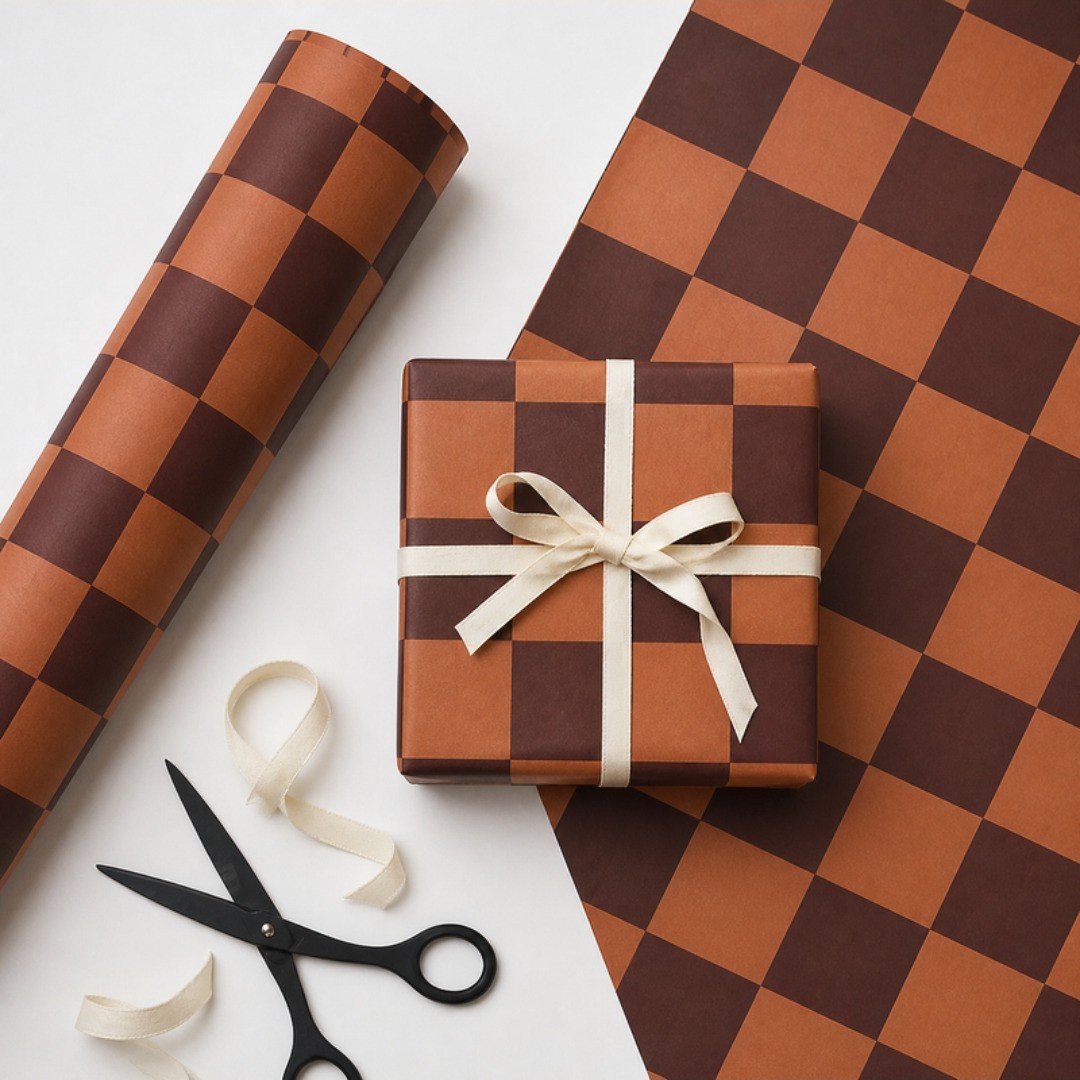
A few more I just added to the board. Sister Paper Co.'s Summer Stripe comes in burgundy and pink painted stripes, tied with a matching satin bow, so rich and so simple at the same time. A Kinshipped check (we found it at Paper Goods Co.) comes in rust and chocolate, so warm and cozy. Then there's LondonJaeCo's pink and burgundy harlequin with a burgundy ribbon, a deep green and cream stripe from Tints and Tots tied with twine (classic and fresh at once), and crackers in green candy stripes on a burgundy ruffled tablecloth (that one is my own AI version, since I couldn't find who made the original). Same idea every time, a few colors and a lot of pattern.
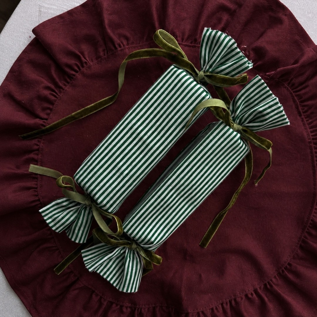
And here's my favorite trick: skip the paper and wrap gifts in fabric. A pretty cloth napkin, a tea towel, even a pillowcase, tied with a velvet ribbon. The wrapping becomes part of the gift, something they'll actually use at their own table long after Christmas. It's a little more green, a lot less waste (no torn paper in the trash on the 25th), and it makes the whole thing feel more meaningful. Pick fabrics in your palette and your pile of gifts under the tree will look like it was planned.
Same Colors, Different Patterns
Here's the idea I want you to take home: pick a color palette and stick to it. Three or four colors. Then use as many patterns as you want. Whatever is going on in the design, as long as those same colors keep showing up, it all belongs together.
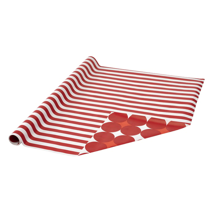
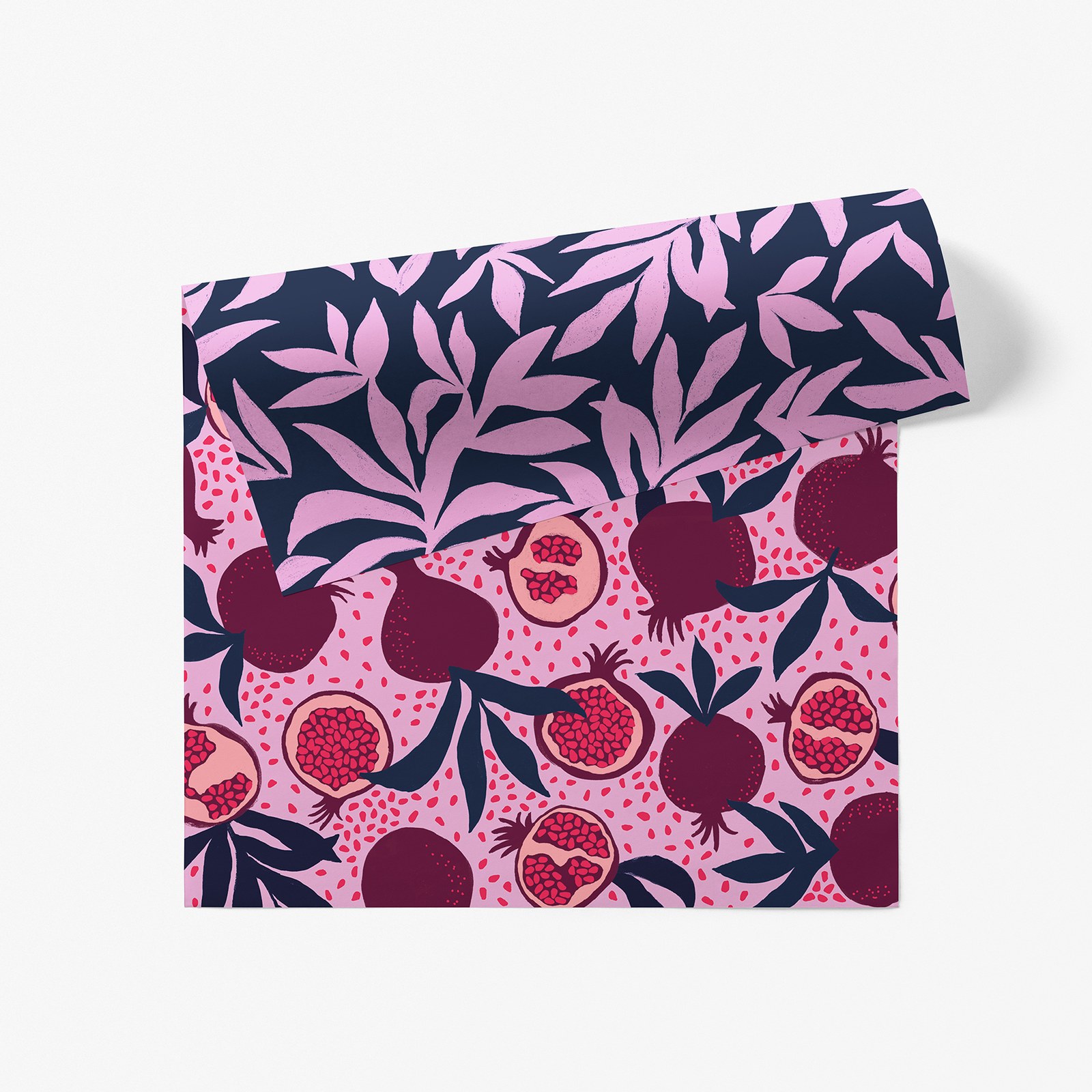
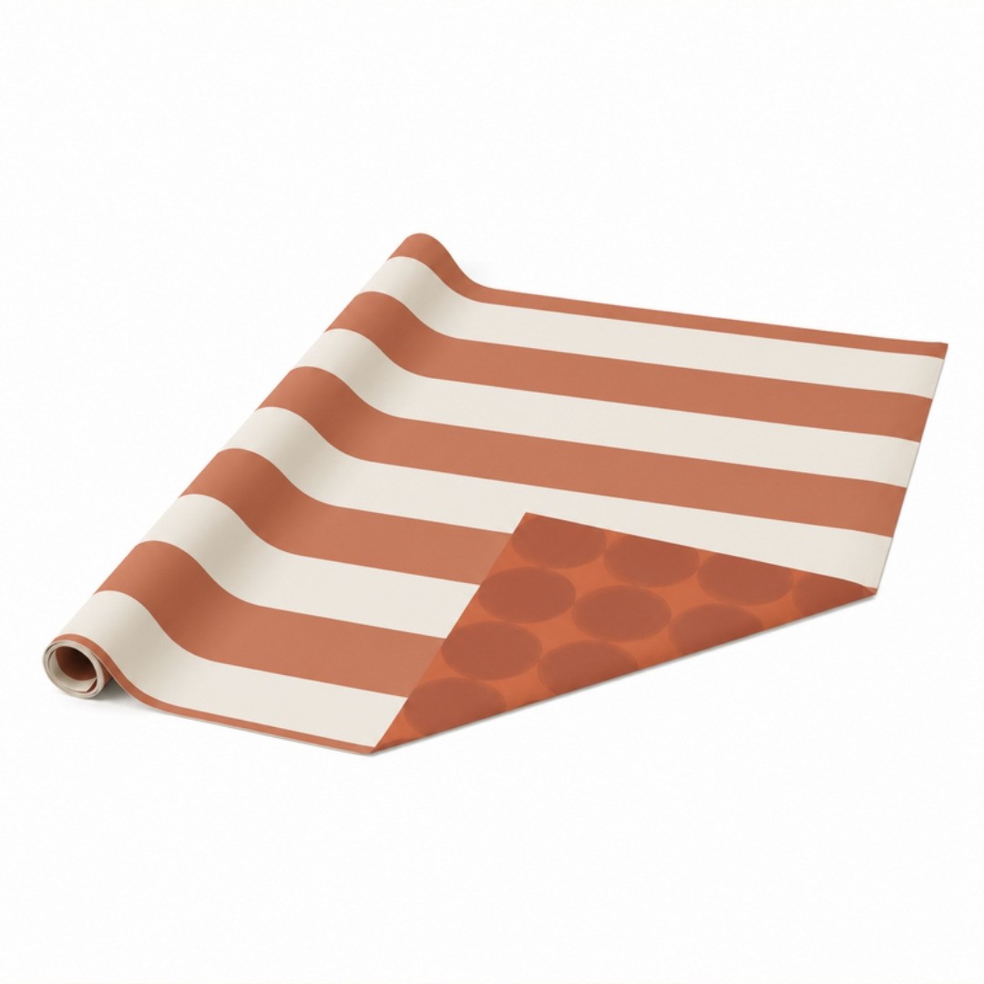
That's why I'm obsessed with double-sided wrapping paper. The colors carry over, and only the pattern changes. March's Winter Ruby wrap (you can find it at Paper Source too) is deep navy with pink leaves on one side, and pink with ruby pomegranates on the other. Navy, pink and ruby on both sides, two totally different looks. Wrap the big gifts in the leaves and the little ones in the pomegranates, and the pile matches without ever being boring. I made my own version in burnt orange and cream, inspired by IKEA's double-sided rolls: stripes on one side, big round shapes on the other. Two colors, two patterns, one roll. And if you want one ready to go, IKEA's VINTERFINT roll does it in red and white, and it's easy on the budget.
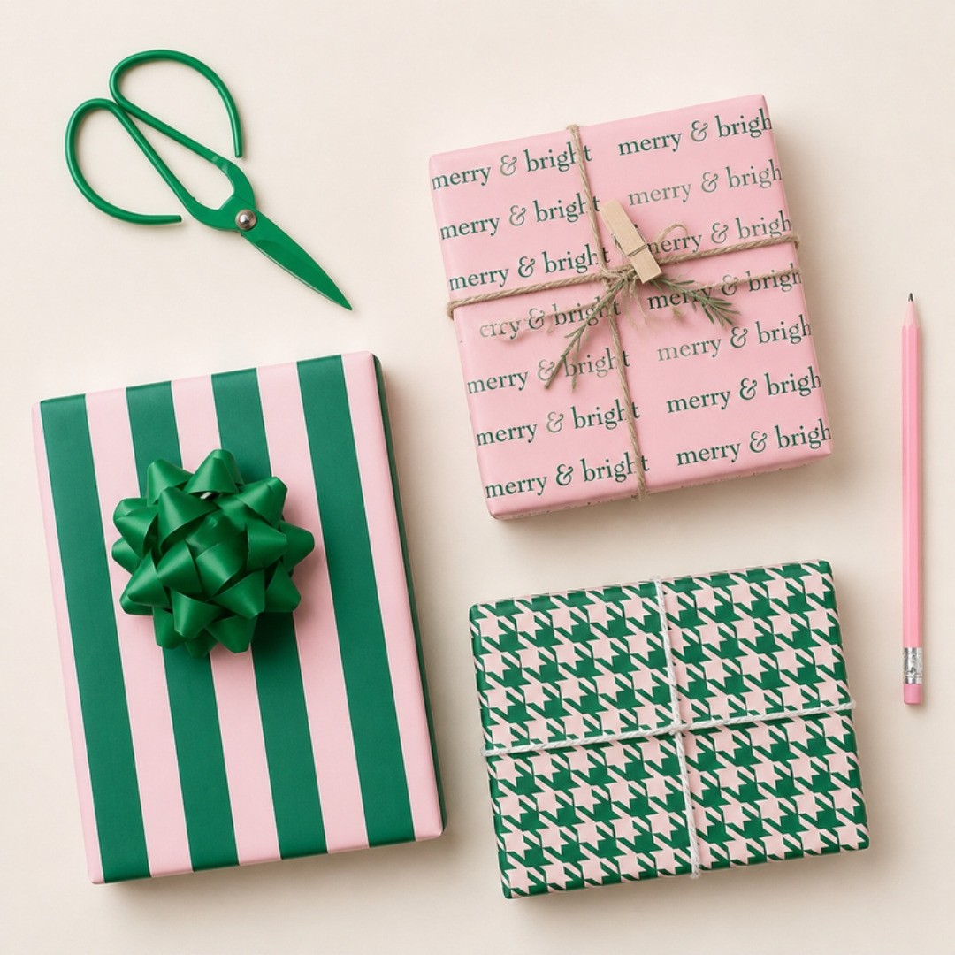
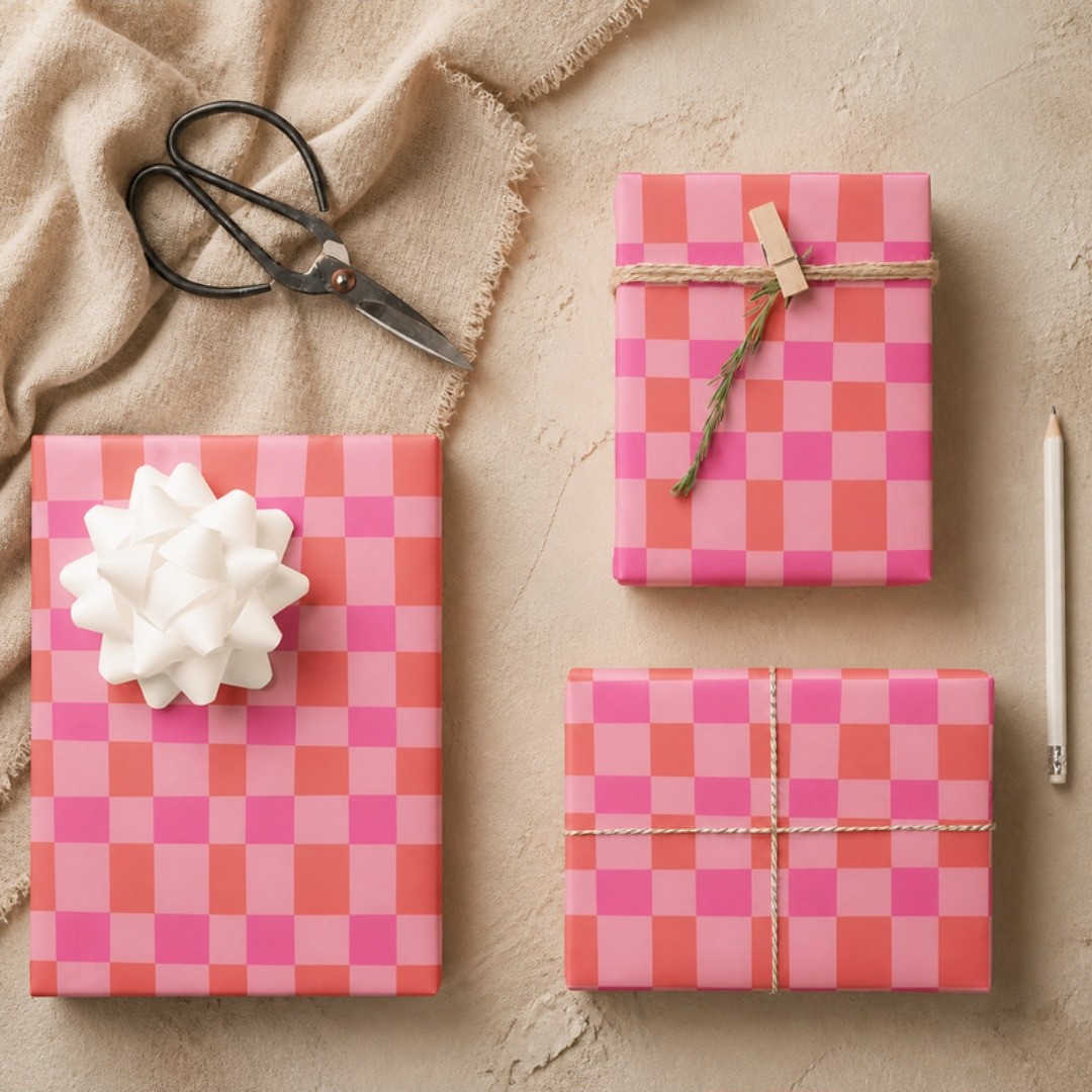
Some shops design their papers as a set, so the planning is done for you. HappyAppleCanvas on Zazzle made a green and pink set that shows exactly what I mean: a bold candy stripe, a soft pink paper with "merry & bright" written all over it, and a tiny houndstooth. Three completely different patterns in the same two colors, and stacked together they look made for each other. Freya Opal's set on Zazzle does it with checks: hot pink and orange in a big check and a small one. So simple, and so cheerful under a tree.
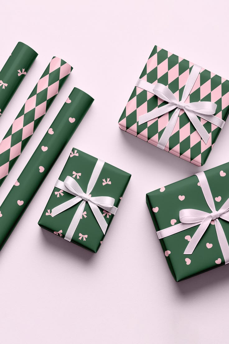
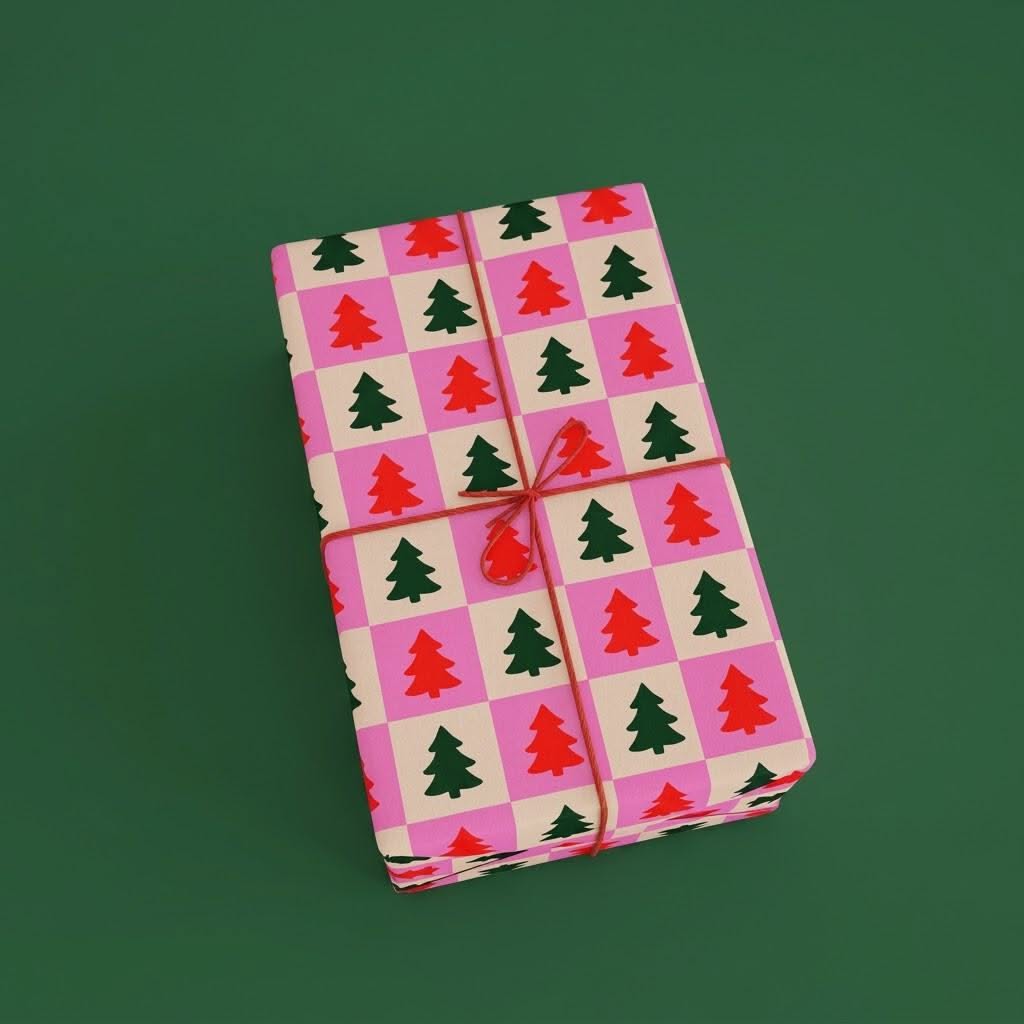
Anantam's preppy set on Etsy is green and pink too: a harlequin, a paper sprinkled with tiny bows and one with little hearts, all finished with white satin ribbon. Sweet, but still so polished. And Mindy Ashby's retro tree paper on Etsy puts little red and green trees on a pink and cream checkerboard. Mix any of these in one pile and they'd get along beautifully, because the colors are doing the work.
Now look at these nutcracker gift bags from Next. Every bag has a different pattern: big ornaments with bows, a pink harlequin with a green tree, a giant bow, and a row of nutcrackers with "Deck the Halls" written underneath. But the colors never change: hot pink, raspberry, burgundy and cream, with just a little touch of green. That's the whole trick. Line them up and they look like a collection, not four random bags you grabbed at the store.

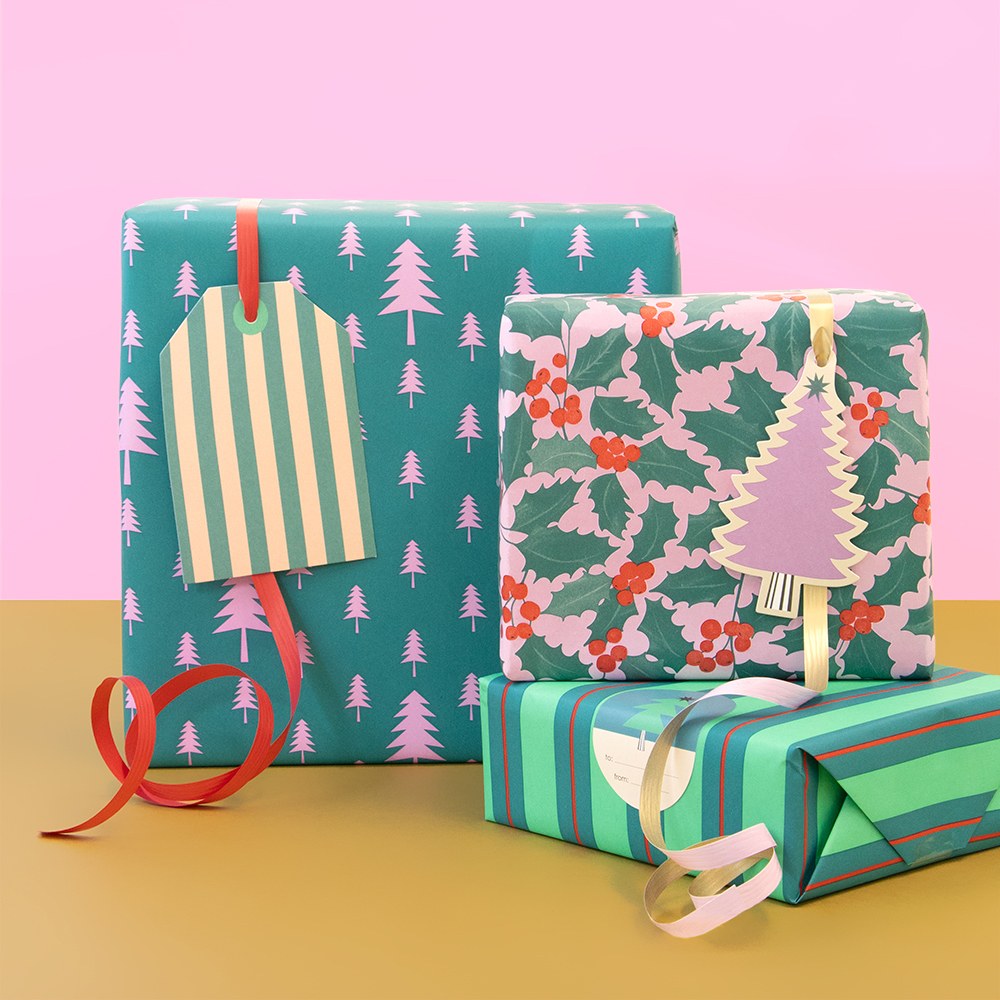
House of Products (yes, the same people behind the striped gifts at the very top) did it with wrapping paper: teal trees, pink holly and green stripes on three gifts, every one different, and together they look like a little family. And this stack from Snapfish's holiday campaign is another one I love: a pink and green stripe, a green check and a red bow on top. Two patterns, one palette, and it looks so put together.

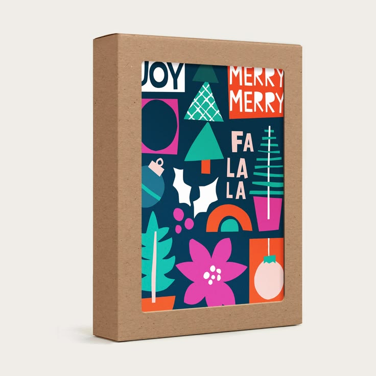
Even a box of Christmas cards can work this way. Ampersand Design Studio's Holiday Icons cards come in a box of ten, and every card is different: JOY, Merry Merry, Fa La La, a tree, a poinsettia. But they all share the same deep navy, hot pink, red and green, so the whole box feels like one collection. Send a different card to everyone on your list. And Storigraphic did it again with their Christmas Garland paper: a green geometric with soft pink dots, finished with a hot pink ribbon.

Plain brown paper or a piece of linen with twine, a sprig of eucalyptus, a cinnamon stick or a dried orange slice is beautiful too, and the cloth can be used again next year.
Shout-Outs
A lot of what you see in this post you can actually buy, and these shops deserve a shout-out.
Desenio's Jolly Holiday collection is so much fun. And Mango Home is on fire all year.
- Wrapping paper and tags: Lagom Design, March Party Goods, Good Tuesday, Storigraphic, House of Parlington, Pearly Paper Design, Gale Switzer on Society6 and MiekenPetraDesigns on Etsy.
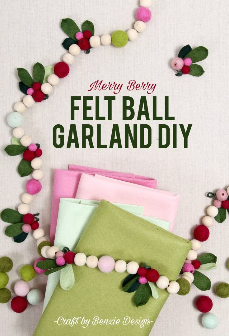
- Garlands and party pieces: Meri Meri, Anthropologie and Benzie Design (those felt balls!).
- Cards and paper: Caroline Gardner, Jaymes Paper, paper&stuff, Paper Source and Jenna B Studio.
- Gifts and decor: Oliver Bonas, Garden Trading, Sarah Madeira Day (those ornaments!) and Scalamandré for the stripes.
How To Find Your Mix
Two ways. One: tell AI everything you love and see what it puts together. It's fun, but AI can get a little crazy, and the whole point is not to get discouraged. (I have thoughts on that in is AI taking over design.)
Two, my favorite: make two or three Pinterest boards, one for colors and one for patterns, and start mixing. Then look at your boards as a whole. Does it feel good? Does it sit well with you?
And with whoever you live with. I love girly things, but if I go too girly, my husband won't be into it, and then the vibe just isn't there. We both need a vibe. So play with some masculine colors and some feminine ones until they feel good together. The palettes in Part 2 are the best way to learn how.
Then Bring It Home
Greenery first
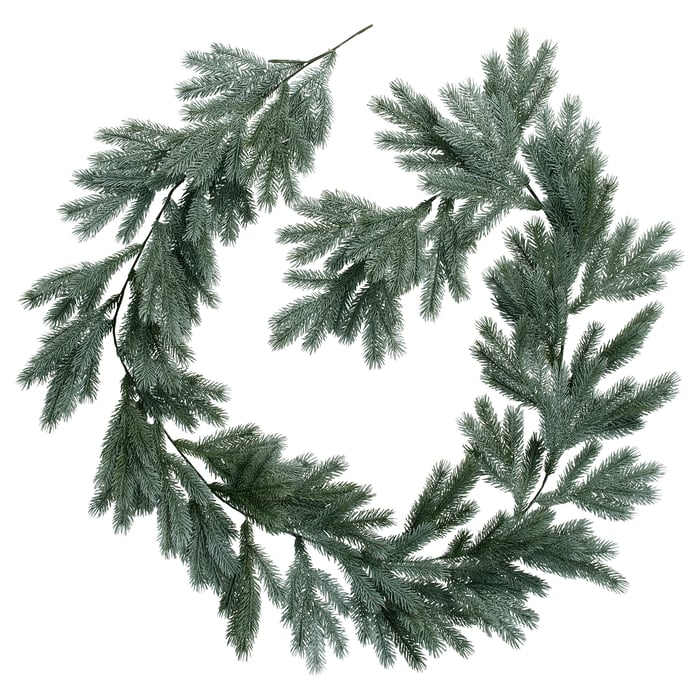
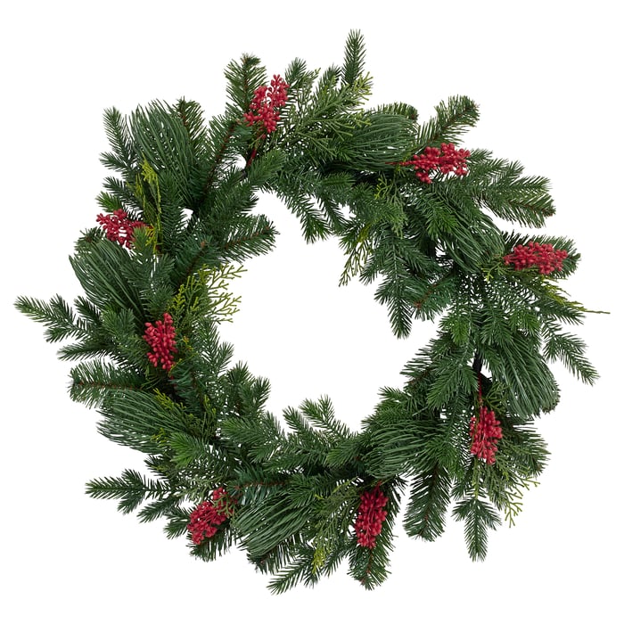
A garland around the front door, a long one on the mantel, cuttings in a vase, a small tree in an old pot in the kitchen. Mix your greens. Real smells amazing, but a good faux garland you bring back every year is completely fine.
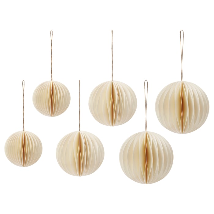
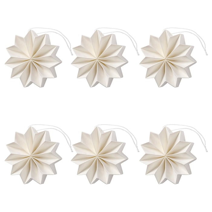
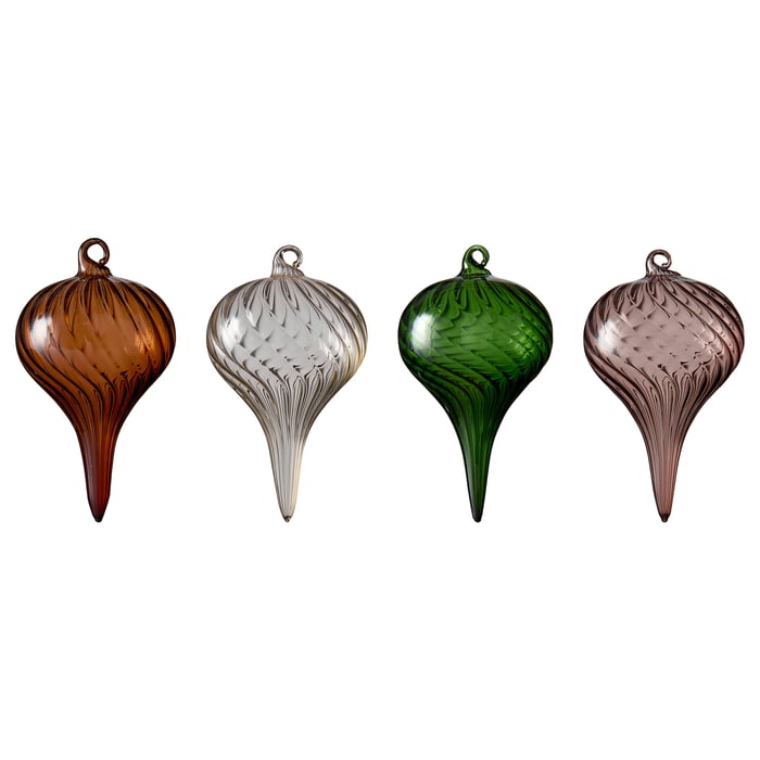
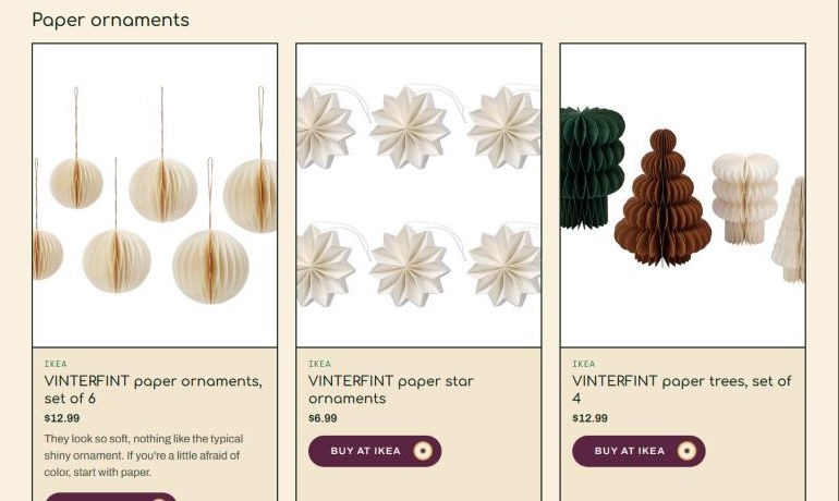
If you're thinking fun, IKEA has so much this year. Look at these paper ornaments. They look so soft, nothing like the typical shiny ornament. If you're a little afraid of color, I would start with paper, because it isn't so in your face. You can even play with bold colors, because paper isn't shiny and that mutes them a little. And if you're opening up to color, mix paper with glass. It gives your tree so much visual interest.
The mantel: a classic, or a statement
Don't get me wrong, I'm obsessed with greenery dripping over the fireplace. It's a classic, it's beautiful, and I don't think it's ever going anywhere. If you love it, use it.
But here's another option: a garland made of nothing but ornaments, like this red glass one from CB2. It's fun, it's not typical, and you can easily make your own.

My one tip: if you use it in several places, keep it all the same color. This one is all wine red. Mix a bunch of colors and it gets a little crazy. Or make it your one fancy, funky statement over the fireplace, and use the classic greenery everywhere else.
And think about the quirky things that make you different. I wrote a whole post about adding something unexpected.
Velvet bows and old bells
A velvet bow makes any greenery look special: on the garland, the wreath, the kitchen cabinet handles, the backs of the dining chairs. Cheap, fast and so elegant. And old bronze bells feel like Christmas without shouting it. Look for them at flea markets (here's how I hunt).
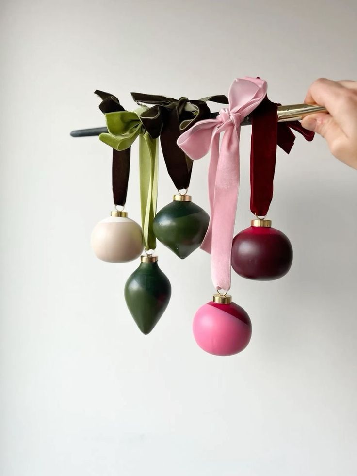
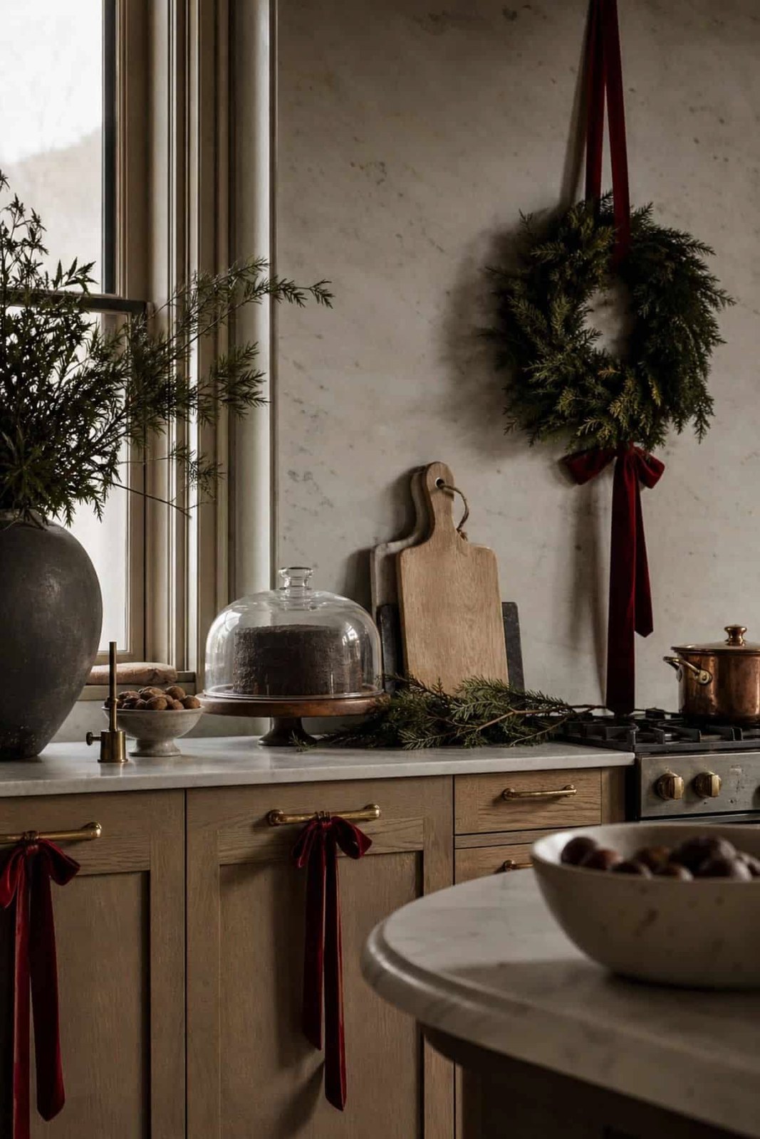
Look at those ornaments hanging from long velvet ribbons on a brass rod: cream, green, pink and burgundy, and every bow a different shade. And that kitchen from Pretty Wild World, with a wreath on a burgundy ribbon and little burgundy bows on every cabinet handle. It's such a small thing, and it makes the whole room feel dressed up.
Those ornaments are by Sarah Madeira Day, and they're the perfect lesson in using color and still looking elegant. Look closely: they're not super shiny or metallic. They're mostly matte, with just a little bit of shine, almost like ceramic. Full of color, and still so delicate.
That's the difference between elevated and that dollar-store look: super metallic, super bright, super shiny. (And the dollar store can have some really nice things if you know how to look!) So when you shop, ask yourself: is this loud to my eyes because it's so shiny and so metallic? Does it look cheap? Getting this look doesn't mean spending a lot of money. You just have to know what you're looking for, and then you can find it on almost any budget.
Now the bells. Tuck them into the garland on the mantel like Susie Zaldivar of Home.Coop.Garden did.

Candlelight, everywhere
Turn off the big light. Candles on the mantel and the table, string lights in a jar, a lamp in the corner. Tree-shaped candles, like these made with Boowan Nicole's candle mold, are so cute you almost don't want to light them.
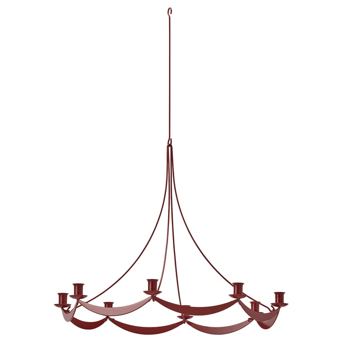
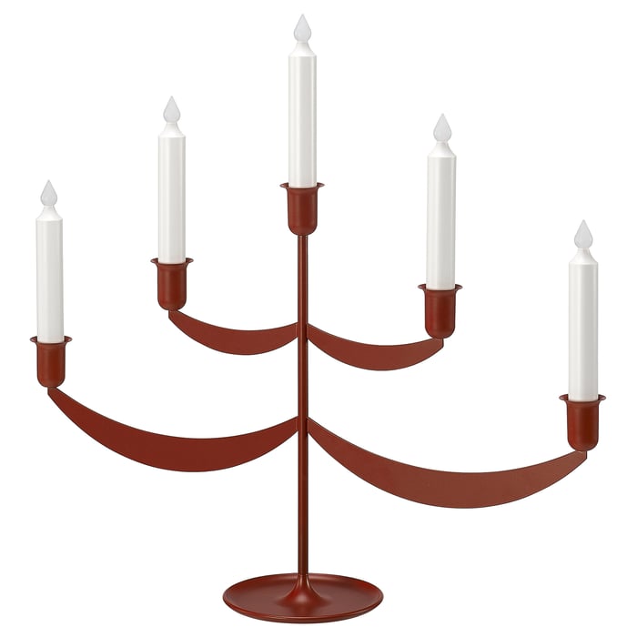
That red IKEA chandelier is absolutely adorable. What a beautiful way to have a chandelier for the holidays: it looks real, and it comes down when Christmas is over. What a great idea. And the battery-operated candelabra is another one you can just enjoy.
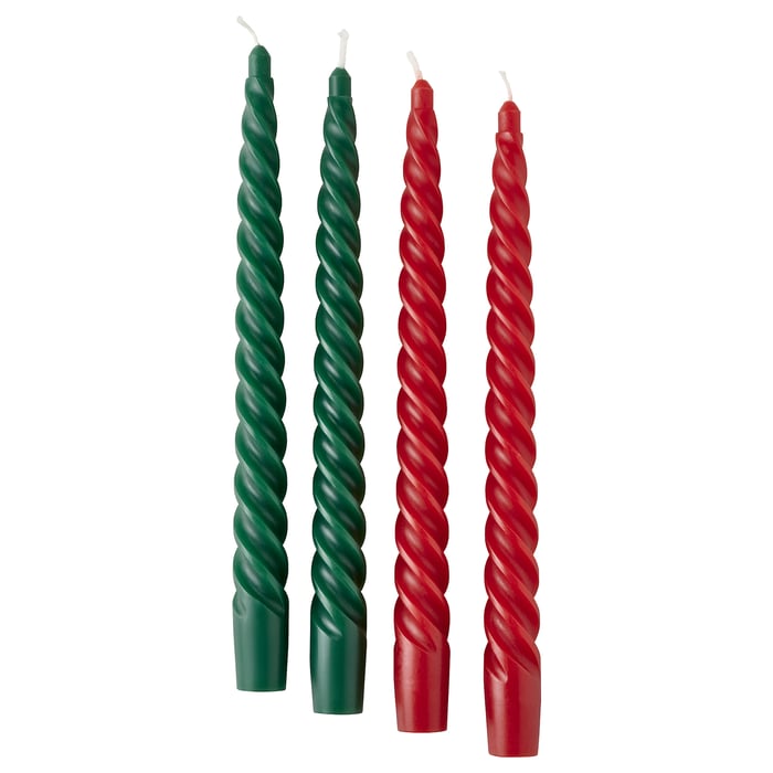

Colored tapers are an easy way to bring your palette in, too.
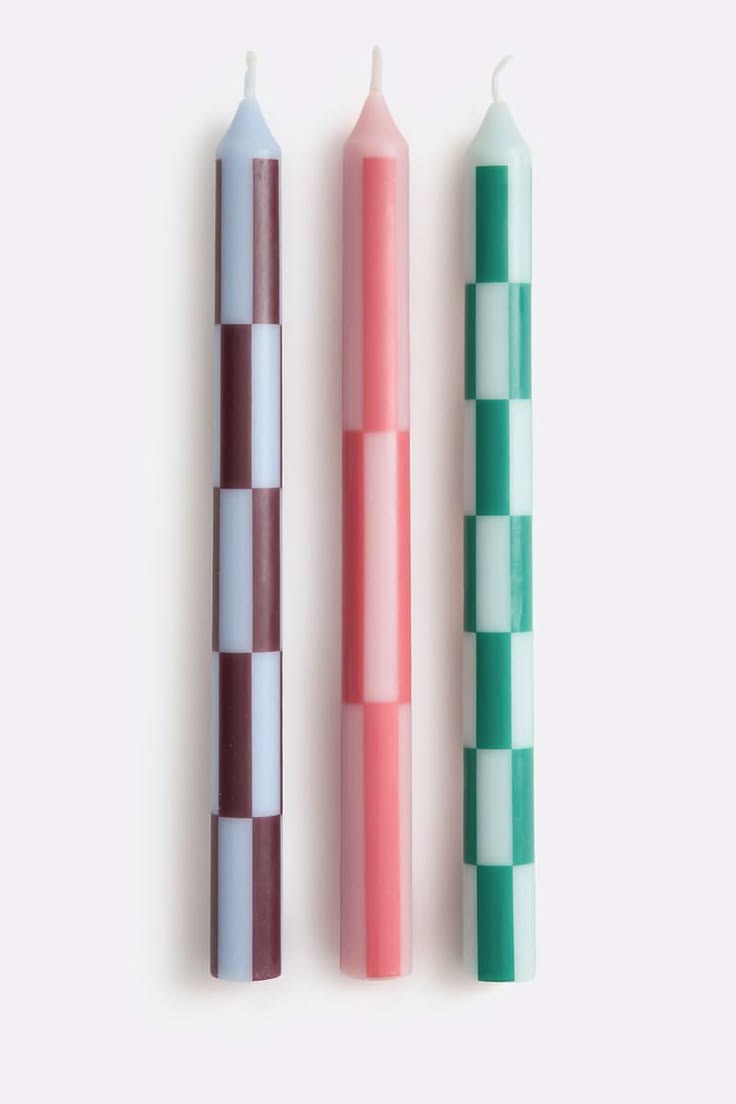
A few more I love: hand-dipped plum tapers from Slow Roads, a whole rainbow of tapers in their wrappers from Anthropologie, and HAY's pattern candles in pink and bordeaux, with checks and stripes right on the candle (via Lamptwist).


And in this home, a pair of deep burgundy candlesticks that look like stacked bubbles makes the whole shelf feel like Christmas. Next to them, five Pantone colors that say the same thing: Aubergine Gleam, Pickled Beet, White Asparagus, Pine Grove and Mountain View. Put just those colors on your table and you're done.

And a few from the shops this season that I'm loving. Mango Home has little tree-shaped tapers in garnet (tie a red ribbon on the candlestick and you're done) and two-tone tapers in plum and green. And La Redoute Intérieurs has these checked tapers.


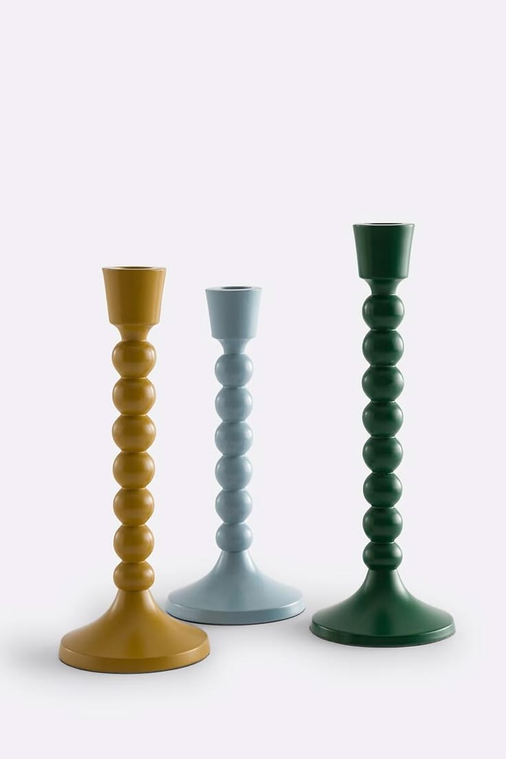
La Redoute also has the cutest bobbin candlesticks in mustard, pale blue and green. For the table, Anthropologie's Ribbon Stripe glasses look like peppermint candy. And these tall pink-and-red tapers from Wayfair are shaped like little wrapped presents.
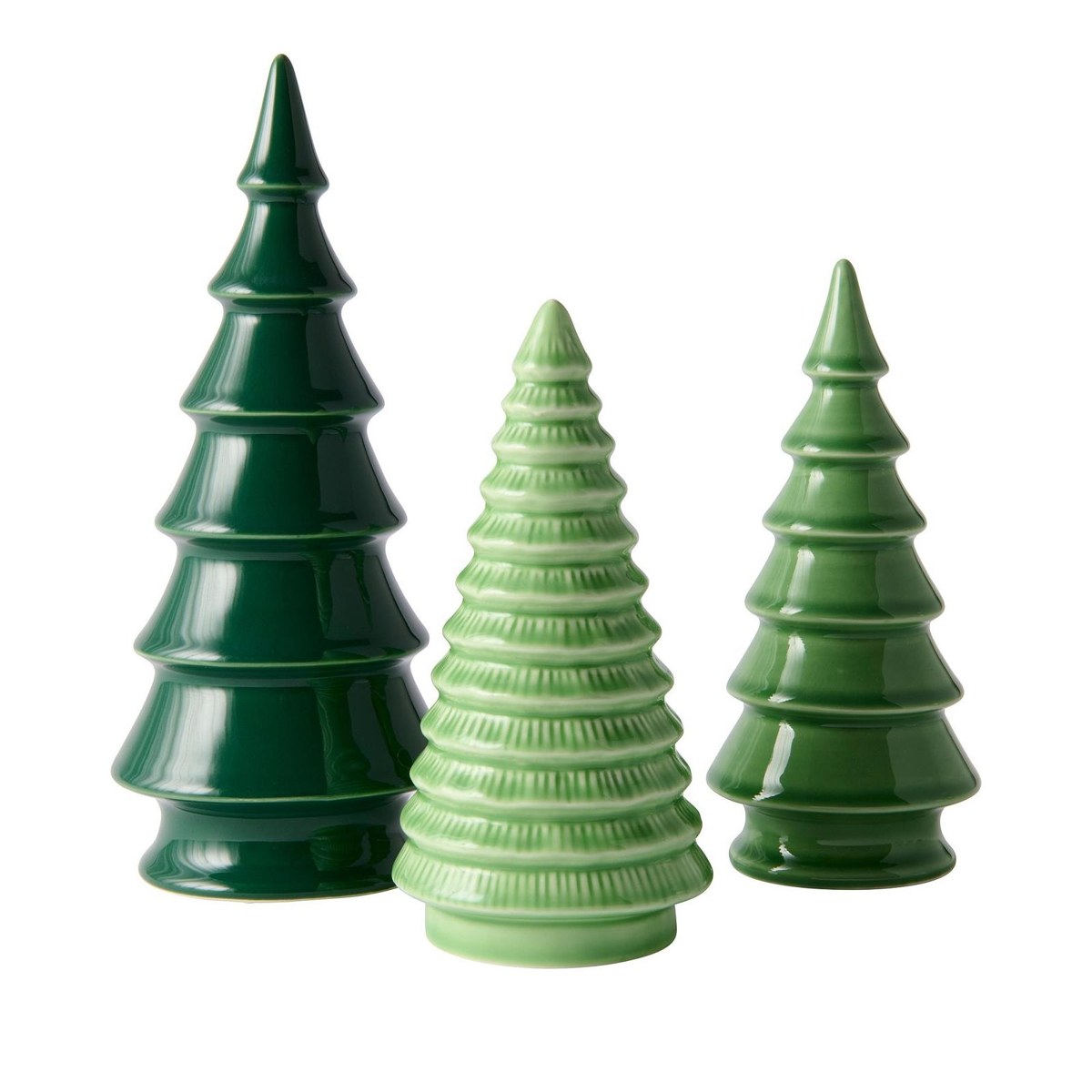
And for a little forest on the mantel or a shelf, IKEA's VINTERFINT trees come in three shades of glossy green, tall, short and ribbed. Group them with a few candles and you have a whole scene.
The IKEA and Kave Home links in this post are affiliate links: if you buy through them, Astratto Design may earn a small commission, at no extra cost to you.


And the Stripe and Glow tapers from The Preppy Bunny come in a sweet little box, in greens or in pinks and reds, so they're a gift on their own.


Two more I can't stop looking at: Gustaf Westman's chunky candle holders in plum, coral and pink, like little glossy donuts, and HAY's Column candles with a thin grid in red and blue on pink, white and cream. A grid on a candle! That's pattern in the smallest, easiest dose.


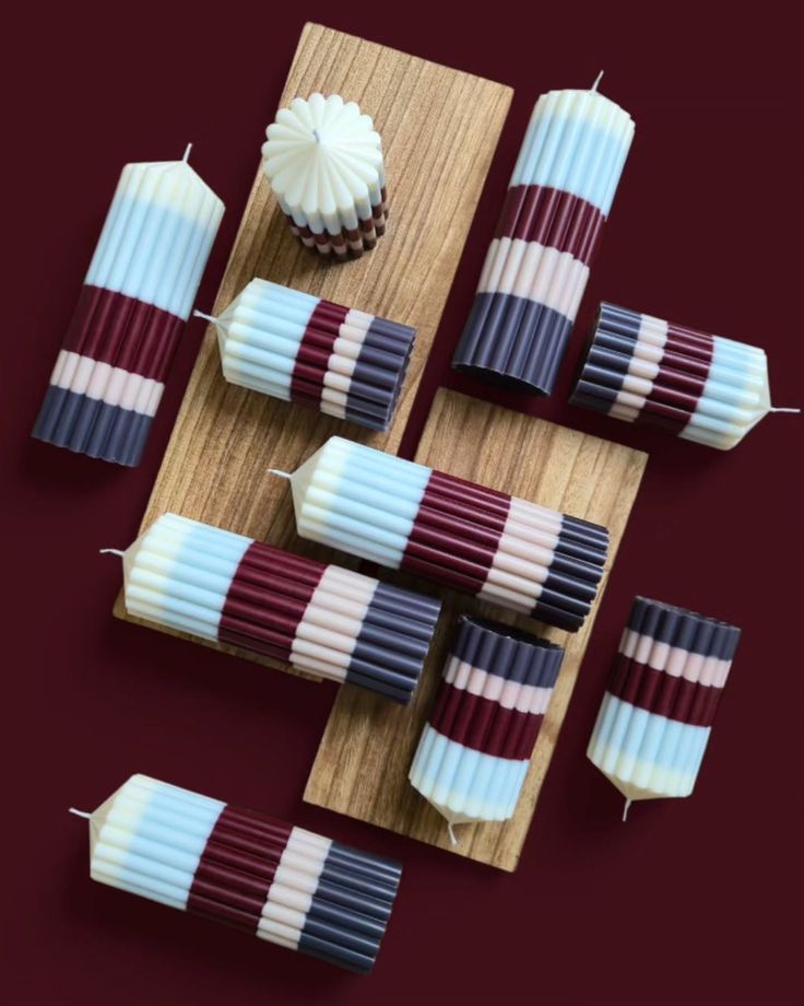
And look at these ribbed candles from Last Ember, in stripes of burgundy, navy and icy blue, scattered on a wood board on a wine-colored table. They're not even red and green, and they still feel completely like Christmas.


Look at those tapers from Anthropologie lying on the table with the pine: green, pink, orange and cream. They're not matching, and that's exactly why they work. Pick candles in three or four colors from your palette, put them in mismatched brass candlesticks, and you have a centerpiece in two minutes. (I put a few skinny ones next to my donut tree too.) And Katharina Puritscher, an illustrator in Munich, drew four advent candles tied with ribbon over pine, the same idea in a little drawing.
Ornaments with a story
The best trees aren't matching, they're collected: a flea-market glass ornament, one your kid made in school, one from every trip. Put the extras in a bowl with some greenery and you have a centerpiece. Lucy Akins of Craftberry Bush filled a bowl with amber glass ornaments and a sprig of pine, and it glows. And Affleck & Co. makes clay name-tag ornaments with white beads, so everyone in the family gets their own.


And the ornaments themselves can have so much personality. Christen Glenn's felt cacti from LunaBeehive, with little pink flowers on top, a fig and a slice of dried orange from Anthropologie, one green striped glass drop on a bare branch.


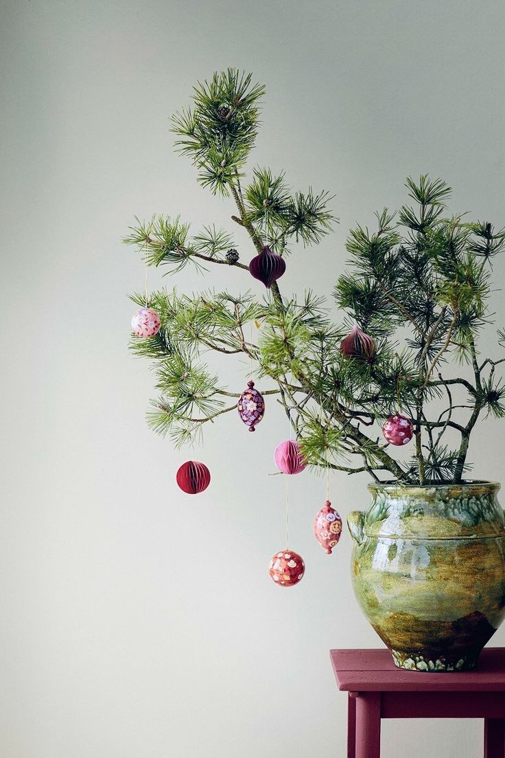
Or skip the tree altogether: a few pine branches in a glazed vase with tiny pink and red ornaments, like this one from Bungalow Denmark. So simple, and so pretty.
Get crafty
Paper is my secret weapon at Christmas: paper trees, paper stars, a garland of little kraft trees in a window. It costs almost nothing and it's a perfect afternoon with the kids, or with friends and a glass of wine.
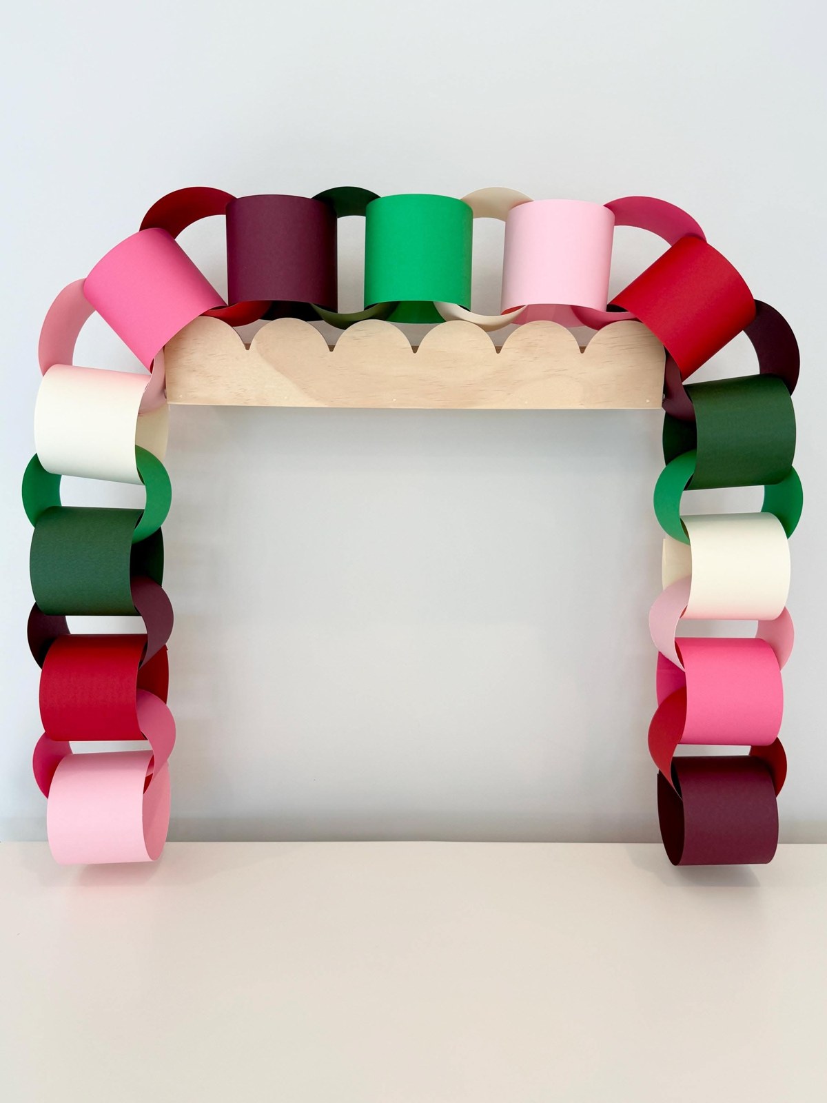
Look at this paper chain arch from AddyJacksCo in red, pink, green and white. It's the same paper chain we all made in school, but in the right colors it looks so good. That's the whole idea: the simplest craft can feel designed when the palette is right. (You probably spotted one on my donut tree too.)
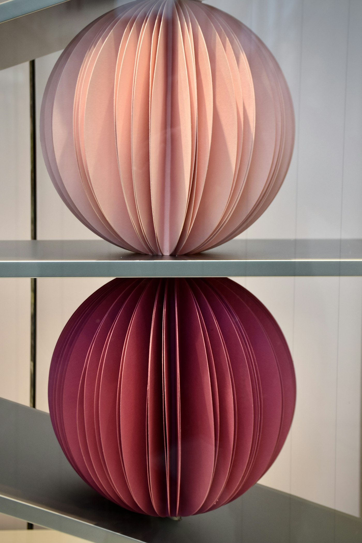
Kraft paper is my other favorite, because it goes with everything. Fold a few paper stars, like Olena Hassell, who teaches them step by step. Once you get the hang of the first one, you'll want to make twenty.

And paper trees! Folded green ones with tiny cork stars on top. Line up a few in different heights on a shelf or the dining table and you have a little paper forest.

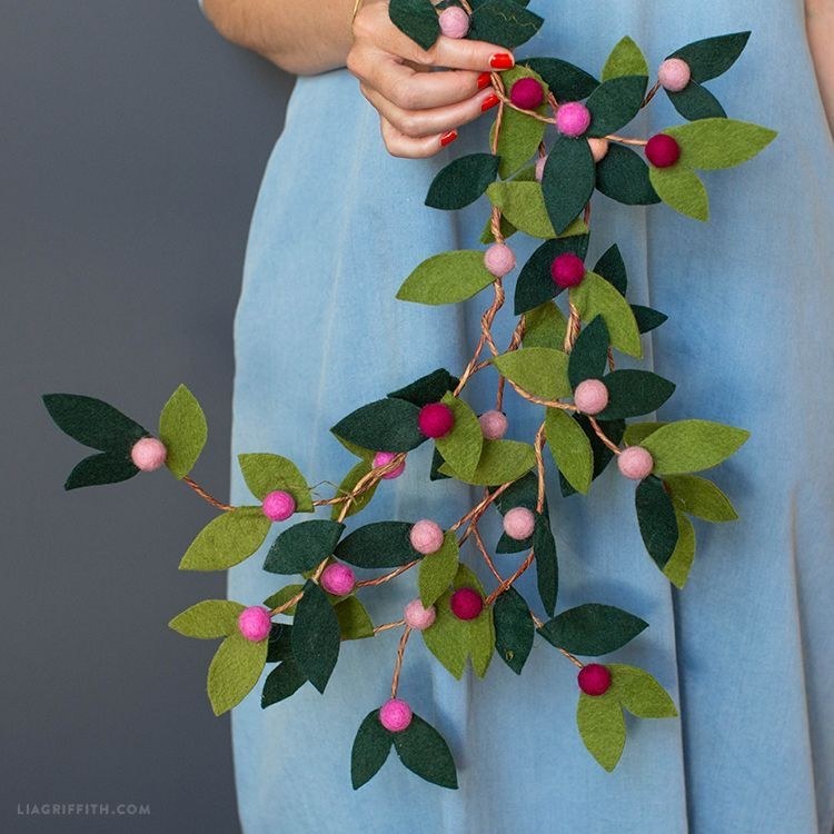
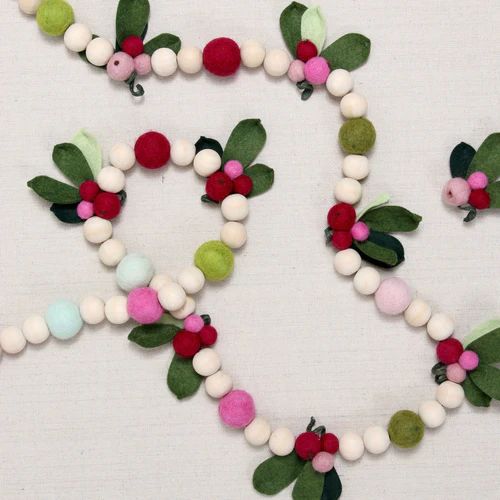
Garlands are another easy afternoon project. Peony and Honey links a velvet chain in deep green and burgundy, Lia Griffith makes felt leaves with pink and red berries, and Benzie Design's felt ball garlands come in cranberry, pink, cream and green. Pick the colors of your palette and you're set.

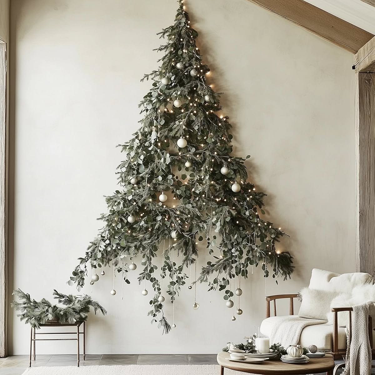
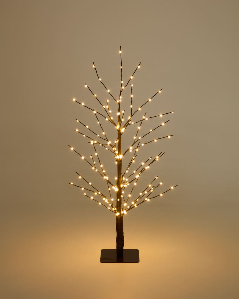
Short on space, or renting? Make a tree on the wall with branches or eucalyptus and a few lights. It's gone in five minutes in January. More ideas in my renter-friendly hacks.
If this calm, natural look is you, stay tuned: a special wabi-sabi Christmas post is coming later this month. We only announce our Monday posts, so we won't be announcing this one. Keep a lookout on the Journal. We've had this Pinterest board sitting in our account forever, and when I happened to go back to it, I just had to share some of the pictures. I have a huge love for wabi-sabi. I'm into color now, but wabi-sabi is still something I buy, keep and cherish, and it has a special place in my heart.
Make It A Tradition, Not A Shopping Trip
Make Christmas memorable. Start something you do every year, with family or with friends. Paint a little watercolor for the season, hang it again next year, and add a new one every Christmas. Ten years from now you'll have a whole wall of them, and a story for each one.
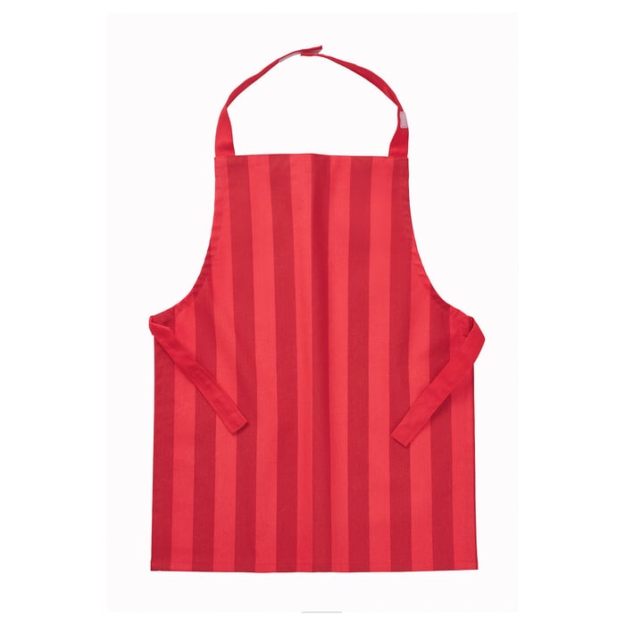
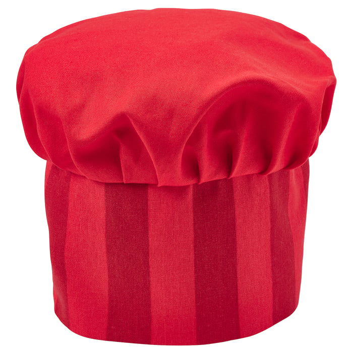
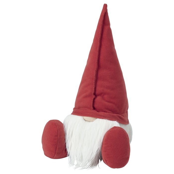
I would totally give this little apron and chef hat to my child to bake cookies in, and buy my own to match. And gnomes are always adorable. I'm obsessed, and my father-in-law is afraid of them, so every Christmas we hide them on each other. Start that game with your own family.
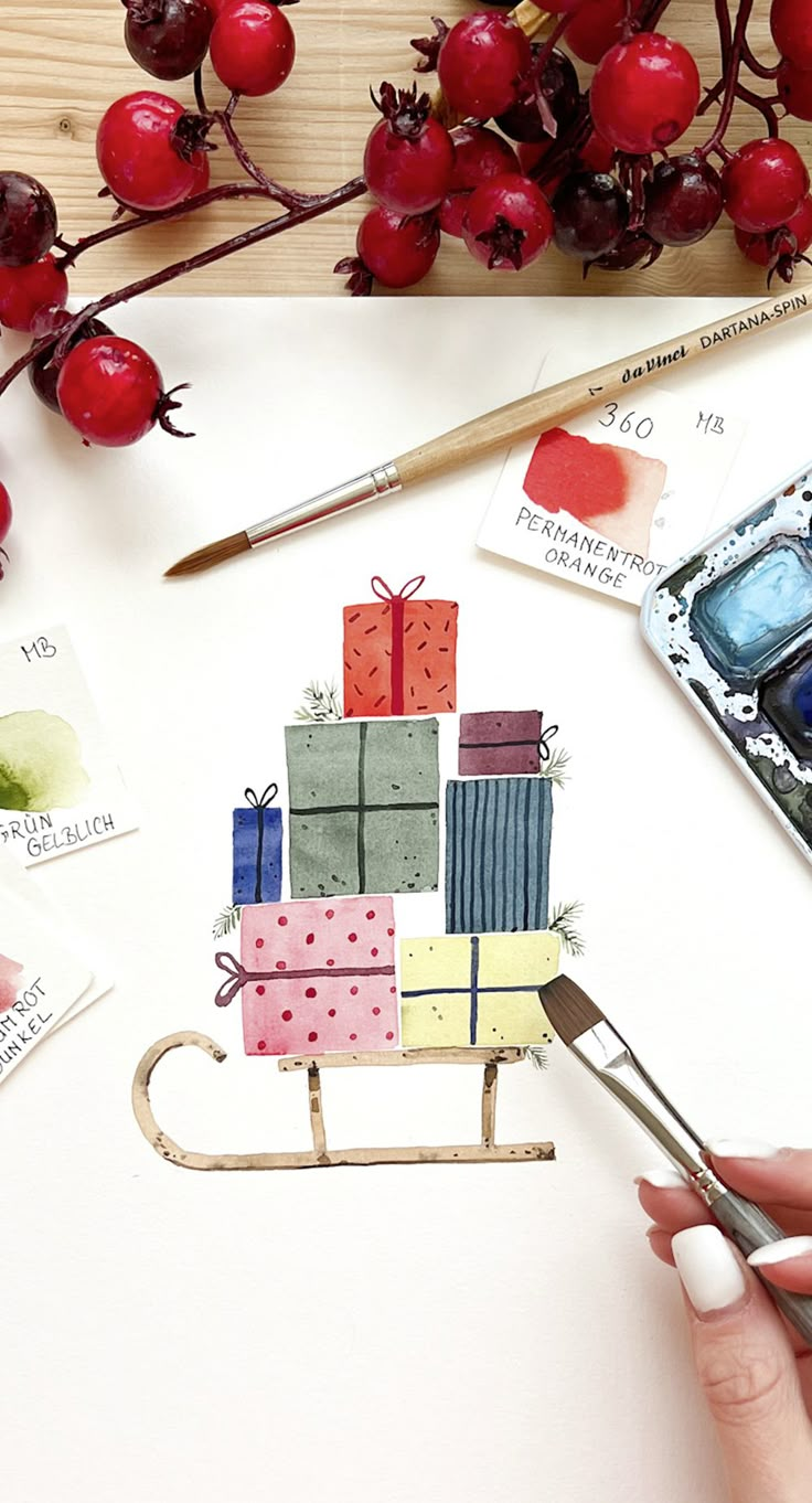
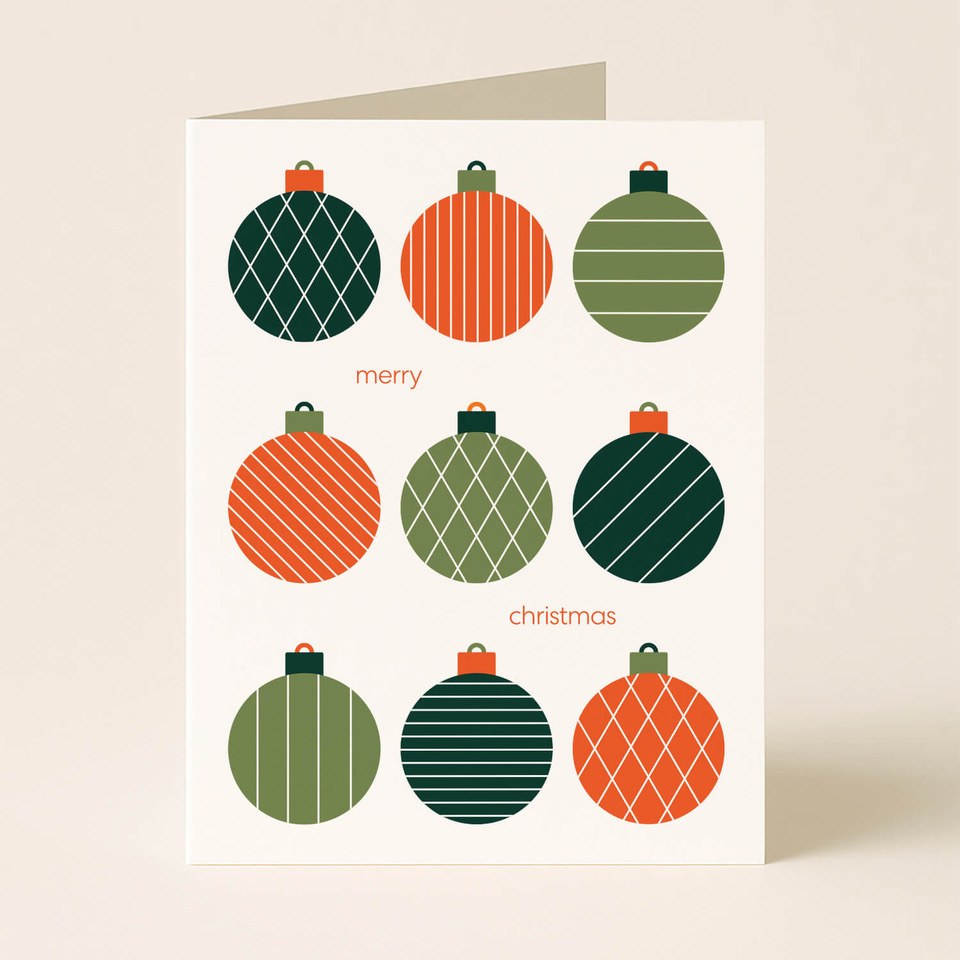
Christmas cards are another place to do your art. These are watercolors: Jenna B Studio painted a candle inside a wreath and a simple pine branch, and May & Berry painted gifts stacked on a sled. Someone took the time to paint something so simple, and it looks so great. And paper&stuff's card, nine red and green ornaments in a grid, shows how good a simple layout can be. They're cards, but you could put one in a frame and set it out for the season. Voilà, there's your Christmas artwork, and it barely cost a thing.


Stores want you to spend a ton of money on decor. I love shopping, so I'm guilty too. But if this year you need to save, please don't give up on Christmas. I've been there, and I know the struggle. As a designer, I refuse to not have a beautiful Christmas, and I refuse to wait until next year. Wrapping paper, paper crafts, greenery from a walk, things you already own: there are so many ways to make it even better than buying something and feeling guilty about it.
Gather, Eat, Play
And remember what all of this is for: long dinners, gathering with your family, creating a vibe, playing games, and loving who you're with, number one, and where you're at. The decor is just the stage. The people are the show.
The Short Version
- Keep some kind of red and some kind of green, and play with their tints, tones and shades.
- Red and green are complements. Find the complements that fit you.
- Colors that aren't Christmassy? Put them on the tree, the donut or the garland, and it's still Christmas.
- Pick colors with a little gray in them. They calm the eye.
- Three colors, four at the most, plus neutrals like black, white, cream and beige.
- Green and burgundy are the new neutrals.
- Skip "the" trend. Find your personality, then add your own twist.
- Elegant classy or fun classy: keep it classy.
- Minimal if you want calm. A little maximal if you want personality.
- Don't be scared of pattern. A few, not everything.
- Let your wrapping paper do the pattern, and wrap early.
- One statement piece is plenty. Repeating it? Keep it one color.
- Break a rule now and then. Asymmetry can look so intentional.
- Decorate with whoever you live with in mind.
- Start a tradition. It doesn't have to cost much.
- Love something loud, or even cartoons? If it brings you joy, go for it. Just watch the tones.
In A Nutshell
If I had to sum up this whole post in one idea, it's this: there's no one right way to do Christmas. Picture a whole row of little Christmas trees, each one made a different way. They're all cute, they all look like Christmas, and guess what? They all have personality.
Honestly, I think that's how we should all design our homes. Not copying the same look as everyone else, but making it unique, fun, cute and a little different from the house next door, and still looking like Christmas, just in a creative way. Your home should look like you, not like a catalog.
And this watercolor by AtelierPoa, Lysiane's little shop in Lyon: gifts stacked up on a sled with a little pine branch on top. It's still a Christmas tree, just told a different way, and her soft brushwork makes it feel like the coziest card you've ever gotten. Thank you, Lysiane, for letting me share it.
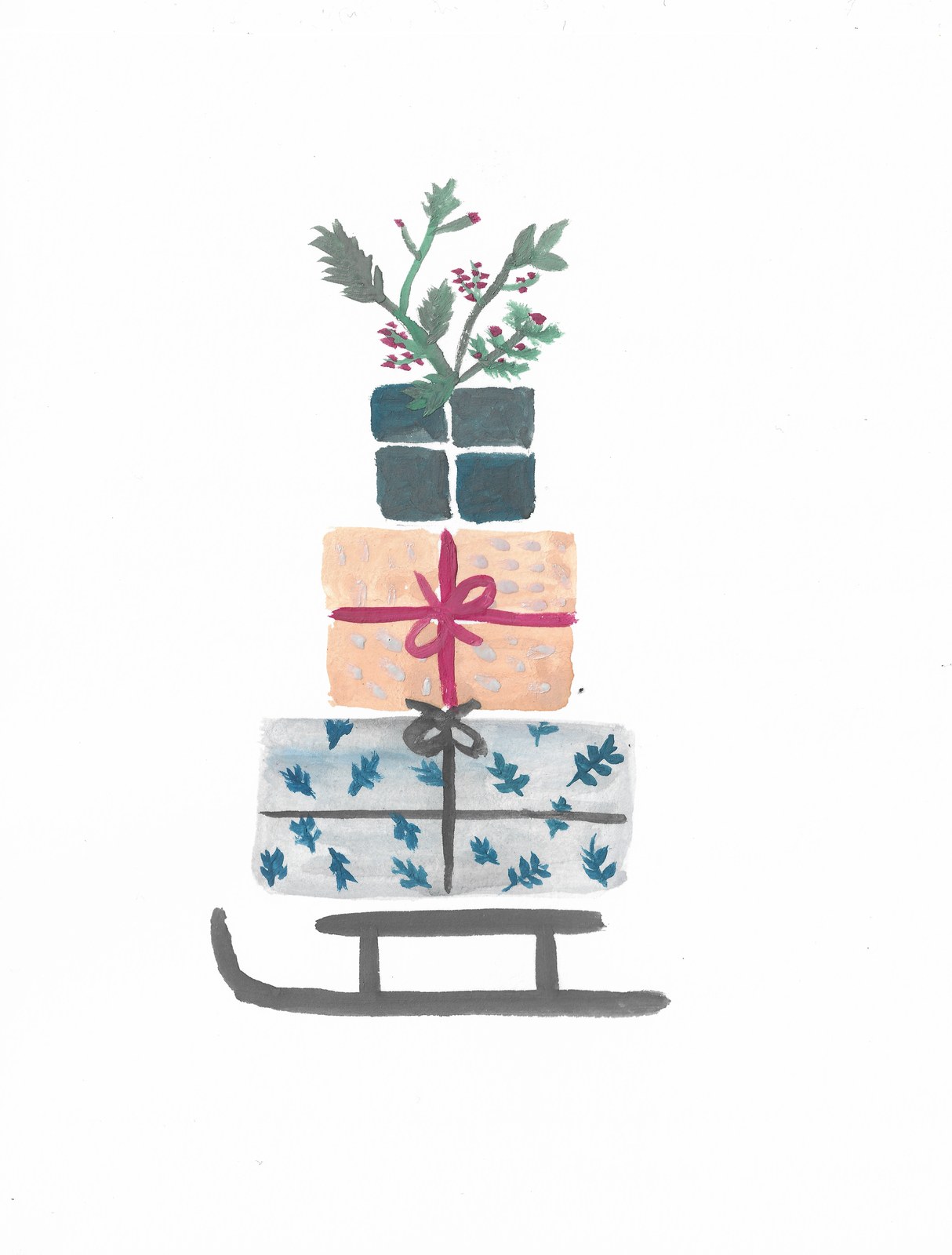
That's all I'm trying to say. You can do Christmas your own way, with class and with personality. Her painting says it better than I could.
Remember the striped gifts from House of Products at the very top of Part 1? Periwinkle, rust, chocolate and plum. Not one of those is a "Christmas color," but put that stack under a tree and it's still Christmas. It doesn't take anything away.
Think about the '90s and early 2000s (and I'm guessing way before that too). Wrapping paper was covered in little animals and cartoons, in every color you can imagine, and it never took away from Christmas. We're just trying to be a little classier than a pile of cartoons. But if you love cartoons, or cute little monsters, go for it. This is your Christmas, and it should show your personality.
I'll be honest, cartoons are harder to keep classy. The good news is that companies are making things classier every year. So look for the ones that are a little more muted, or that play with the shades of color I've been showing you here. Use this post as your guide. And if you're reading this, I'm guessing you're a little picky about your colors at Christmas, just like me.
So here's how to keep it classy:
- Pick a color theme, and stay in it. Three colors, four at the most, plus neutrals. It won't always be easy, but try. Repeat your colors on the tree, the wrapping, the pillows and the table, and it looks planned instead of random. Not sure which three? Go back to Part 2 and borrow a palette.
- You can never go wrong with neutrals. Black, white, cream, beige, off-white. Use as many as you like.
- Watch the tones. Pick colors with a little gray in them: cranberry instead of fire-truck red, sage or pine instead of kelly green. Super bright and loud gets uncomfortable to look at for a whole month.
- Matte over shiny. A little sheen is pretty. Super metallic, super glittery everything is what makes it look cheap.
- Keep one thing traditional. The tree, the greenery, the lights, Santa. Pair the fun thing with something classic, and everyone still gets that it's Christmas.
- Don't make every gift a cartoon. Love cartoon wrapping paper? Use it, just not on every single gift. Look at the colors your cartoon paper is showing off, and wrap the rest in stripes, checks or another pattern in those same colors. The cartoons get to be the star, and the whole pile still looks put together.
- Bring in nature. Greenery, wood, linen, pine cones. Natural materials calm down even the brightest colors.
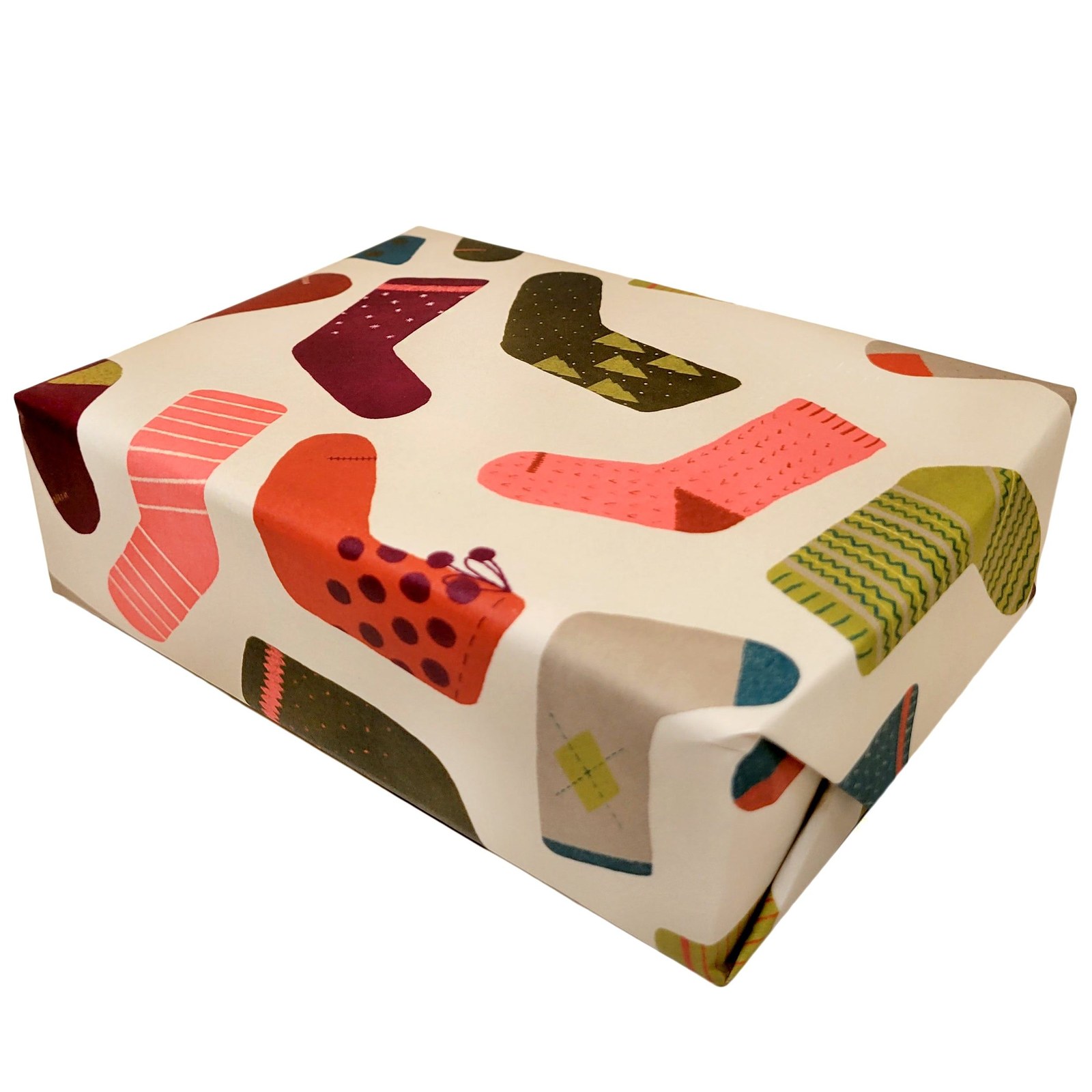
Look at Target's Wondershop paper with cats tangled up in the Christmas lights (so cute), or beve's winter socks paper, with fun, colorful socks on cream. Use them for a few gifts, then pull their colors, the green, red and cream, into stripes and checks for the rest.

My Christmas Picks
I put together a little store on my website with everything I would buy this Christmas, store by store. Every link goes straight to the store, and if you shop through it, you're supporting a small mom and pop shop. Come take a look.
A few favorites:
And if it brings you joy, hey, that's what matters.
And above all, be grateful. Too many people can't even think about decorating, or about having dinner with the ones they love. Decor is nice and all, but it's the small details that make it. You don't need a lot of things, and you don't need big things. Be inspired, but there's no need to overdo it. Play with what you have, add a few cute things here and there, and make the season special for you and the people you love.
So in the end: enjoy your holidays, and have fun decorating.