Just here to shop? If you're only interested in buying my picks, go straight to my Christmas Picks.
In 2020 I Said "Find A Palette On Pinterest." This Year I Did It For You
In my 2020 Christmas post I told you to find a color scheme on Pinterest and build everything around it. So this year I collected every palette I loved on our Christmas 2026 board.
I rebuilt each one as plain color chips and left out the photos behind them. They're beautiful, but busy, and I wanted you to see the colors. Every palette links to its creator's pin, and the hex codes are under each one, so you can match paint, ribbon or wrapping paper.
And to everyone who makes these palettes and shares them on Pinterest: thank you. Seriously. Seeing them side by side helps so much to understand color and see the possibilities. I learn from you every year.
And here's what I noticed putting them all side by side: you can tell every one of these was really well thought out. The palettes, the wrapping paper, the Christmas cards. They're fun, but still classy. They have personality, and they were made with good taste. So as we go, I'll tell you what I love about each one.
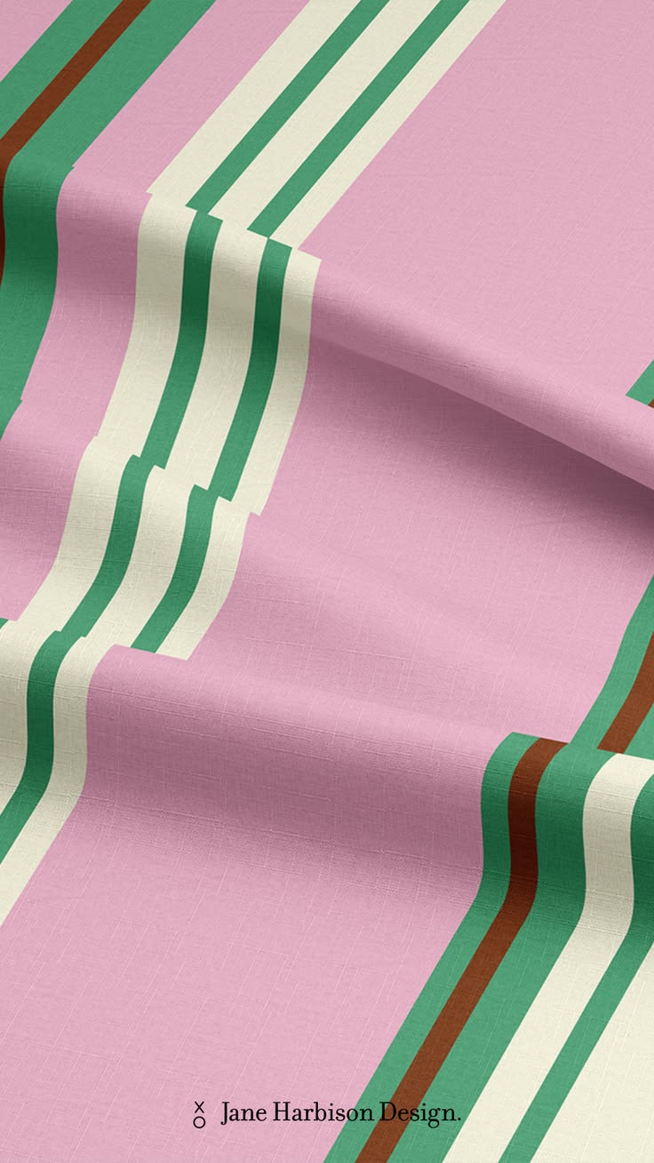
Patterns can be a palette too. Look at this French stripe from Jane Harbison Design: pink, butter yellow, green and chocolate brown, all in one fabric.
Pick Your Personality
Find yourself below. Most of us are two or three of these, and that's great: mix them. And if you share your home, pick with them in mind (more on that in Part 3).
One more tip: if the palette you love isn't feeling Christmassy enough, even on the tree or the donut, add a dark red or a dark green, the more typical Christmas colors. They'll tie it in and guide the whole palette into a Christmas vibe.
The Classic, With A Twist
You love a traditional Christmas: red and green, plaid, the tree in the corner. Keep it! Just reach for the deeper, grayer versions. Cranberry instead of fire-truck red, pine instead of kelly green, ivory instead of stark white, and an old gold.

Laney's Happy Home kept it to four colors: burgundy, evergreen, warm ivory and an antique gold. That's really all a classic Christmas needs. The Blom Collective went a little deeper, with names like Yuletide Velvet and Silent Night Fir, and you can almost feel the velvet. And the checkerboard paper from maisondeJo, green and white with a pink ribbon, is traditional with one little surprise. Fun, but still so classy.

Sprig and Sparkle's Holly Berry Modern is the classic with a twist in one palette: a true holly red, softened by a gray-green and a warm copper so it never shouts. JomoMacci Design did it with three colors, a deep red, a moss green and cream, just like an old ticking stripe. Then Pippi Post slipped pink into a red and green plaid. You can tell these were really thought through. Nothing here is random.
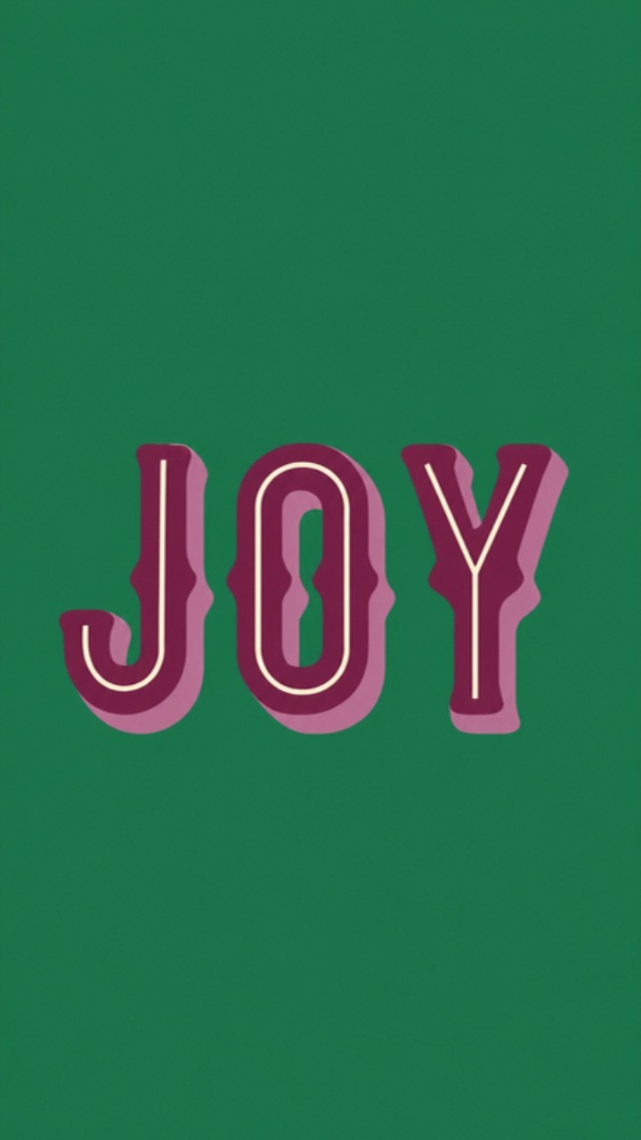
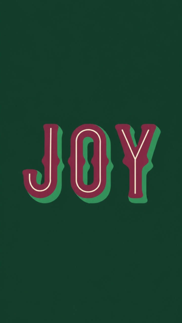
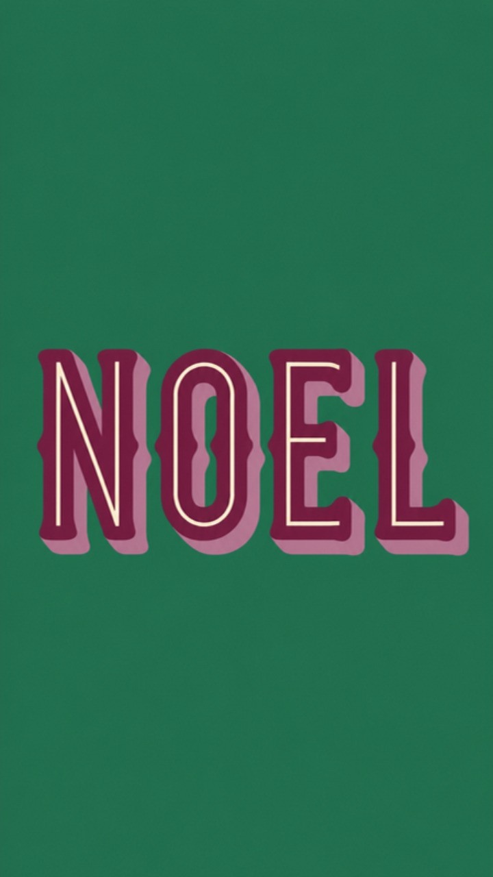
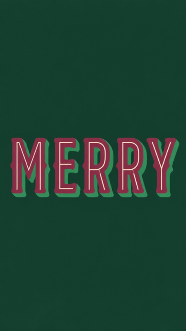
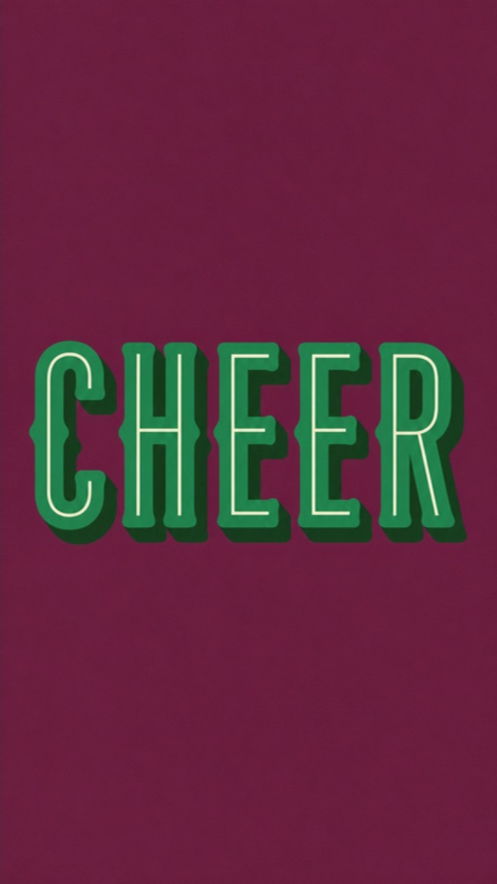
AI images by Astratto Design, inspired by a JOY print Janae Bruce shared on Pinterest.
Events Club Inspiration's Noël is two reds and two greens with a warm sand in the middle, and that sand is what makes it feel grown-up. Mackenzie Makes did the same thing with gold: Real Red, Cherry Cobbler, Garden Green, Shaded Spruce and a touch of gold to make it glow. And a JOY poster Janae Bruce shared inspired my own little set of word prints in plum and two greens: two colors (or three) are plenty when the letters are this big. Print a few and line them up on a shelf or the mantel.
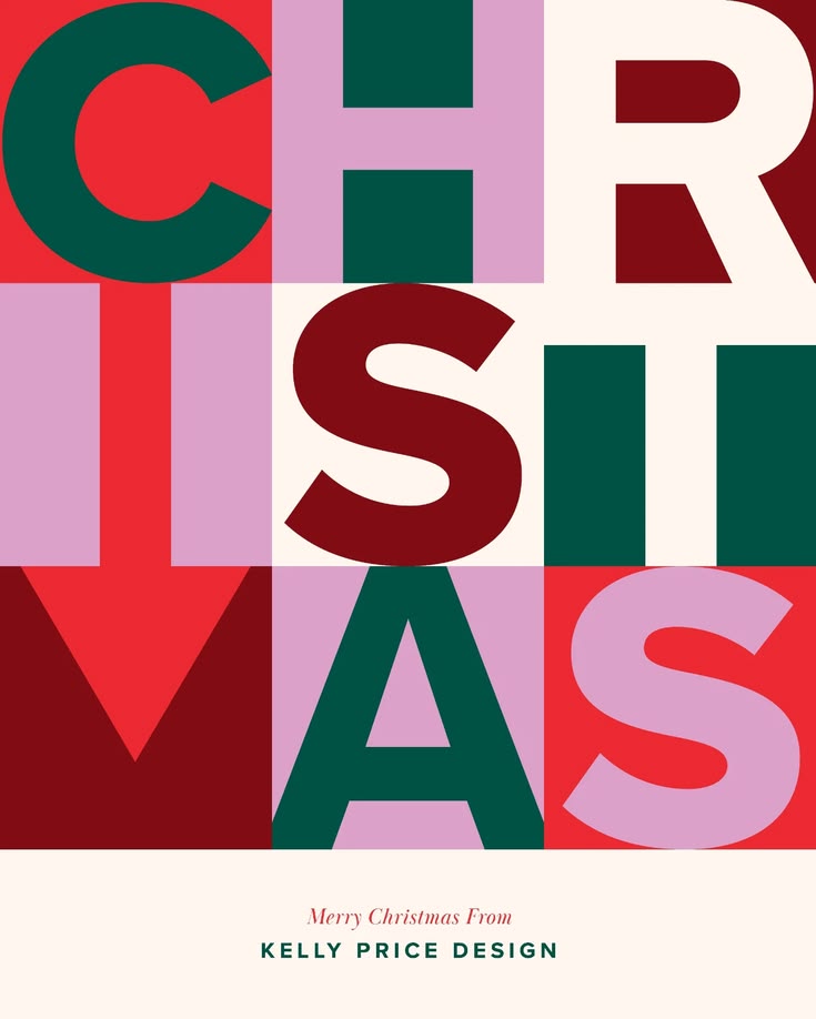
Homary's Emerald, Petrol And Red is a smart one. Petrol is a blue, but it sits so close to the emerald that the whole palette still reads green, and the cream and khaki calm everything down. The Paleta Navidad next to it adds a warm brown, like the trunk of the tree. And that poster spelling Christmas in red, green and pink blocks? Pure fun, and still so put together.
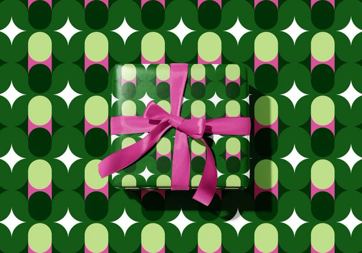
CreativeBooster's Retro Christmas pairs a barn red and a chili red with two greens, and the Dutch white keeps it soft. Mari Pro Design surprised me with orange where you'd expect red. Orange is red's warm cousin, so it still says Christmas, just with more personality. And Storigraphic's wrapping paper, a green and pink geometric with a pink ribbon, is the kind of gift you almost don't want to open.
Try it: plaid or ticking stripes, red glass ornaments, brass bells, a big garland on the mantel.
The Retro Soul
For the vinyl, old radio, typewriter, vintage-piece people. These palettes are a hug of nostalgia: cookie-tin red, mint, brass, mulled wine, burnt orange. Think your grandma's ornaments, a Fair Isle sweater, an old Christmas card.
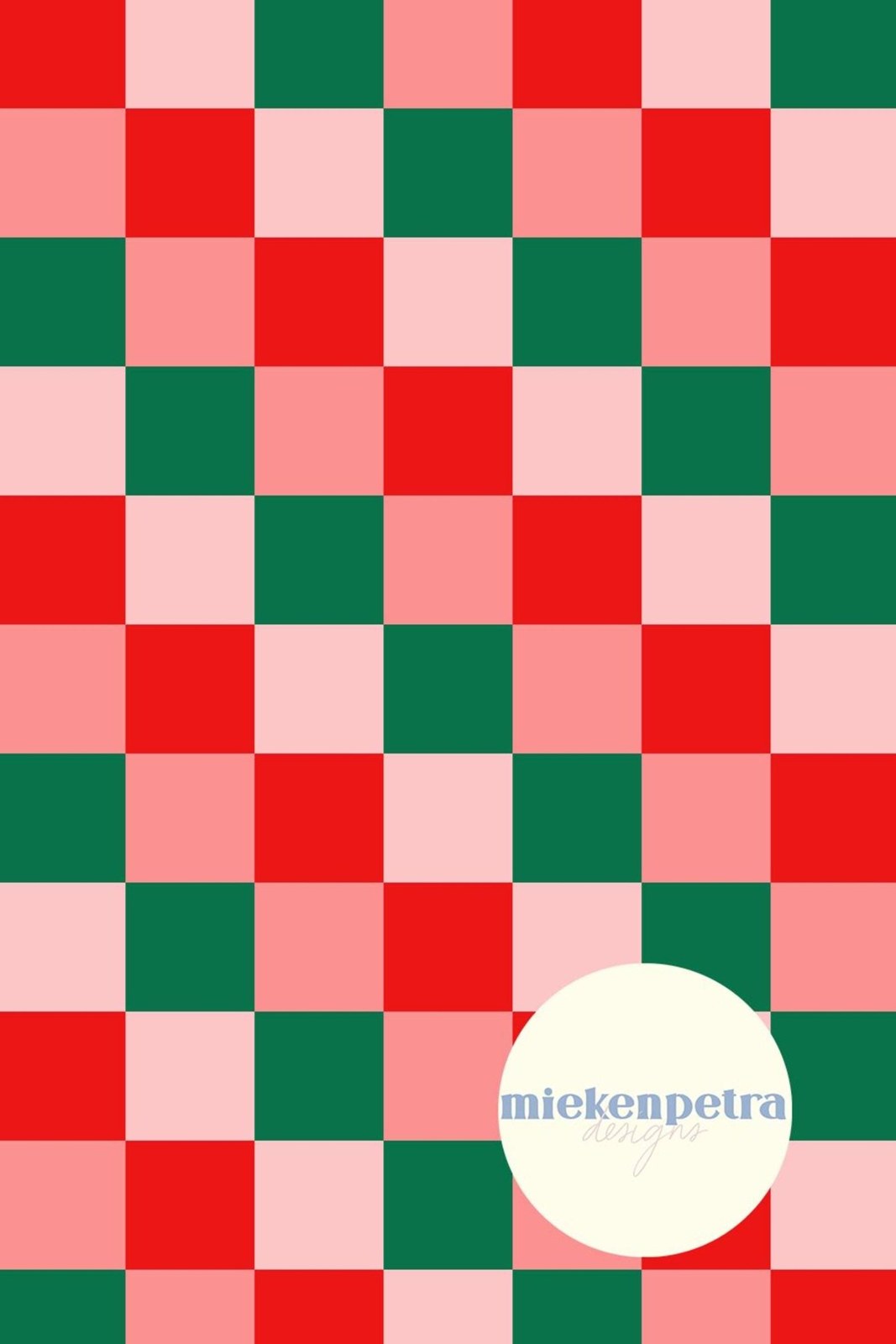
Even the color names tell a story. Alfie & Co. called theirs Antique Brass, Ivory Lace, Santa's Belt and Mulled Wine. Kiley Bennett went with Fireplace, Ugly Sweater and Up Before Everyone, and that last one made me smile. You can tell these makers had fun, and it shows. And MiekenPetraDesigns' checkerboard in red, pink and green looks like an old cookie tin, in the best way.
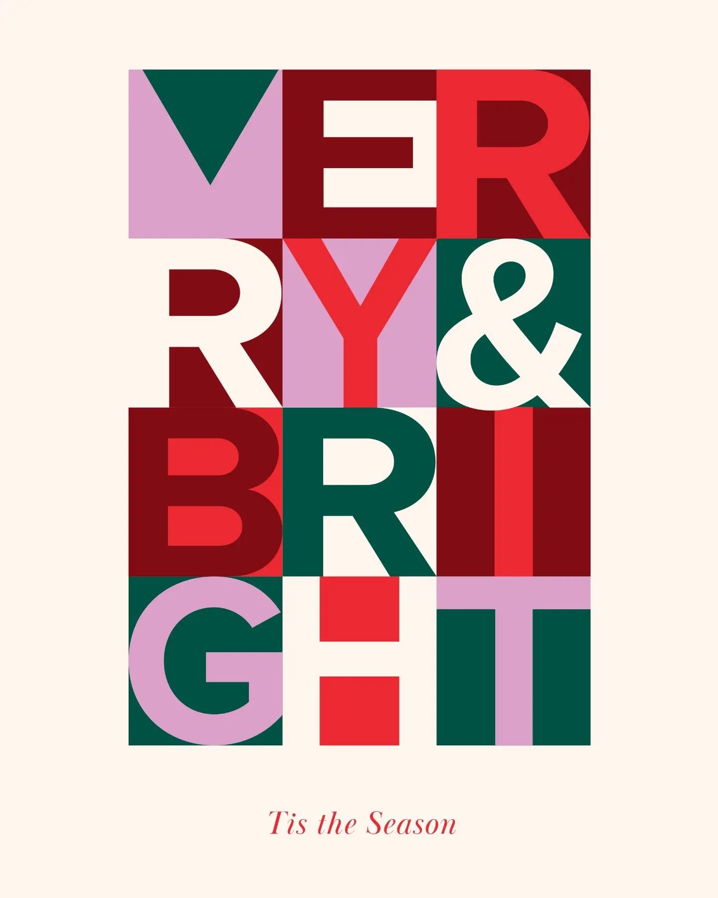
The Ralph Lauren Christmas palette from @kaysthetics3000 is pure cozy: marshmallow, ribbon, garland, sugar cookie and hot cacao. Elegant, but you could curl up in it. Melin Design's Fair Isle Sweater adds a light blue to the red and green, just like the old knit sweaters did, and that one detail makes it feel real. And the Merry & Bright poster mixes pink and lilac into the red and green. Retro in the best way.
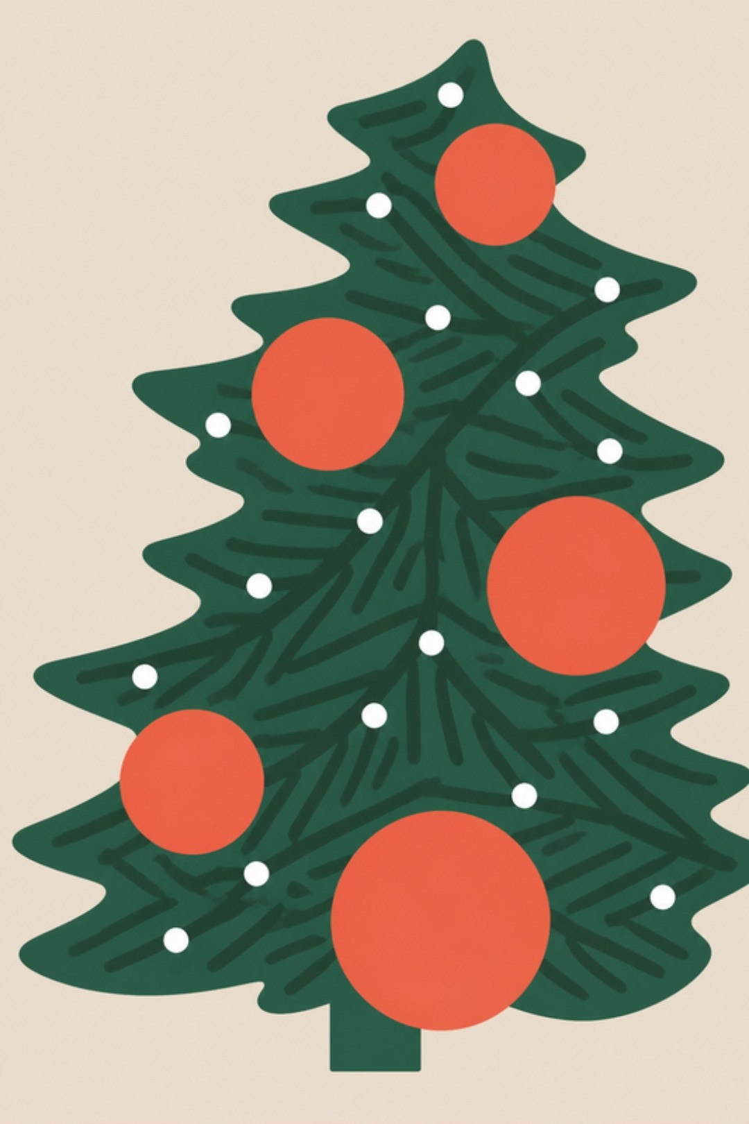
Milkiss drew a Christmas tree with big orange ornaments on a beige card, and it feels like a page from a vintage storybook. And CreativeBooster's Cambridge Blue And Carmine is one of my favorites here: a soft, dusty Cambridge blue next to a carmine red, a dark green and beige. Nostalgic, gentle and still completely Christmas.
The Life Of The Party
You're the fun one, and your house should be too. Bright is fine here, just skip the crayon box: pink next to red, mint next to green, cherry with matcha. Big letters, stripes, a gift-wrap station.
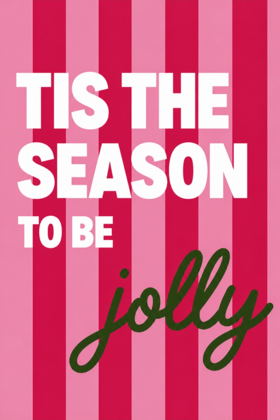
Marusya Design named every color in Ribbon Candy after the candy itself. Katie Carroll Design used just two: cherry and matcha. Two colors! That takes confidence, and it works. Then Haley Walsworth put "Tis the season to be jolly" on pink and red stripes, and it's playful without being childish. That's exactly the line I love: fun, but still classy.
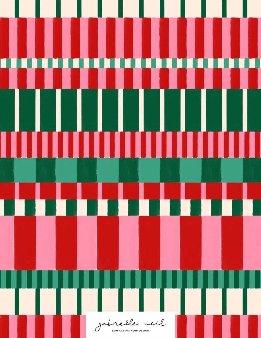
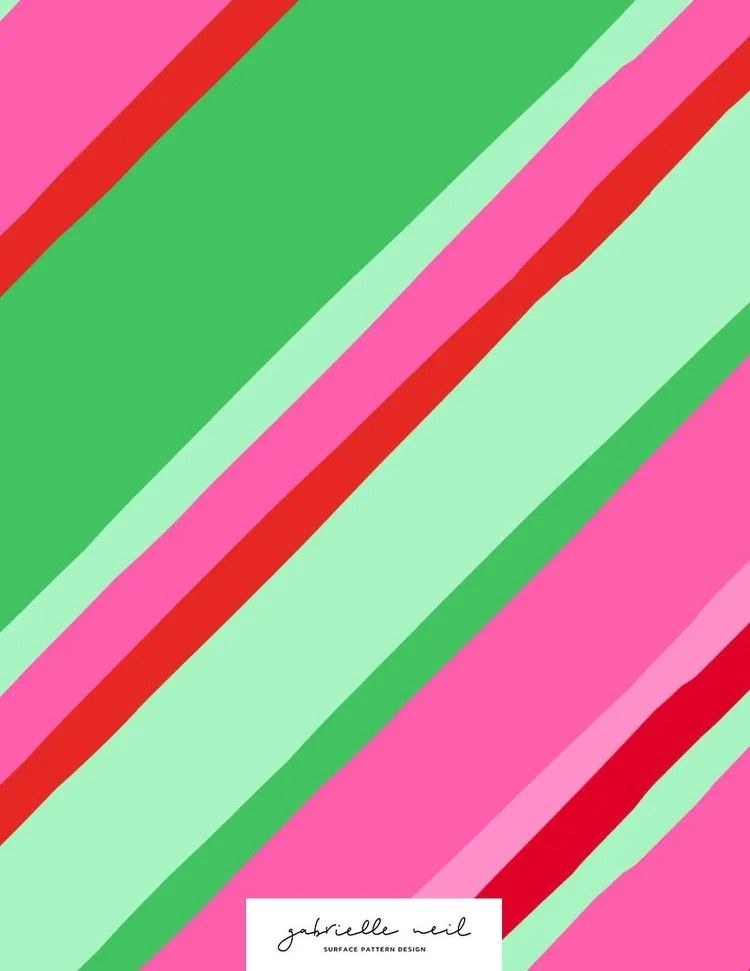
Helloo SamSam Designs made a whole café menu: rose milk tea, strawberry milk, cherry bomb, syrup, matcha and jade. Sweet, but the deep jade keeps it grounded. Go and Tell Designs' Color Combo No. 315 is two pinks, two greens and one bright red, and somehow it never feels like too much. And Gabrielle Neil's stripes and checks in red, green and pink show you can use all of it at once and still look put together.
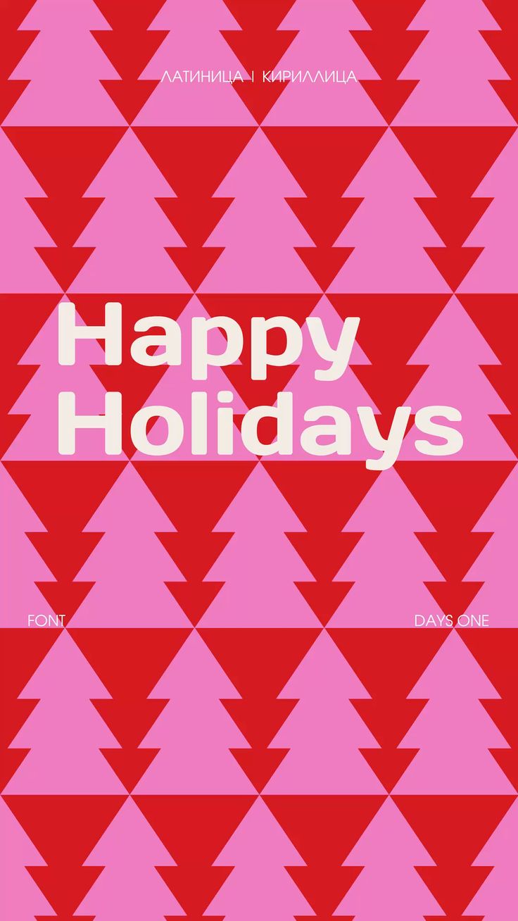
PalettePoint's Gentle Palette pairs turquoise and a crisp lettuce green with a deep botanical green and a red: bright, but balanced. Anya Ionova kept Santa's Suit to three colors, the tree, a cranberry cream and Santa's red. And then Daria Shkapina's Happy Holidays card: red trees on hot pink. I never would have thought of that, and I love it. That's personality.

Cass named this one Happy Christmas!! (two exclamation points, and it deserves both). It goes from a bright red down to a dusty rose, with two greens. Mackenzie Makes' Red, Pear And Moss swaps one of the greens for a fresh pear, and it feels so young. And Meri Meri's velvet chain in pink, green and red is the easiest way to bring this whole mood into a room.
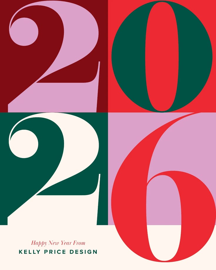
Christmas 01 keeps it simple: seashell, fern, dark spruce and two reds. And that big 2026 poster in red, green and pink is a fun way to carry Christmas right into the new year.
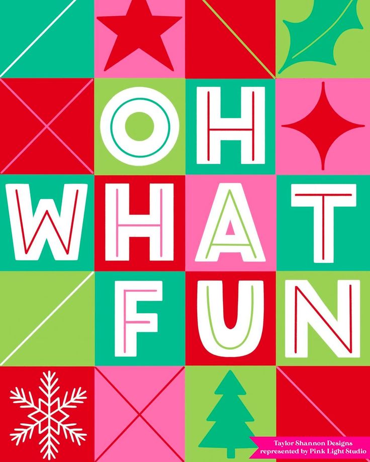
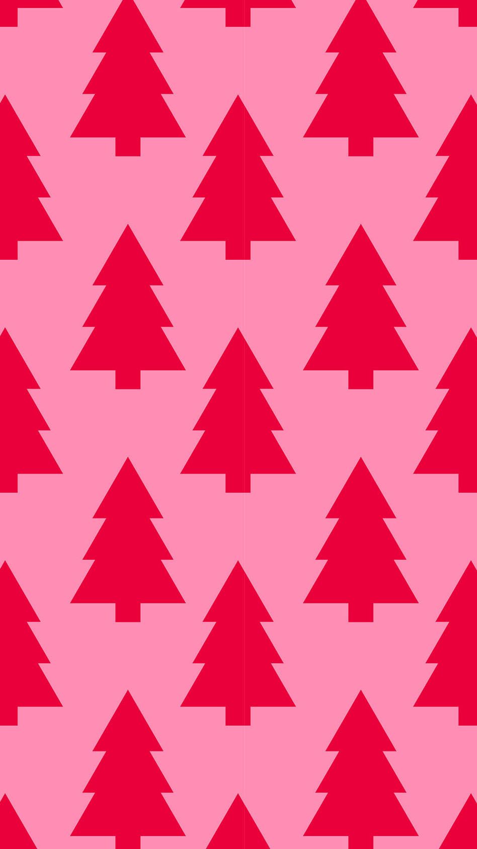
Taylor Shannon's OH WHAT FUN poster (represented by Pink Light Studio) is pure joy: big letters on red, green and hot pink squares, with a little star, a snowflake and a tree tucked into the corners. Frame it for December and it does all the work. And red trees on pink again, this time a phone wallpaper from Audrey Kuether at Oh So Lovely Blog. I can't get enough of that combination.
Try it: a bold poster or two, striped wrapping paper, a pink and red tree.
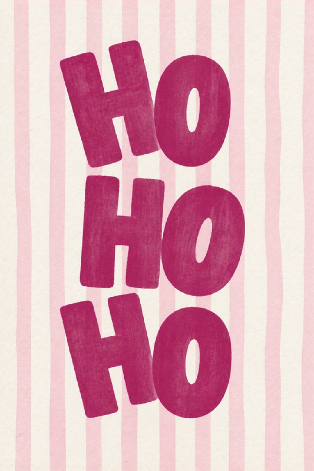
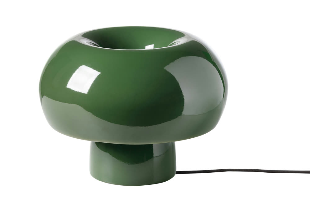
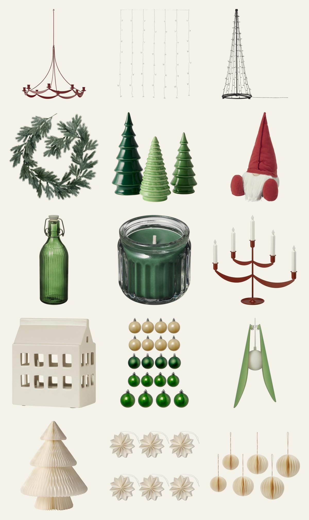
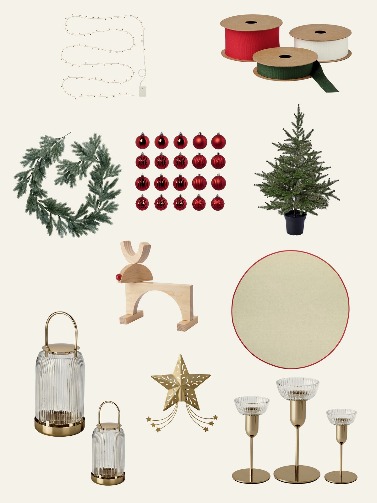
If you're thinking fun, somewhere between traditional and non-traditional, IKEA is the perfect place. It has fun, cute, traditional and non-traditional, and the prices are great. I highly recommend them. Here are my IKEA picks.
The Sweet Romantic
Dusty pink, sugarplum, icy blue and a deep berry. Soft, a little unexpected, and so pretty with greenery. And look at the business cards RITA Estudio Creativo designed for marta h. at the end: mulberry, pink and olive, the exact colors of the palette right beside them.

Grounded And Whimsical, from let it linger, is exactly what it sounds like: sea pink, beet red, crystal blue, lemon icing and rum raisin. Dreamy, but the deeper colors keep it grounded. Tibe's Christmas Palette 2026 has the same idea, pink and icy blue held down by a deep red and a dark green. And look at that narrow pink and red striped wallpaper. Imagine it in a little powder room in December.
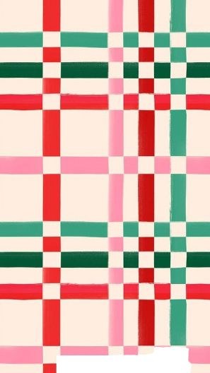
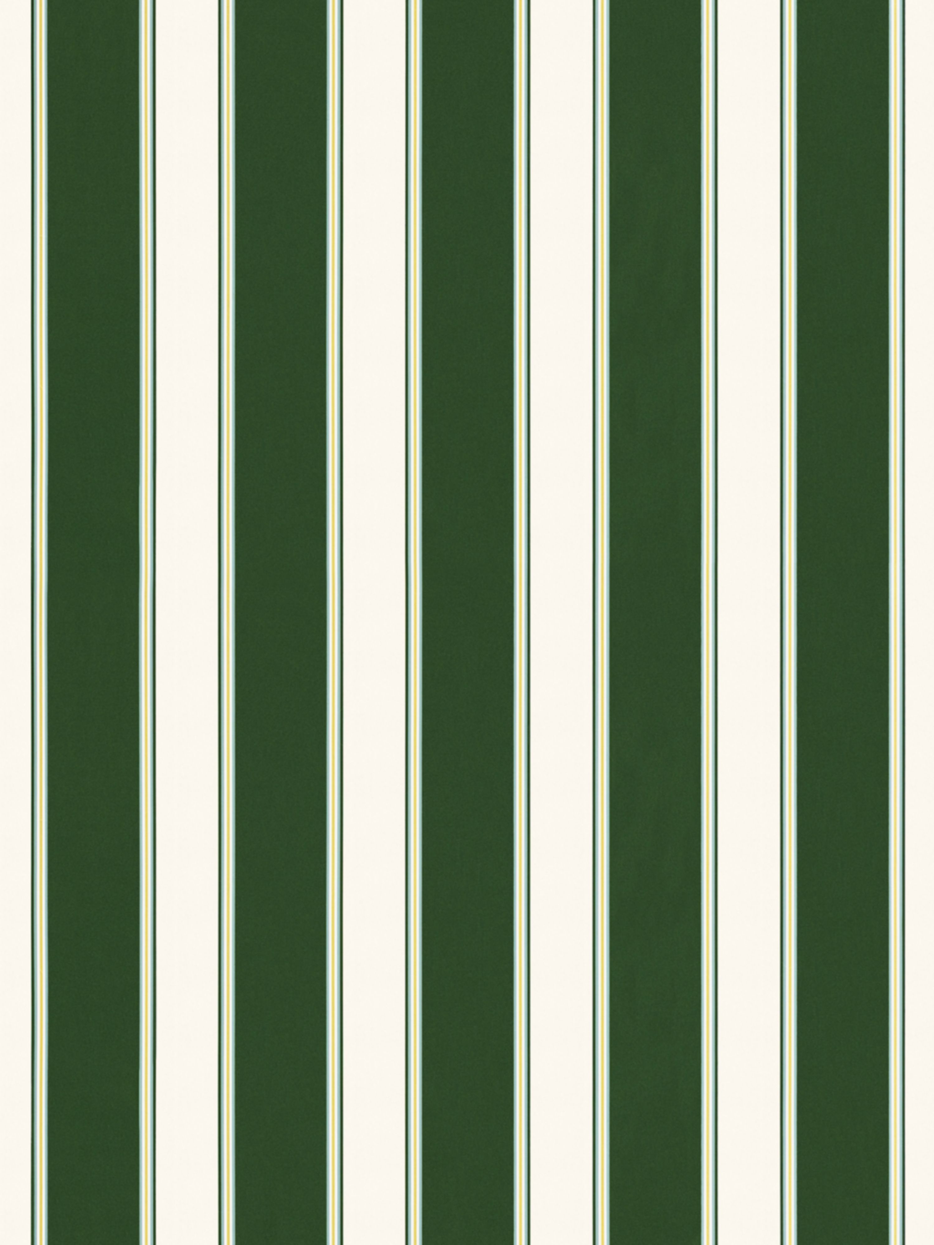
Always Sunny Co.'s Silent Night reads like a poem: snowfall, cozy sweater, sugarplum, winter rose, cranberry. HK Thinks Design went romantic too, with Frosted Rose and Winter Petal next to Evergreen Pine and Mulled Wine Red. You can tell these makers took their time. And Gabrielle Neil's gingham in red, green and cream is so sweet, with a wide dark green and cream stripe right below as its calm partner.
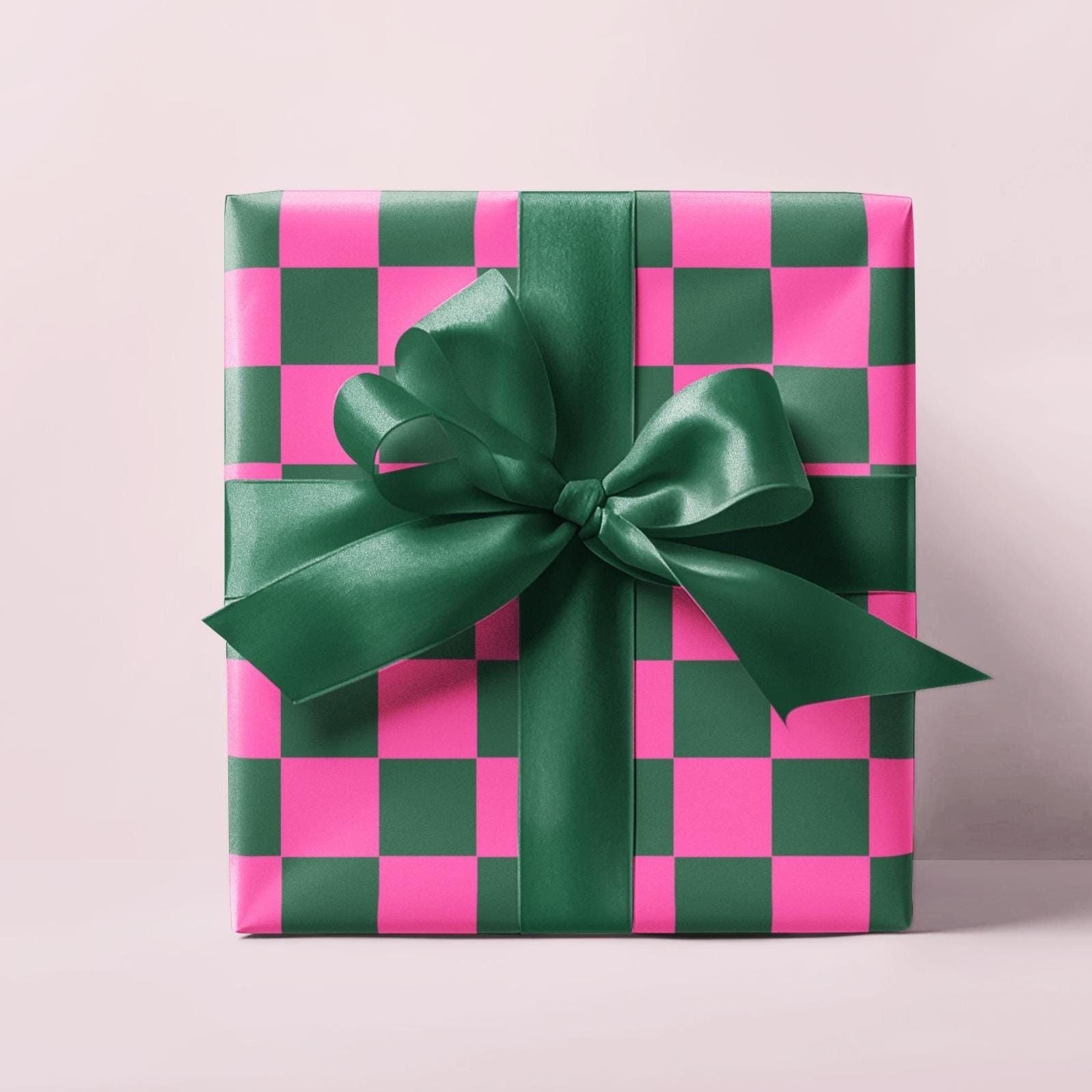
Victoria Miles built Garden Greens And Rose from Pantone colors: three greens, from tarragon to kale, with mauve, slate rose and a deep anemone. Madelyn Vaughn mixed navy and periwinkle with dusty rose and sage, plus a little crimson to keep it Christmas. And the gift from LondonJaeCo, green and pink checkerboard with a green satin bow, is that whole palette wrapped up and ready to go.
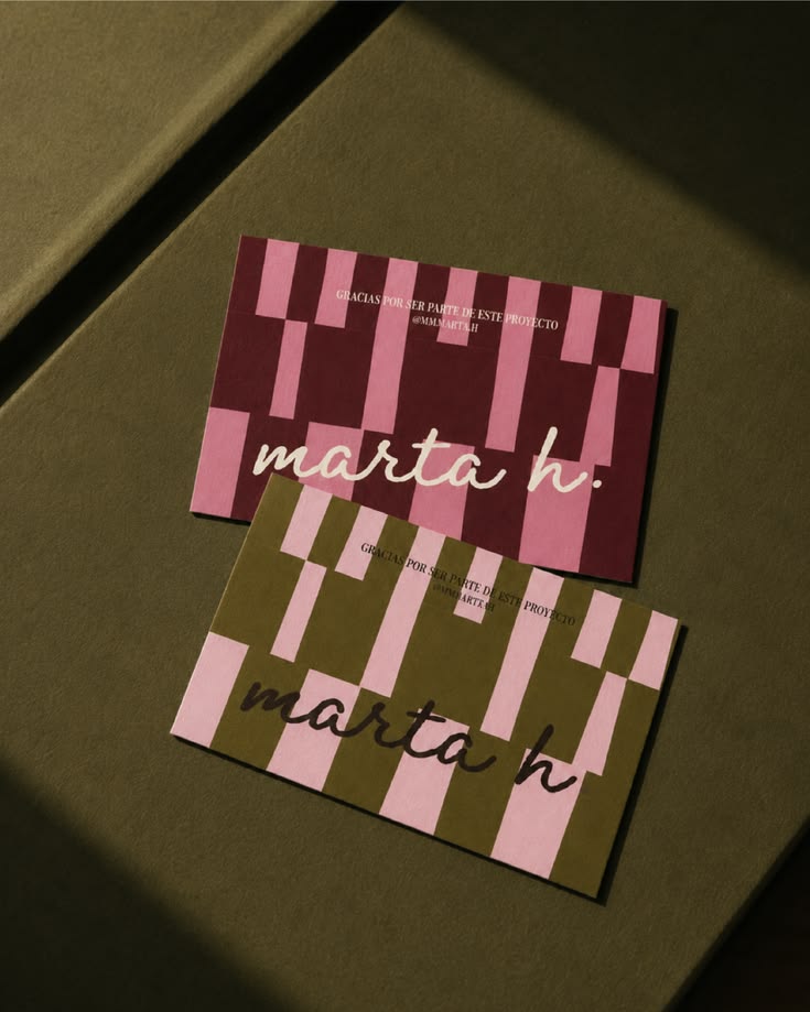
SFV Design's Festive Color Palette is soft and warm: Christmas Star, Forest Crystal, Winter Rose and Candle Warmth. Muse&Mood's Mulberry Wine And Periwinkle Mist is pure elegance. And there are the RITA Estudio Creativo business cards I told you about. They're not even Christmas cards, and they still feel like the season. That's good taste.
Try it: velvet bows, pink candles, paper ornaments, blush ribbon on every gift.
Prints are an easy one too: swap a couple of frames for the season, like these from Desenio's Jolly Holiday collection. Desenio always has the vibe, so make sure to check them out.
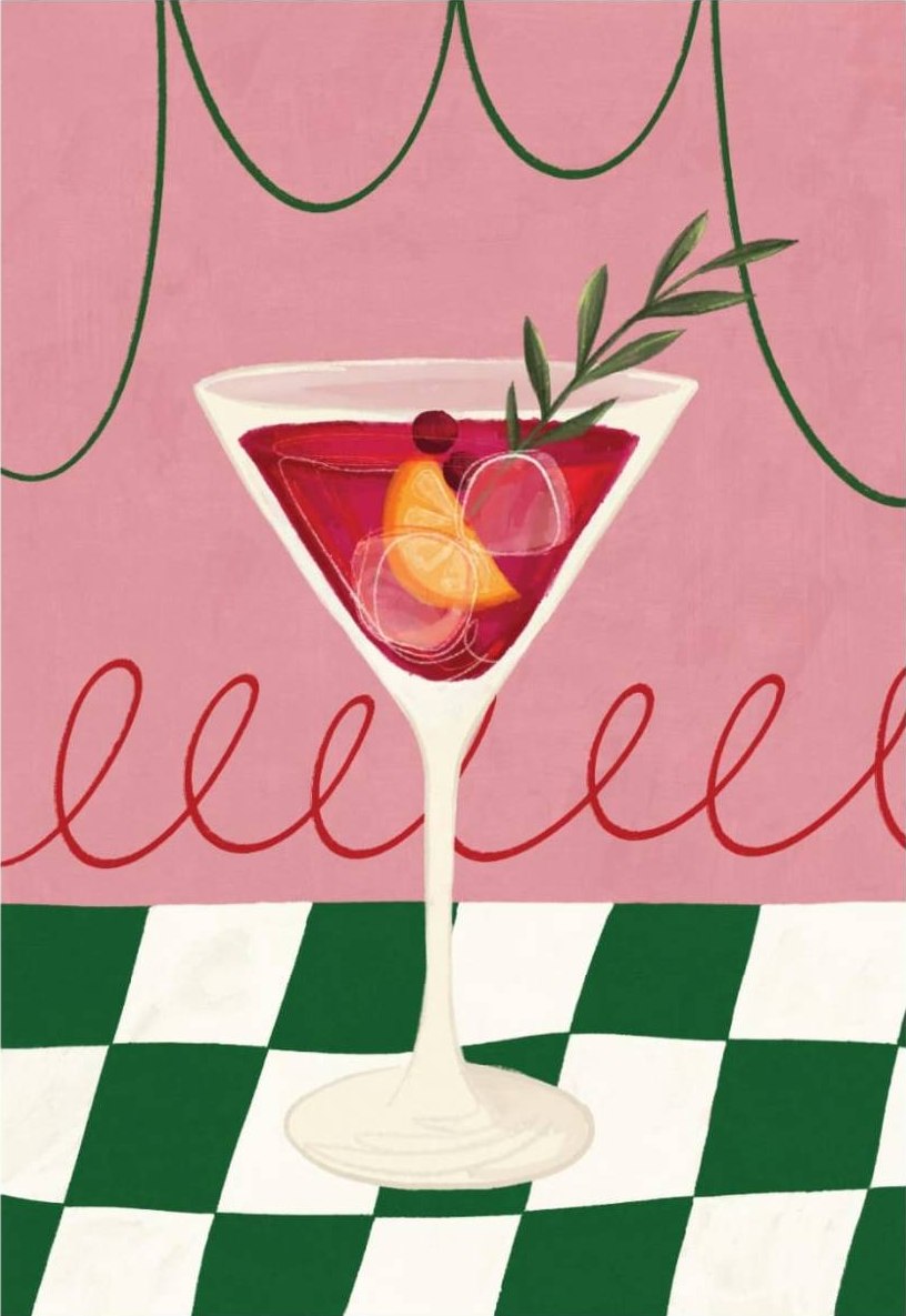
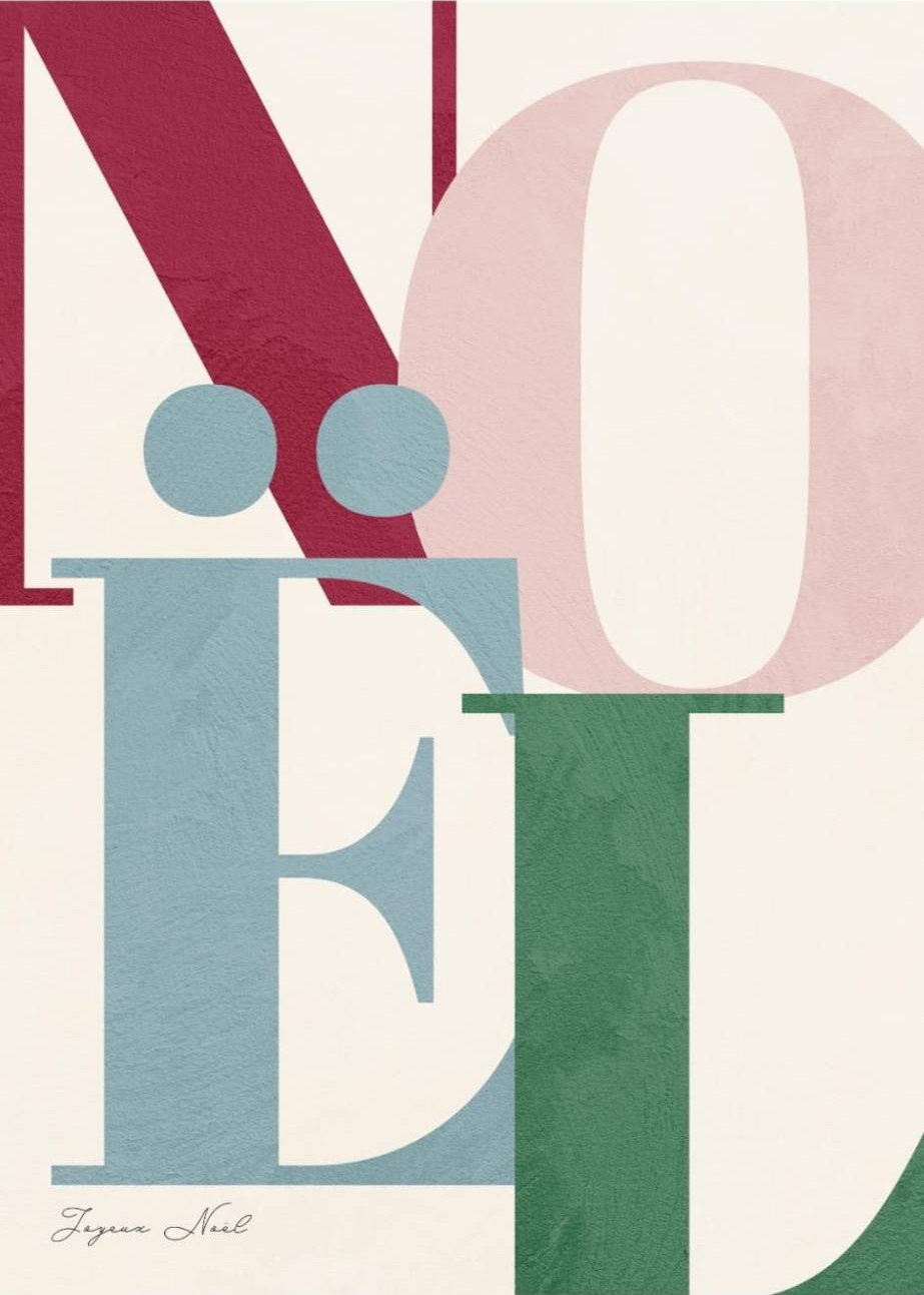
The Serious One
You like things refined and calm, and I love that too. A traditional, elegant Christmas is beautiful. The secret is that elegant is almost always muted: a grayed green, a wine red, never the bright red and green most people grab without thinking.
Burgundy, deep forest, champagne gold, parchment. Velvet, linen, brass and candlelight. Not a lot of colors, a lot of richness.
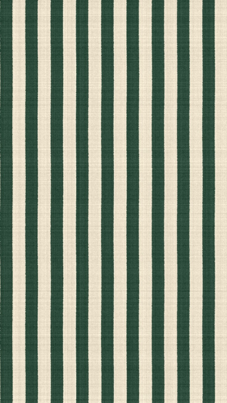
Todhunter England's Winter Garden is quiet luxury: soulful sage, deep forest, black cherry, parchment and an aged champagne gold. Jade Sparks Creative's Bloom & Verse says the same thing in four colors, burgundy, forest, ivory and a muted gold, and it feels like an old library at Christmas. And a forest green and cream stripe might be the most elegant pattern there is.
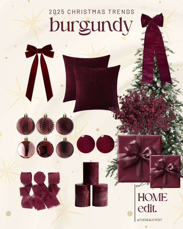
Moments in Frame named theirs Emerald And Burgundy Velvet, and you can almost touch it. Naz Browne's Forest And Merlot adds mink and noir, and that touch of black makes every other color look richer. The Sealey Edit did a whole room in burgundy: velvet bows, pillows, ornaments and gifts. One color in lots of textures. That's how you make serious feel warm.
The Moody Palette from ele.creea pairs a very dark red and a midnight forest with a soft blue cotton. Redefine Your Design went practical, with real Sherwin-Williams paint colors from Red Theater to Pewter Green and Naval, so you can actually put it on a wall. And The Sunny Side Up Blog's The Holiday Edit inspired my IKEA mood board: burgundy and green, garlands, candles and gifts.
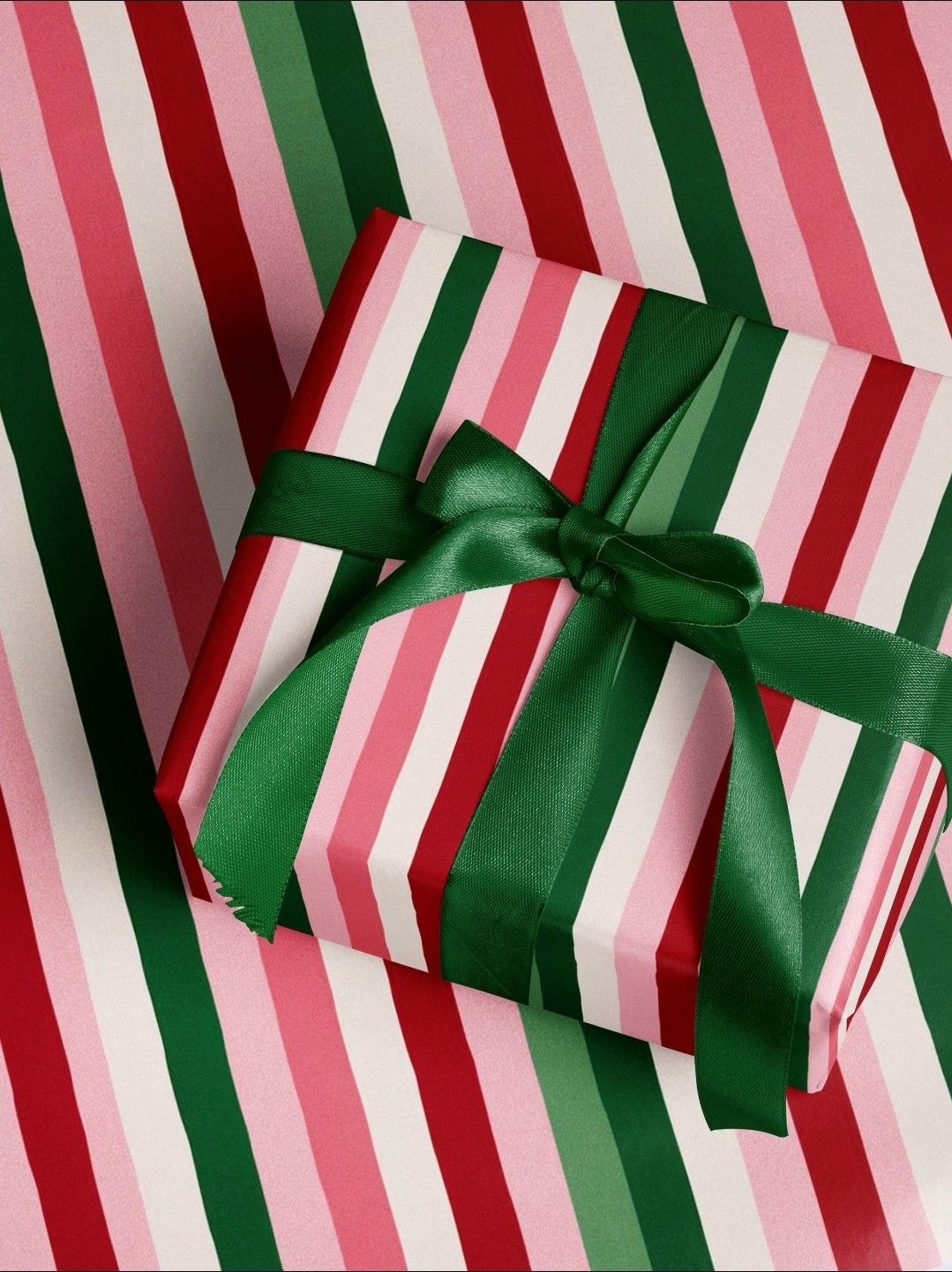
Oxblood, olive and camel is a palette you could wear: a wool coat, a leather bag, a cozy scarf. And that gift in pink, red and green stripes with a green satin bow shows the serious one can still have a little fun.
Try it: one color on the tree in three shades, velvet ribbon instead of tinsel, brass candlesticks, gifts in burgundy and cream.
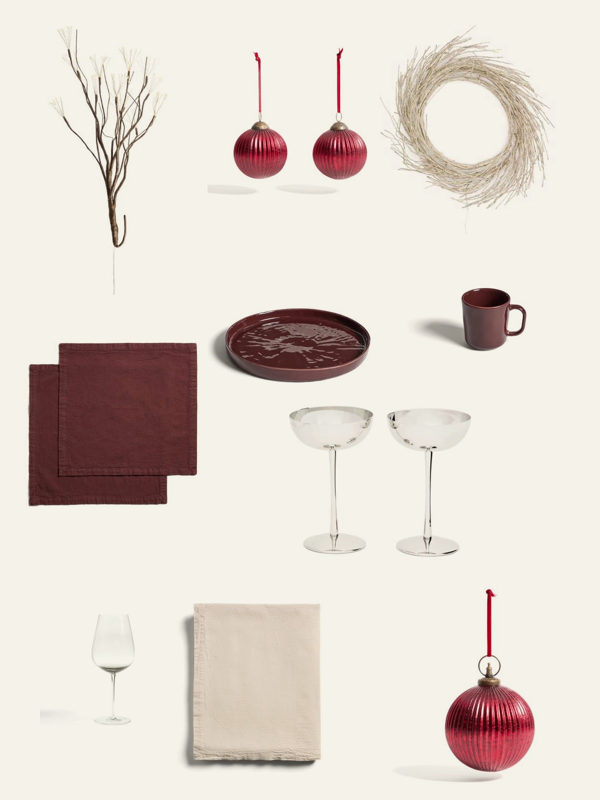
For elegant and elevated, I would go to Kave Home. It's still fun and not your typical traditional Christmas, but it's the burgundy one: a little more safe, and it will always scream class. Here are my Kave Home picks.
The Moody One
Dark and cozy: midnight plum, olive, cabernet, almost black. Candlelight does all the work here (I wrote a whole post on lighting the mood).

EO Design Studio named every color in Holiday Dinner after the food: mashed potatoes, artichoke, green bean, cranberry, cabernet and mulled wine. I love that. Mariane's Vintage Velvet Christmas goes even darker, with olive, plum and an almost-black. And Currey & Company set the table for it, with a greenery chandelier, burgundy ribbons and tall candles. Dark, cozy and so elegant.
Mohamed's Midnight Violet And Olive is only three colors, and the violet makes it feel like nighttime. And Sun and Pixel Co's The Grinch made me smile: Grinch green, of course, but with a deep red and cream, so it's playful and still grown-up.
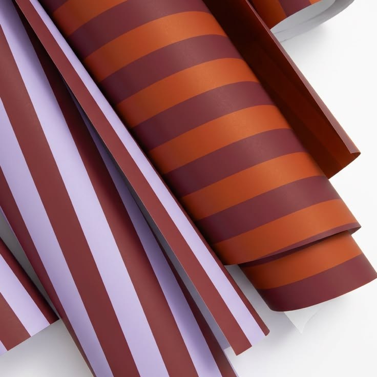
Cranberry and plum with taupe and ivory. A soft Nantucket blue with olive, mahogany and burgundy. Moody doesn't have to mean all dark. And look at Forma Creative Co.'s wrapping paper rolls: orange, lilac and burgundy stripes. Not your typical Christmas mix, and under a tree they'd be stunning.
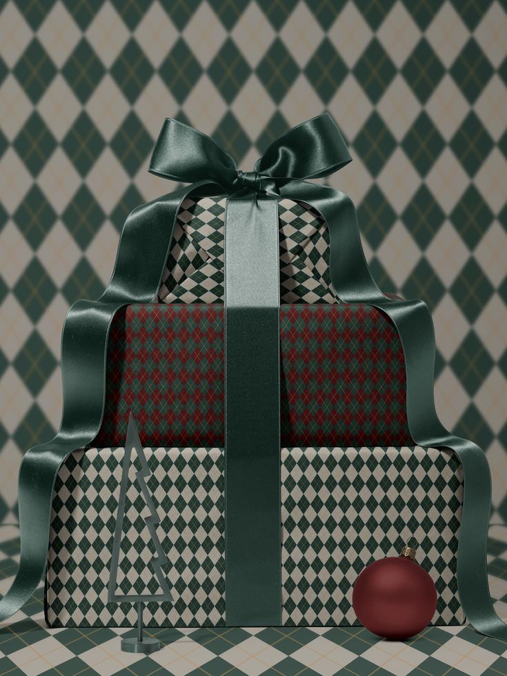
PalettePoint's Hawthorn Berries has the best color names on the whole board: Distinctive Lack of Hue, Harbor Rat and Romeo O Romeo. Mohamed's Jade Abyss is a deep jade in three shades with a wine and a blush. And those gifts in green harlequin paper with a deep green bow and one red apple on top? That's the moody one in a single picture.
Try it: deep velvet, black candlesticks, lots of little lights, one dark wall.
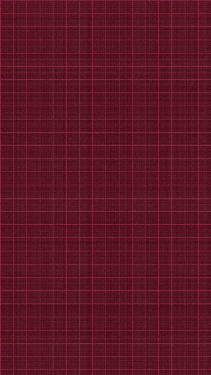
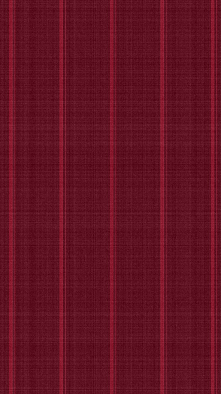
And if you want the mood on your phone too, phone wallpapers like Iunikorn's do it beautifully. I couldn't reach the maker, so I made my own versions inspired by them, in slightly different tones: a dark burgundy with a fine grid, and a deep cherry stripe. Simple, moody and so pretty.
The Natural One
Rattan, wicker, linen, plants. If you're a boho person you probably love rust and terracotta already, and good news: terracotta sits right next to red, so it's perfect for Christmas. Add spiced orange, caramel, sage, moss and kraft.
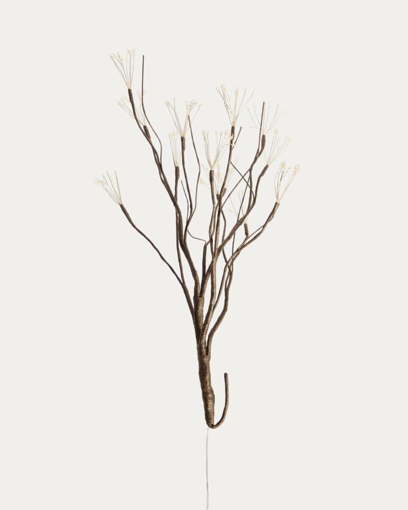
If you're really into the wabi-sabi look, these branches from Kave Home are absolutely the perfect way to follow that style. Greenery goes well with pretty much any style, but this goes really, really well with wabi-sabi. If that's your aesthetic, they all belong in your decorations.
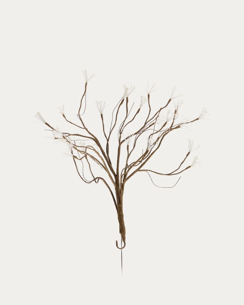
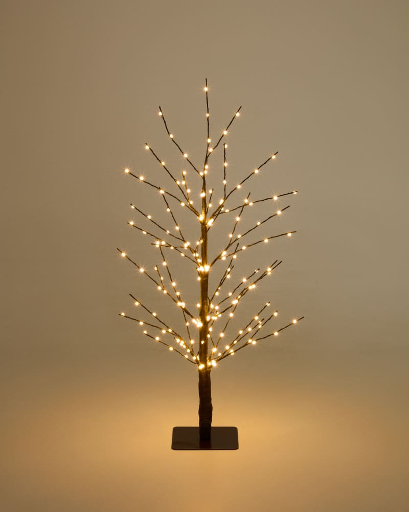
Nature isn't a trend. I said it in 2020 and it's still true.

FOLK & FEY's Spiced Orange is earthy and warm: two soft taupes, a burnt orange, a deep red and an almost-black green. Elle J Design's December 2025 is the gentle version, with eggnog, mistletoe sage, woodland pine and cranberry. And Kinfill's holiday picture, a hand soap and a little donut-shaped soap on boxes in red, pink, cream and blue blocks, shows how pretty even everyday things get in the right colors.

Nikki Nelson's Oxblood, Olive And Oat sounds like breakfast and looks like a cabin in the woods. Kraft And Berry by trin is exactly that: kraft brown, a dusty berry pink, two greens and a wine red. And the Orchard plaid by Nickel & Suede for DW/E, in red, green and pink, is the coziest wallpaper backdrop for all of it.
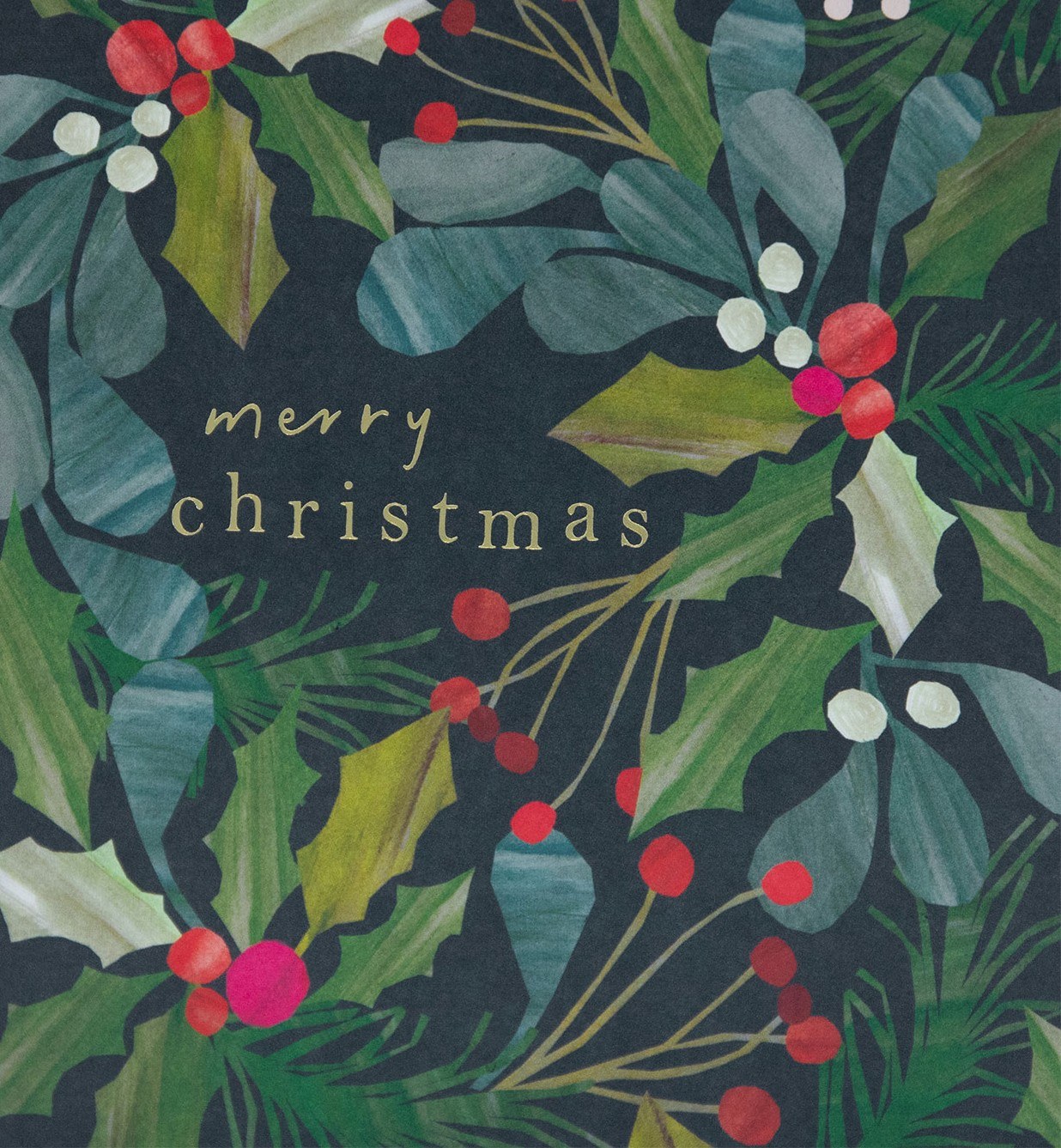
Jessica Jasmine's Festive Color Combos is so balanced: two greens, a cream, a wine red and a soft camel. And Caroline Gardner's Merry Christmas card, all holly, mistletoe and red berries on a deep navy background, is like a winter garden at night.
Why does Homary's Caramel, Sage And Moss work for Christmas? There's green and there's cream, like a tree in the snow. And the caramel and the sand are the trunk and the branches, the wooden part of the tree.
Try it: dried orange slices, pine cones, wood beads, a wreath with long ribbons.
The Cozy Rustic
Cabin, farmhouse, gingerbread. Kraft paper, twine, plaid wool, cranberry and pine. Warm, a little homemade, and it smells like cookies.
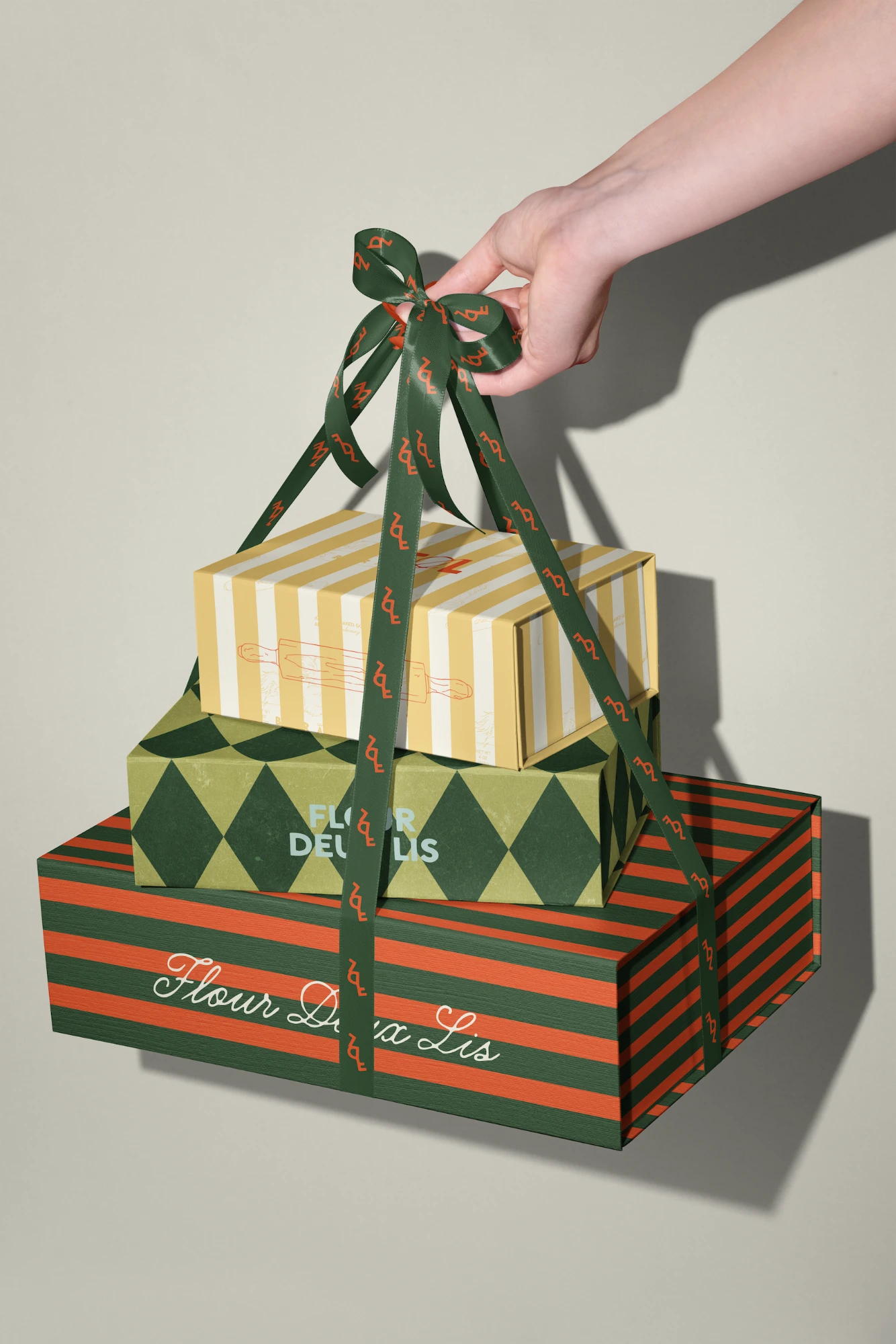
Cedar + Mint Co. went straight to the kitchen: Gingerbread Glaze, Midnight Cranberry, Holly Forest and Gingerbread Icing. Olga Svitla's Rustic Kraft And Cranberry adds a kraft tan and a chocolate brown, and it already smells like cinnamon. And Ladyfang Creative's packaging for Flour Deux Lis, stacked boxes in stripes and harlequin tied with a green ribbon, is exactly what a bakery should look like at Christmas.
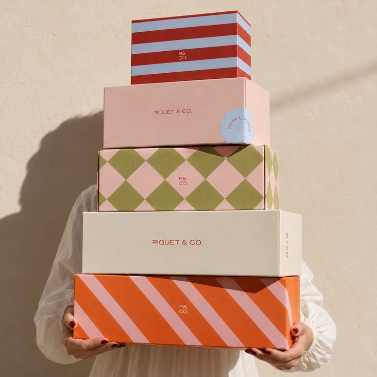
Marusya Design and Color Harmony Glow landed on almost the same idea, icing, mistletoe, wreath, gingerbread and candy cane, and both feel so cozy. And Forma Creative Co.'s stack of gift boxes in pink, green and orange patterns proves rustic doesn't have to be plain.
Christmas Coded by pixelpalette8 mixes a deep red and a rust with an olive and a soft sand. Mackenzie Makes' Berry, Moss And Espresso even sounds delicious: Cherry Cobbler, Crumb Cake, Early Espresso, Very Vanilla.
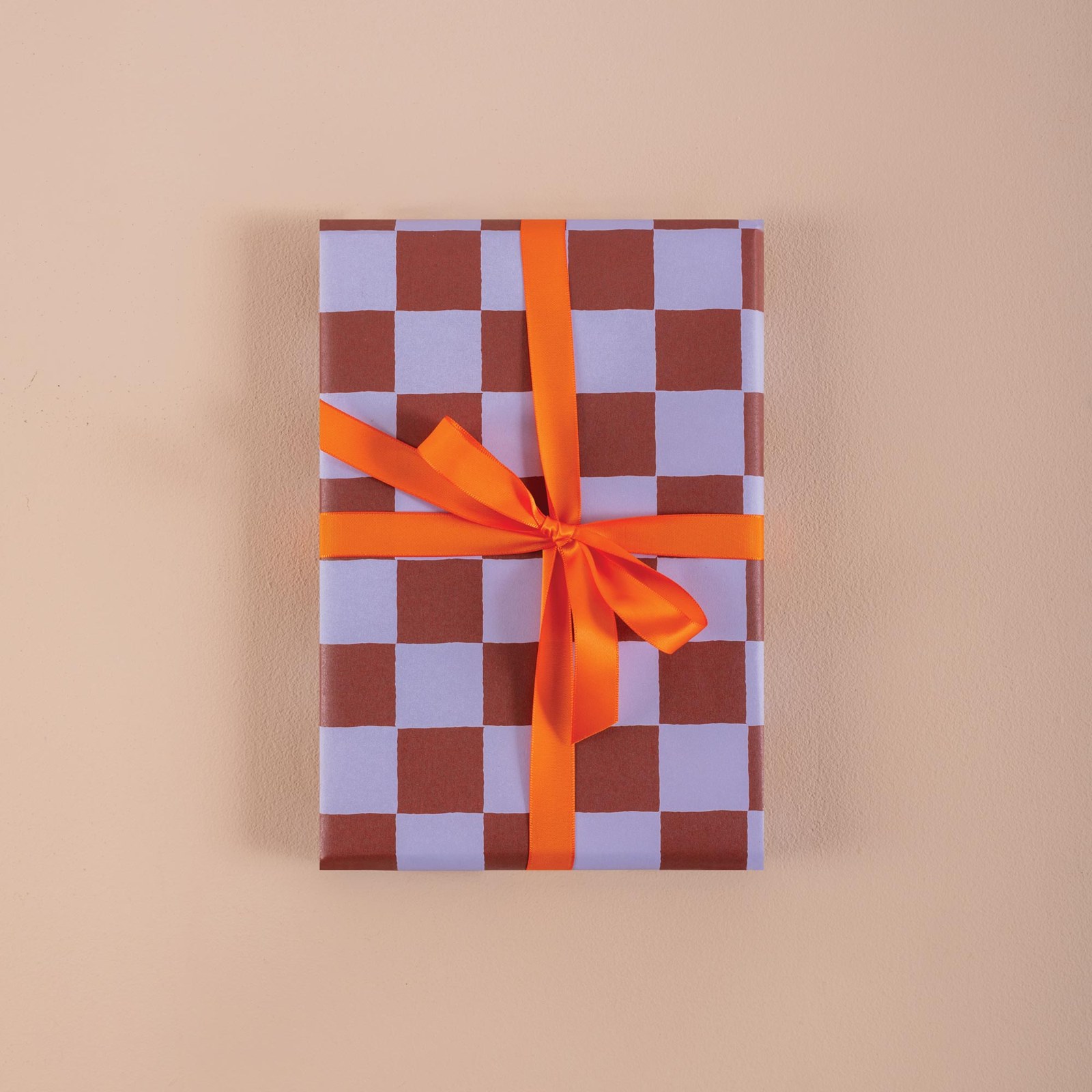
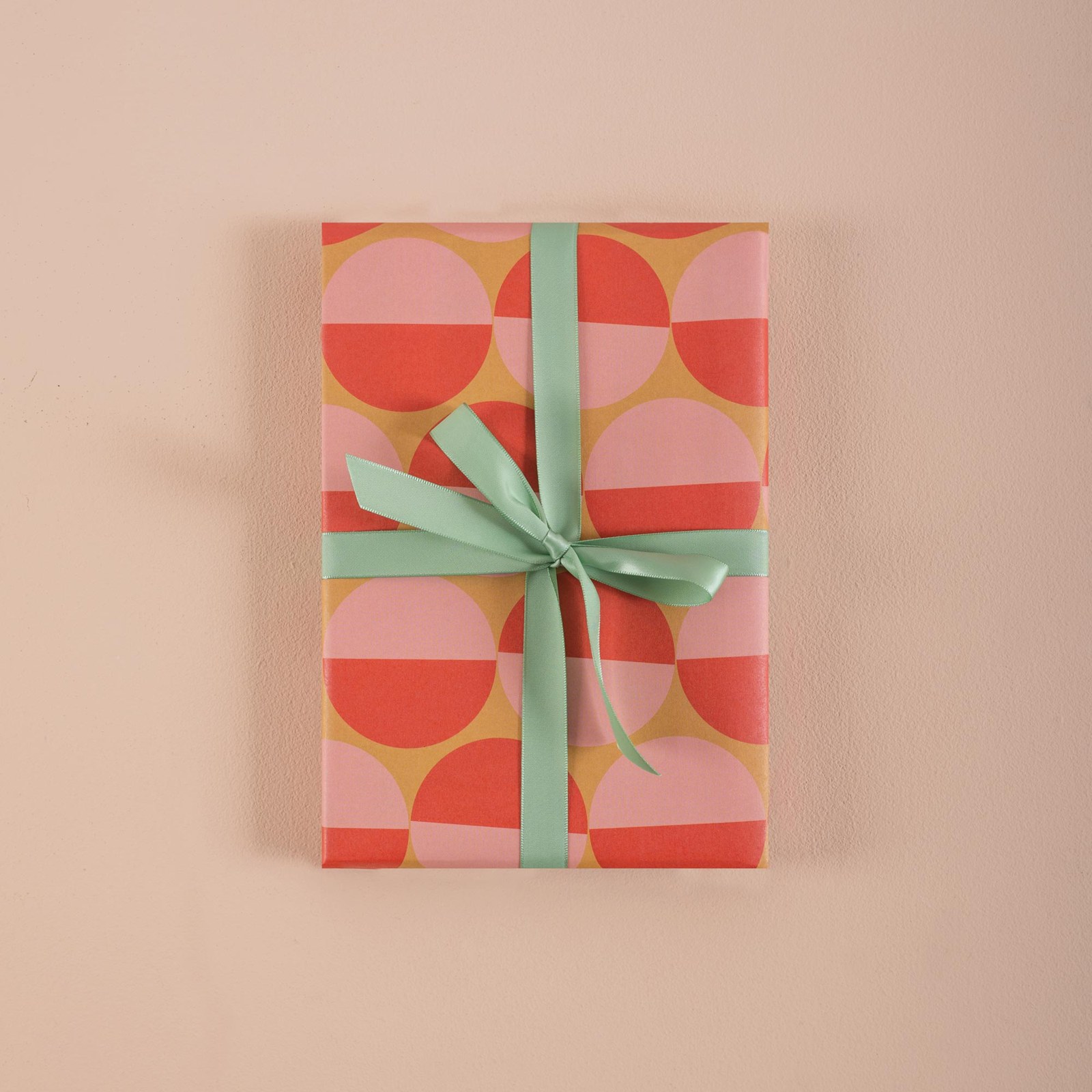
Mackenzie Makes has a real eye. Red, Olive And Kraft is just three colors, and it's perfect. And Good Tuesday's wrapping papers are such a happy surprise in a rustic room: Tidal Berry Check in burgundy and lilac with an orange ribbon, and Peach Sunsets, red and pink half-circles tied with mint. Proof that a bold color on the ribbon finishes the whole gift.
Try it: brown paper and twine on every gift, a wool throw, gingerbread on the counter.
The Calm One
Me on a quiet day. Frosted blue, misty gray, soft sage, a little berry. Neutrals with one or two colors and a lot of texture. Still Christmas, just whispered.
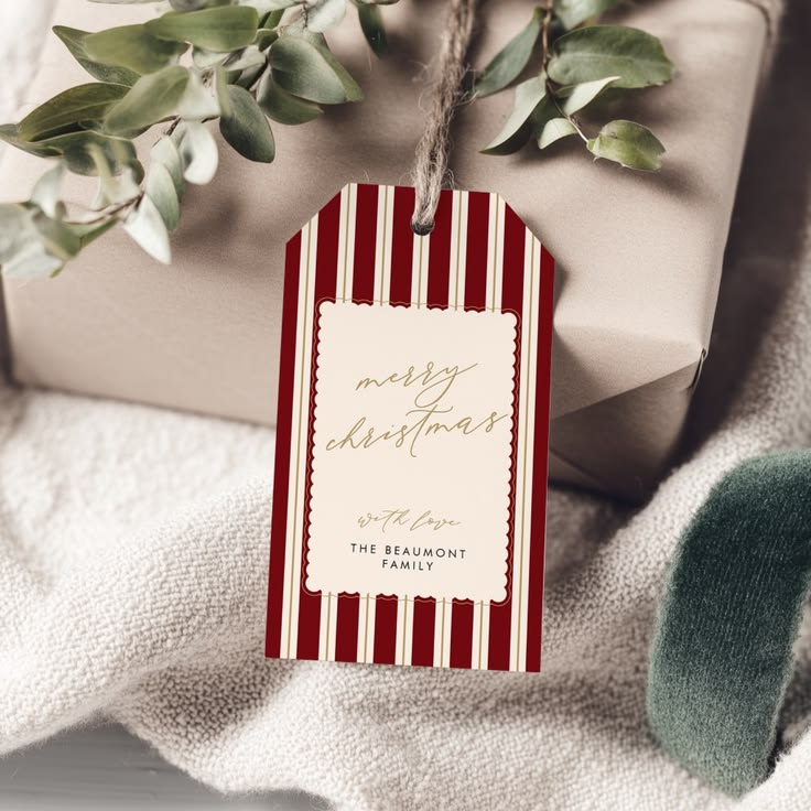
Erin King's Modern Woodland starts with an icy blue and a cream, then adds a soft green and two reds. It feels like a snowy morning. Hannah Clawson's Winetasting And Dusty Blue is calm and grown-up, right down to the cappuccino foam. And Pearly Paper Design's red and white scalloped tag is proof that one little detail makes the whole gift look special.
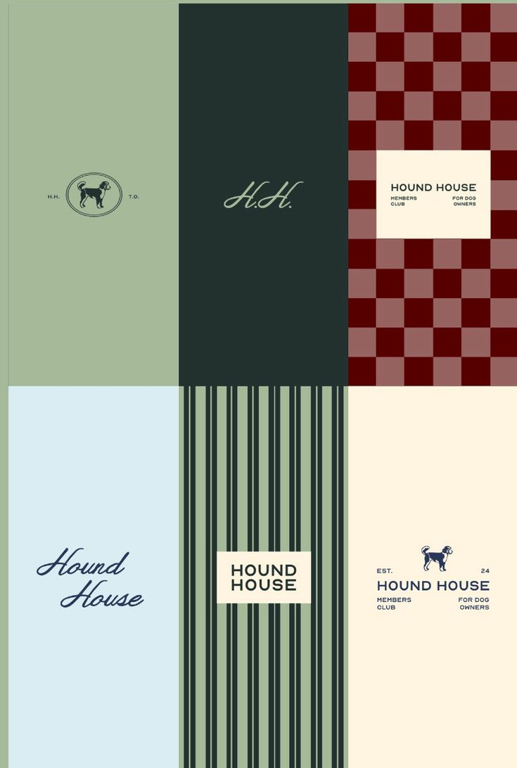
Marusya Design's Berry, Branch And Snowflake is the calm one in five colors. Stacy's Design paired butter yellow and icy blue with a deep cranberry. I never would have thought of butter for Christmas, and it's so pretty. And Maybe Design Studio's brand board for Hound House, with sage, deep green, a burgundy check and pale blue and green stripes, is calm, classic and full of character all at once.
Try it: white and blue ornaments, linen, frosted greenery, candles in glass.

That table is from Mango Home, and they're really killing it with their design. It works for Christmas, but I don't think it was even made for Christmas, and that's the point: their design is on fire all year.
Whichever one you are, have fun with it. There's so much fun in exploring different shades of green and different shades of red. Elegant classy or fun classy, just keep it classy.
Minimal, Or A Little Maximal?
My last Christmas post leaned minimal, and I still like minimalism. I wrote about it because I loved it. But I'll admit it: we lost some personality along the way.
It depends on the vibe you want. If you want calm, keep it calm and minimal (hello, Calm One). But if you want personality, something to look at and maybe something new to think about, consider a little maximalism. I'm not saying go crazy and become a hoarder. Just a little more than minimal, because it's fun.
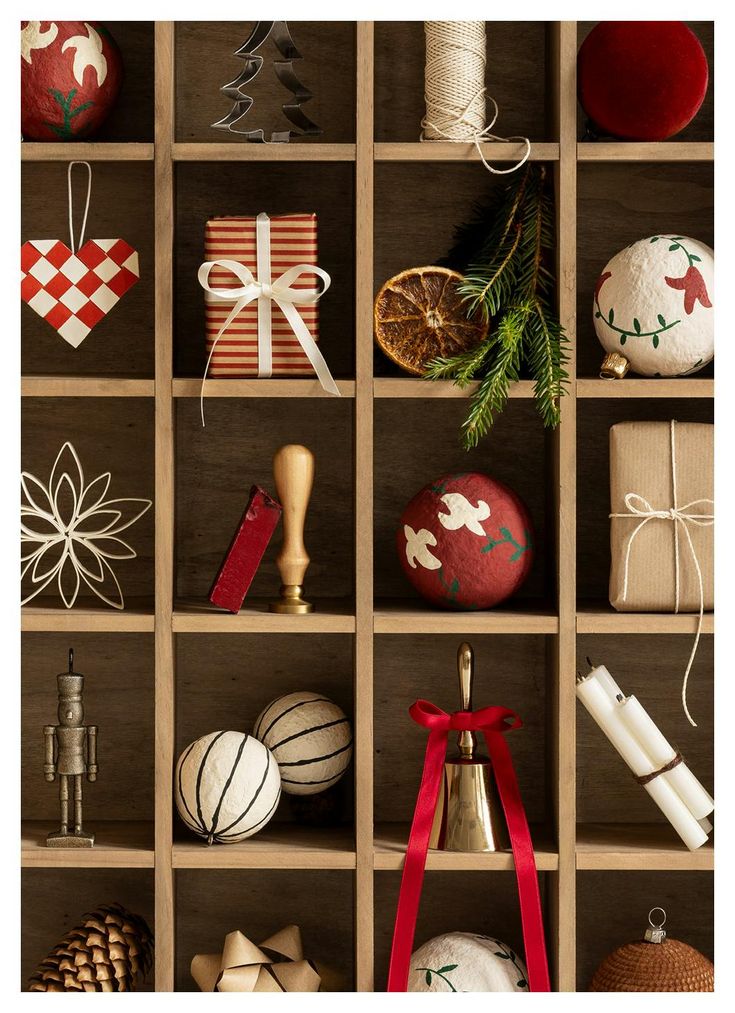
This cabinet is my favorite example. Every cubby holds something different: a star, a ball, a little statue, an orange, a tiny pine tree. There's a lot drawing your eye, but in a good way, because nothing is screaming at you. Lots of nature, soft colors, a little pattern. That's maximalism that still feels calm, and it's so Christmassy.