Just here to shop? If you're only interested in buying my picks, go straight to my Christmas Picks.
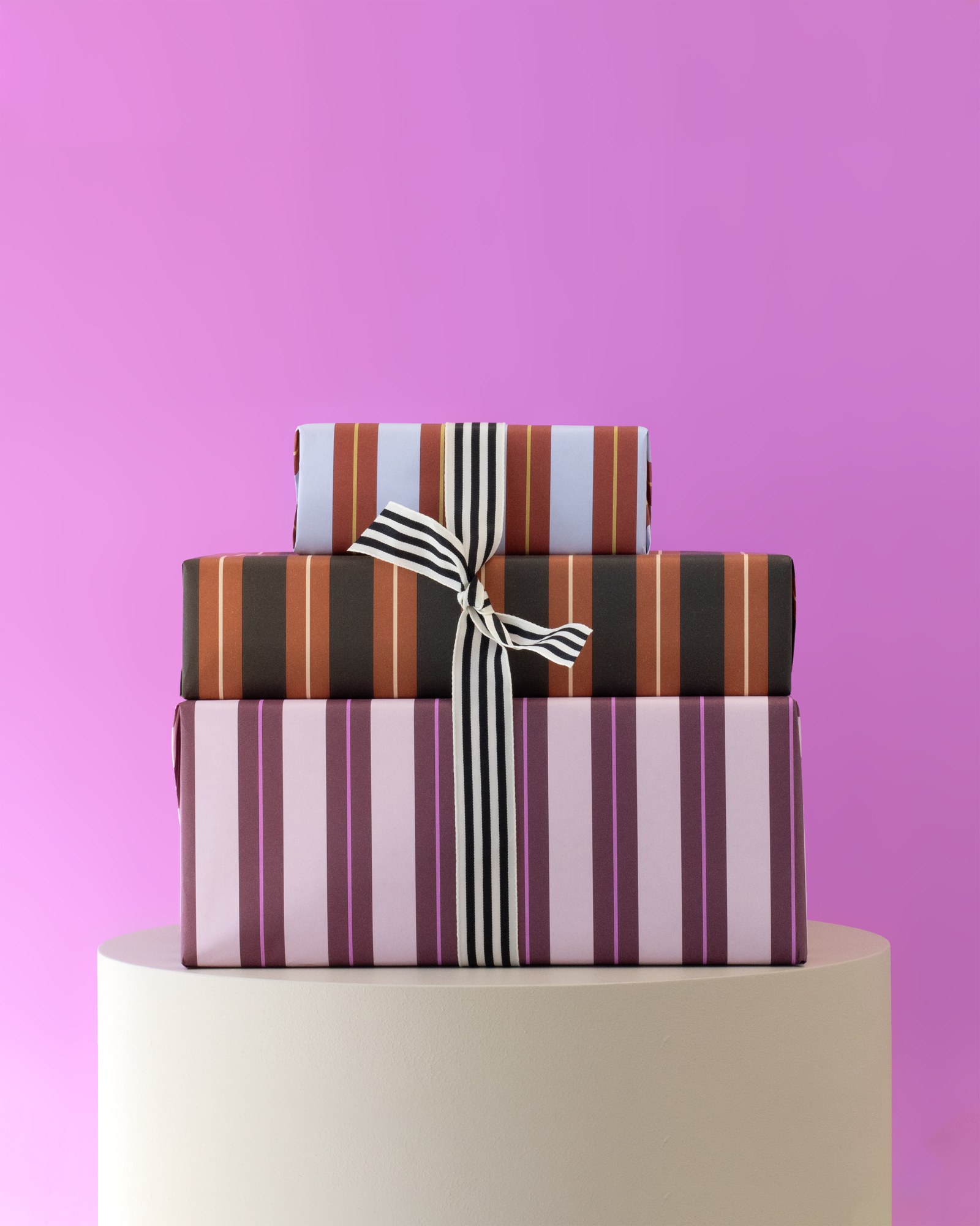
Holiday posts only come once a year, so this one comes in three parts. Grab a hot chocolate and get cozy. And look at those striped gifts from House of Products: they might not look like Christmas at first, and that's exactly the point of this post.
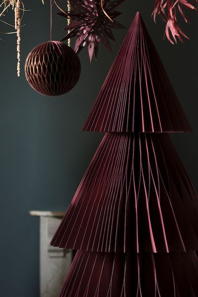
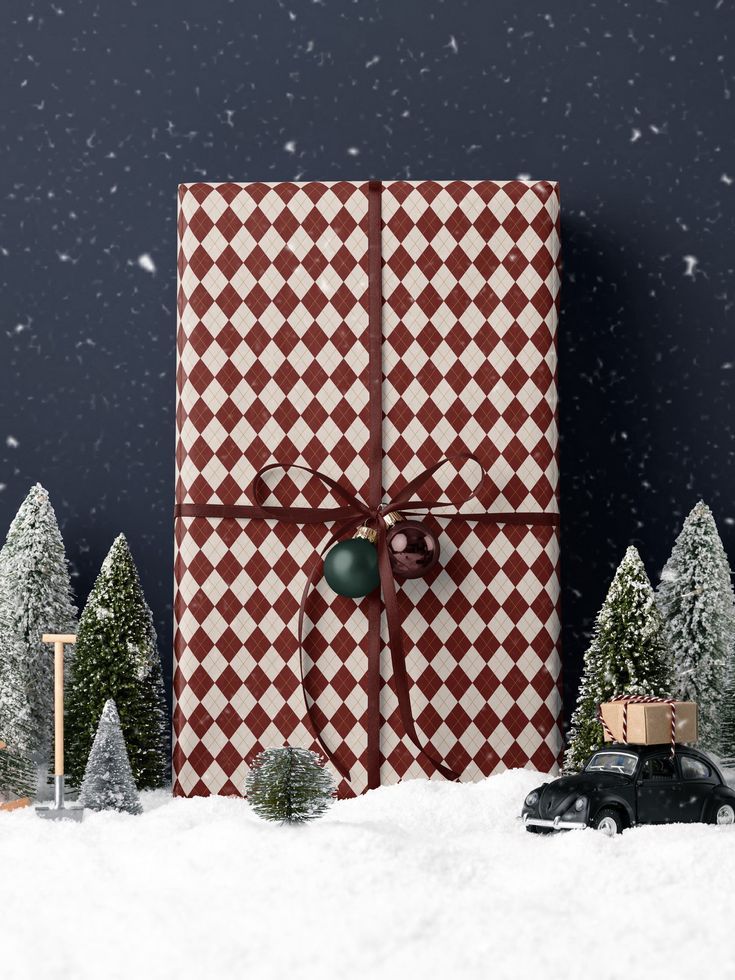
This year I filled our Christmas board on Pinterest with color palettes, more than 60 of them, made by some really talented people. I rebuilt every one of them in Part 2, sorted by personality, so you can find the one that feels like you. And yes, there's pattern too. Lots of it. Like this burgundy argyle wrapping paper from House of Parlington (and how cute is that little car with a gift on its roof?).
This Christmas (And Probably The Next): Pattern, Color And Personality
Here's what I think we should focus on this Christmas, and probably the next one too: lines, pattern and color combinations. Colors that complement each other, and lots of different shades of red and green. Keep it Christmassy with the traditional things we all love, the tree, the lights, Santa. Then put your personality everywhere else: in the gift wrapping, on the tablecloth, on the pillows.
Don't get me wrong. A traditional Christmas, with nature, organic materials and not a lot of color, is absolutely stunning. It's a classic for sure, and there's a reason for that. But this year, dare to give it personality and color, in a curated, thoughtful way. Get creative, get crafty, and still make it look elevated, elegant and delicate.
Confession: Primary Colors Scare Me
Fire-truck red, crayon blue, school-bus yellow. I've never liked them. They're loud, and to me they don't have much personality. Correction: they have too much personality. They're like the person who babbles and babbles but never actually gets anything across. They're basically just screaming, "get out of here."
I blame the park. When I was little, every playground I remember was bright red, bright yellow and bright blue. Or at least that's how I remember it. I'm sure I was having fun and forgot all about it, but my first instinct was to leave. Then I went to a park that was all wood and I was obsessed. I wanted to stay all day. Some people say, "but they're children, they need color." Okay, but we can introduce them to other colors. Not just the yellow, blue and red.
I'll be honest: I did put these colors on the blog, right here, and then I had to take them off because I just can't handle them. There's a reason hues exist. There's a reason we shade a color or mute it. There's a reason combining those primaries with their softer shades makes such a big difference. So to save your eyes, here's what I would use instead. But I do want you to understand where I'm coming from, so click below to see my trauma, and it will pop up right next to what I would use instead.
Fun fact: fast food places like McDonald's lean on red and yellow. Those colors grab your attention from the road, and the story goes that they make you hungry and make you want to leave fast. The research on that is honestly mixed (I dug into it in the psychology of interior design), but hungry and in a hurry is not the vibe I want for Christmas at home.
Still, I respect them, because every other color comes from those three. And when you play with their tints, tones and shades, those same colors get so fun and so elegant. Not obnoxious at all. They can even be calming, and they put a smile on your face.
Back in the day, walls were hardcore bright. Then I became a designer and felt convicted to really learn color. Most of my early projects were neutral, so I learned to layer texture until a beige room looked anything but boring.
Now I'm obsessed with color. I still love my neutrals, they calm me down. But color is where the personality lives.
Keep The Red And The Green (Just Not The Crayon Ones)
The one thing I don't want you to forget: Christmas is still red and green. Duh, right? Those are the cultural colors. But think about where they come from too. Green is the pine tree. White and cream are the snow on it. And snow in the shade turns a little blue, which is why icy blues feel like Christmas as well.
So keep some kind of red and some kind of green, then play. Wine, burgundy, a reddish brown: still red. A blue-green, a sage, a soft mint: still green. Love blue? Red and blue is Christmas too. One is Santa, the other is a snowflake.
A quick cheat sheet, because the words get mixed up all the time (I had to double-check myself):
- Hue is the color family: red, green.
- Tint is the hue plus white: lighter and softer.
- Tone is the hue plus gray: muted. This is the magic one.
- Shade is the hue plus black: deeper and richer.
Use a few tints, tones and shades of red and green with some white and cream, and voilà. It screams Christmas, and it never looks flat.
Fun fact: red and green are complementary colors. They sit opposite each other on the color wheel, and that's why they look so good together. You can play with complements to fit your personality too: pink and green, wine and sage, navy and burnt orange, plum and gold. I wrote all about it in stop matching: how to use complementary colors.
Some palette makers show it with dots: every color gets a partner color in the middle, so you can see exactly which pairs work together. I love these.
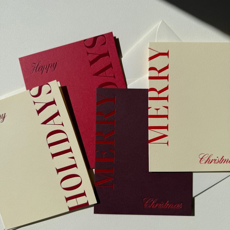
You can also pair a color with its own deeper shade. Look at these Merry Christmas cards from Jaymes Paper: cream with red, a light red with a really dark red, a red with an even darker one. Tone on tone, and it looks so rich.
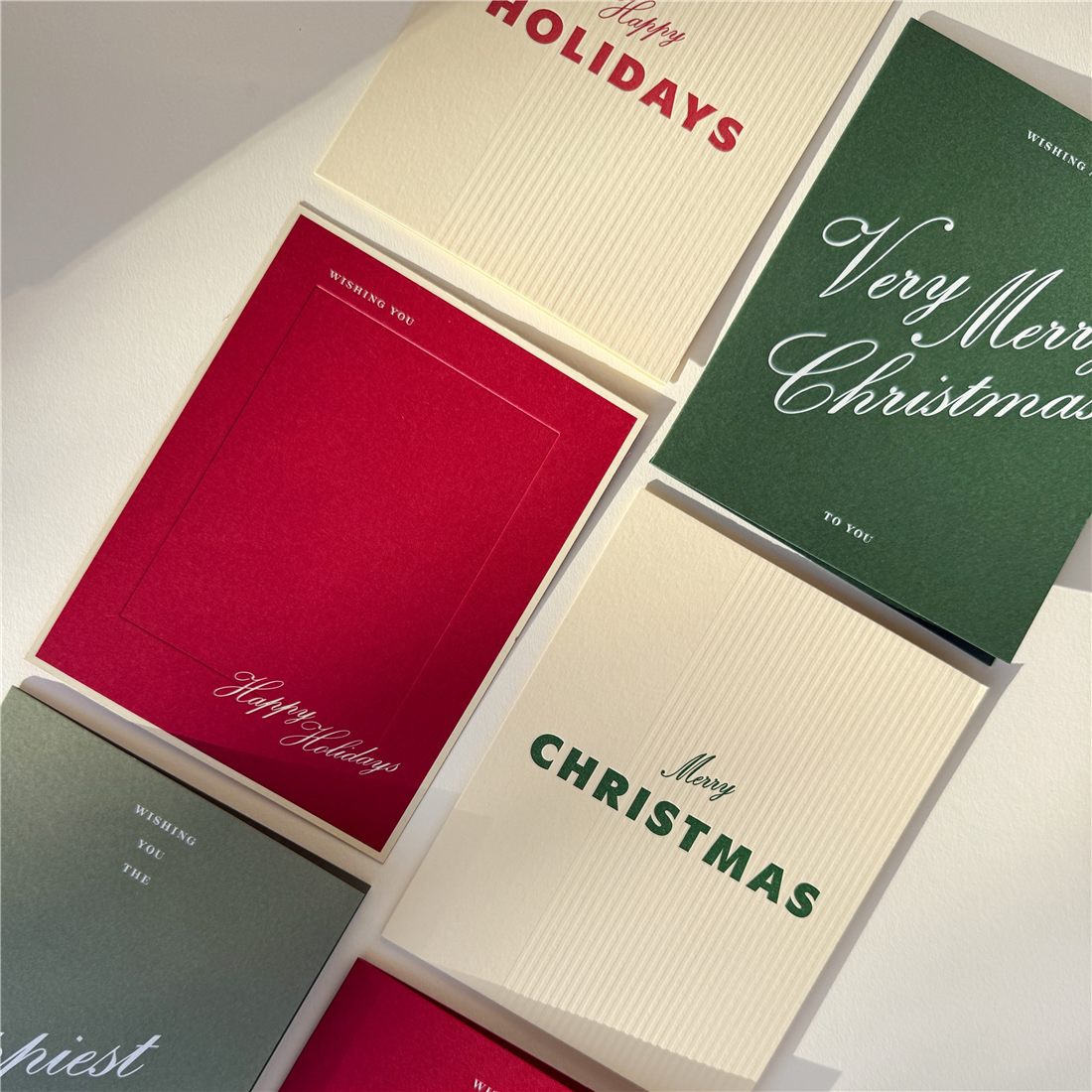
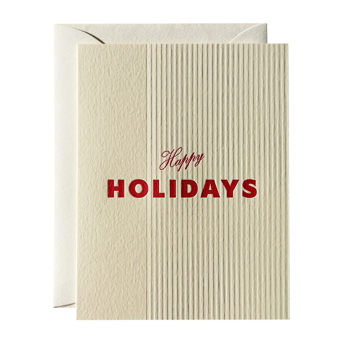
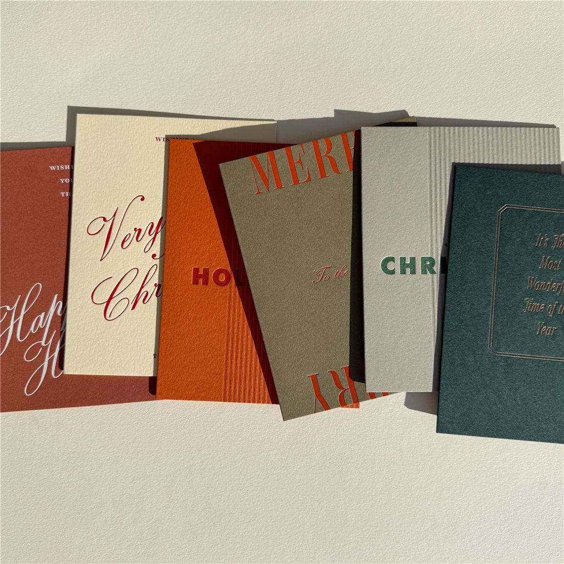
And Jaymes Paper just brought out their new holiday cards, and I already see a few I love. That red Very Merry Christmas in white script, a cream Happy Holidays with the finest little ribs, and a whole row in rust, olive and deep teal. Same idea: a few shades side by side, and they look so good together.
So why do these colors work for Christmas? Because almost every one of them comes from the season itself. White and cream are the snow, and icy blue is snow in the shade. Deep red is Santa's suit, red wine and mulled wine, and the cherries everyone eats this time of year here in Europe. Green is the pine tree and the mistletoe. Brown is the trunk and the pine cones. When a palette pulls from those, it reads as Christmas, even when the colors are a little unexpected. And it works for Halloween and every other season too: pick the colors the season gives you, then play with their shades.
The Shape Says Christmas, The Colors Say You
Now the fun part. If you put colors that aren't typical Christmas colors on something that's obviously Christmas, like the tree, the wreath or the garland over the fireplace, then duh, it doesn't matter. That's where your personality goes. (Around here we call wreaths donuts. We love the donut shape. Not that we eat donuts, we actually never do, but I'm obsessed with my little donuts, so you'll see them everywhere.)
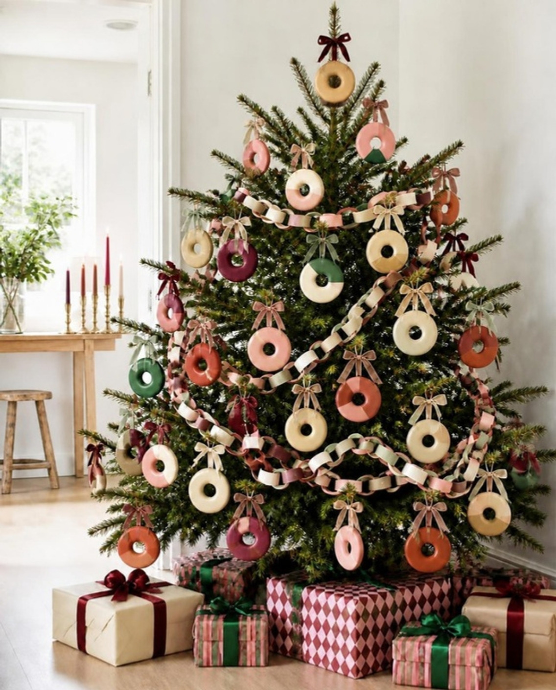
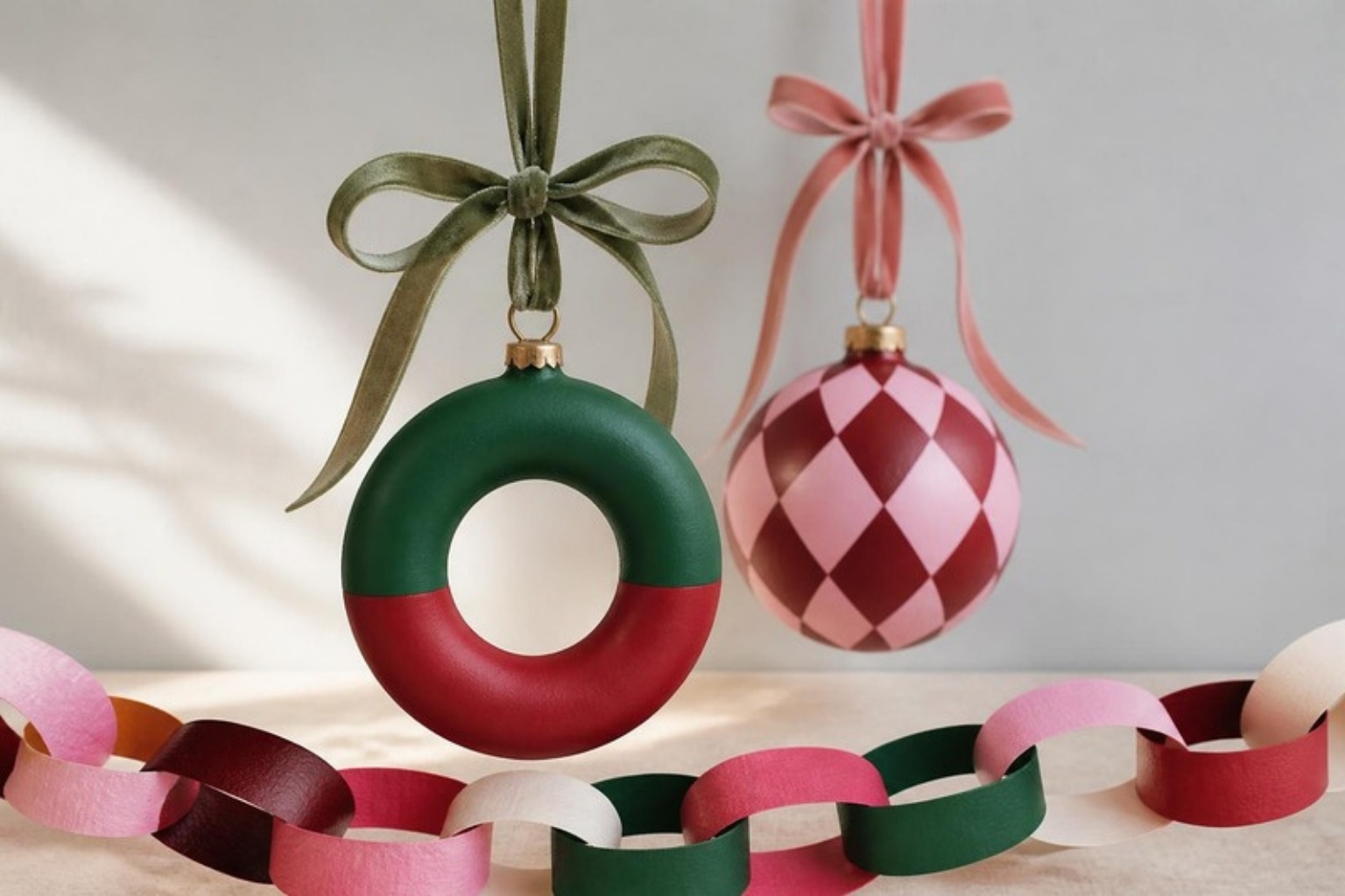

My tree is a little bit whimsical, but it's fun if you're into donuts, or anything like that. It's just one way to show that if you're into something, you can still bring it into your Christmas tree in a way that isn't tacky or ridiculous. I was just playing around with funkiness and with color: not only the typical red and the typical green, but the colors around them on the color wheel.
Something needs to stay traditional, and you pair that traditional thing with something that isn't. People still get it: it's Christmas. Nobody is going to say it's not Christmas anymore because you didn't follow the red and green perfectly.
Love pink? Use pink, in a few different shades. Put it on the candles, the donut and the tree, and pair it with colors that belong to Christmas: white and icy blue for the snow, greens, burgundies, reds. Or go for a whole pink Christmas. That's fine too, just keep it on the obvious Christmassy things.
That's the trick with a palette. Repeat each color at least twice and it looks planned, even when it's playful.
Want one ready to go? Look at this velvet chain from Meri Meri. Red, green, pink and white, soft and a little bit retro. Drape it on the tree, over a mirror or along a shelf and it does all the work for you.
Why These Palettes Feel So Good
Look closely at the palettes below. Most of them aren't bright, and they aren't pastel either. They sit in between, with a little gray in them. That gray undertone calms the eye: you get all the color without the shouting. Color really does change how a room makes you feel (I wrote about it in how your home affects your mood and the psychology of interior design).
Green And Burgundy Are The New Neutrals
Why do beige, white and black go with everything? They're neutrals, sure. But they're also nature: the dark of night, the trunk of a tree, the beige of rattan (a plant that dried up!) and pampas grass. We never get tired of nature. I said it in my fall and Halloween post and I'll keep saying it.
Green and burgundy are the new neutrals, so you can use them as your base and go off of that. Your base doesn't have to be beige. Beige, white and black will always be neutrals, but green and burgundy are the new ones you can build from.
Burgundy is definitely my favorite color for Christmas. I used to hate plain red, but now when I put that loud red next to burgundy, it softens right up. Imagine that colors need to be dressed. Red by itself just needs a little burgundy on. Kave Home does this so well, and don't get me started on mugs. I'm obsessed, especially in burgundy.
Look what happens when you combine a really strong color with a muted one. Take that bright red and the burgundy. Normally I would make the burgundy the big one, the one that stands out more, and keep the bright red small. It's so loud that it needs to be little. You need to shrink it.
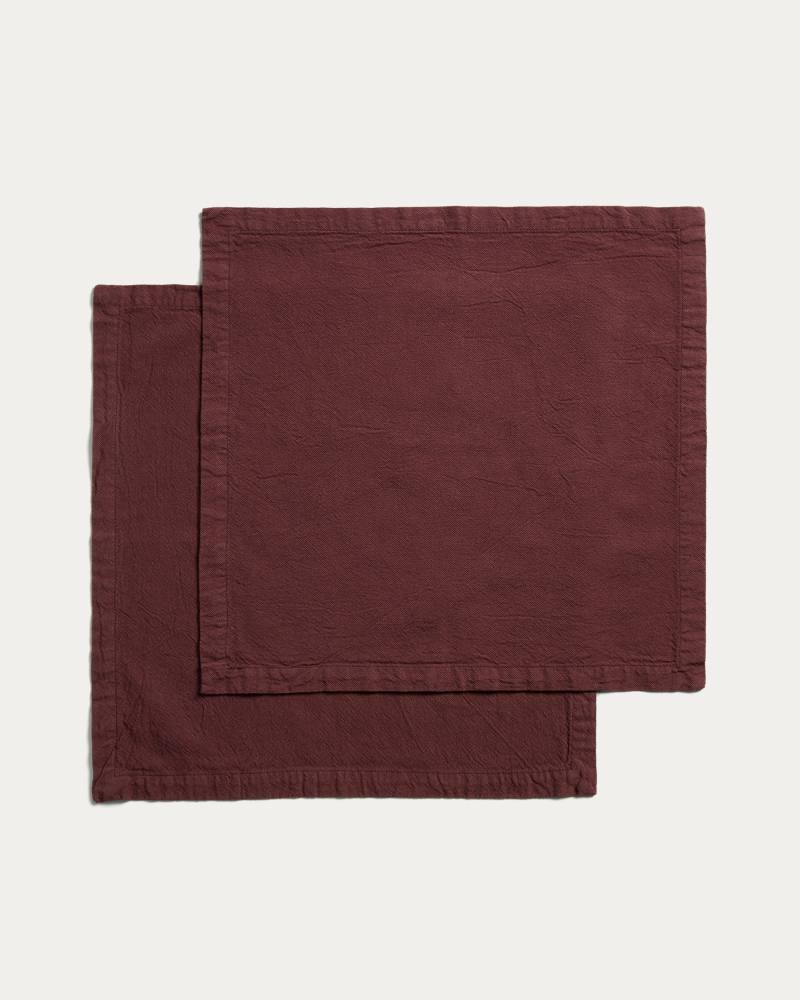
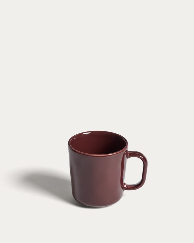
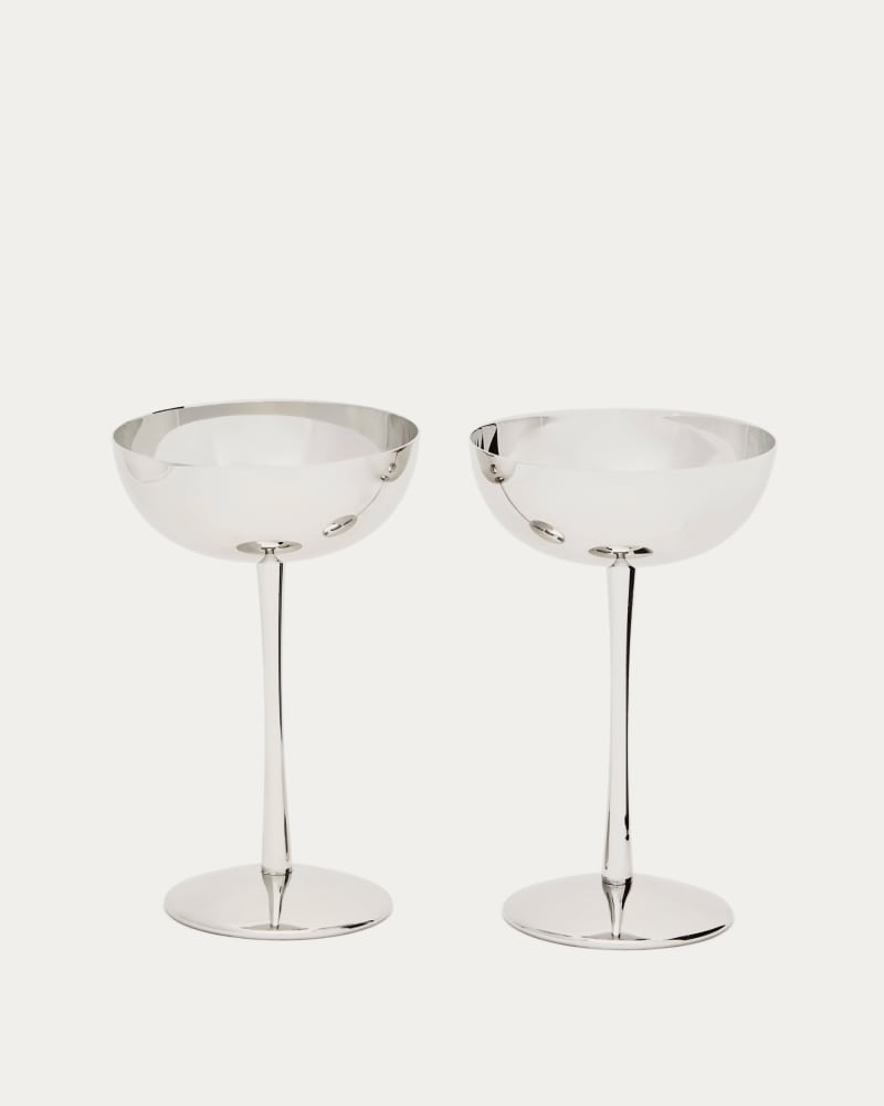
Green is in literally every tree, so I treat it as a neutral. I have it paired with so many colors in my house right now, and it works every time. Burgundy is the other one: it's basically brown with a twist, and it looks good with everything. Sick of beige and black and white? Start there. More in color is back.
Please Don't Follow "The" Christmas Trend
Here's how a trend happens: one color or one style gets popular, everybody copies it, and suddenly every house looks the same. It stops being special. We're all getting sick of the same song on repeat, and it's the same with design. Christmas and Halloween too.
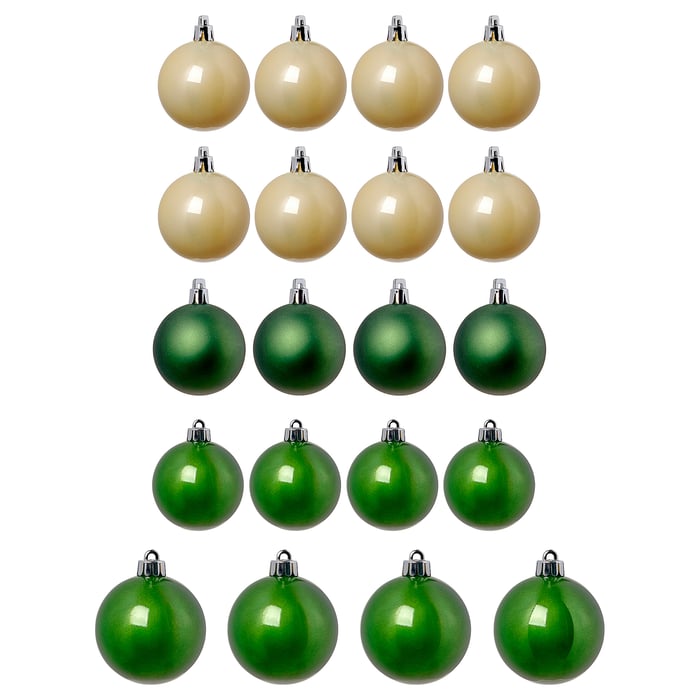
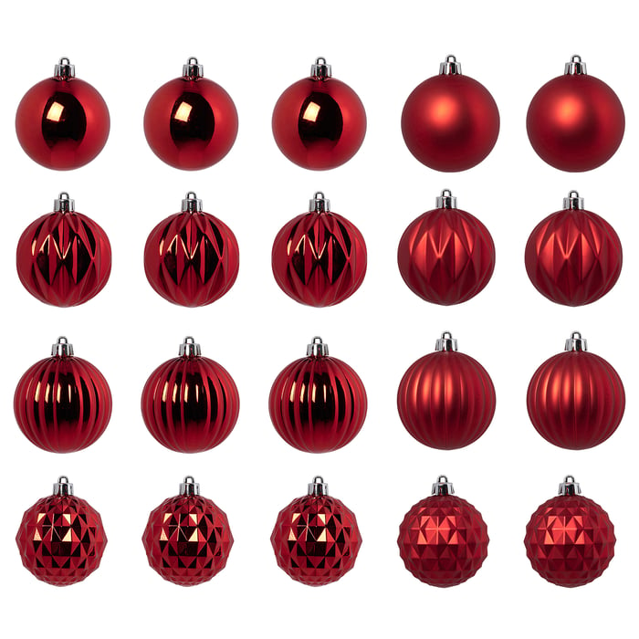
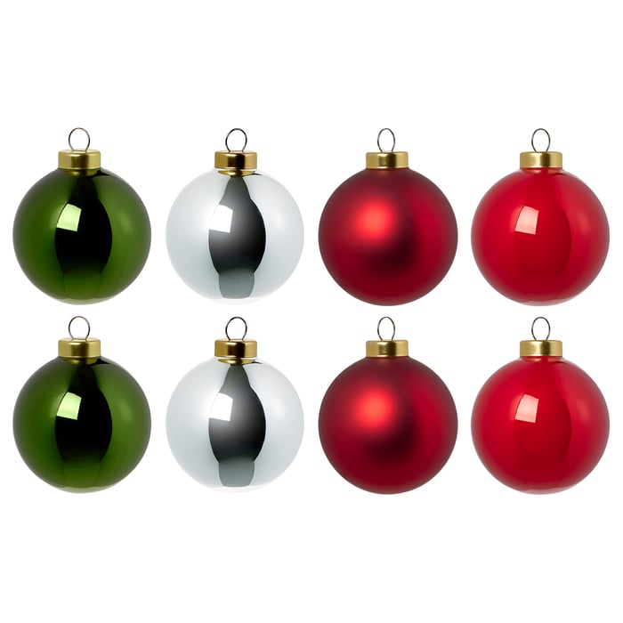
It happened with farmhouse. I love farmhouse dearly, and it's beautiful, but honestly I can't look at it anymore. Let's not do that to every style, or to Christmas, or to Halloween, until they're frustrating to look at.
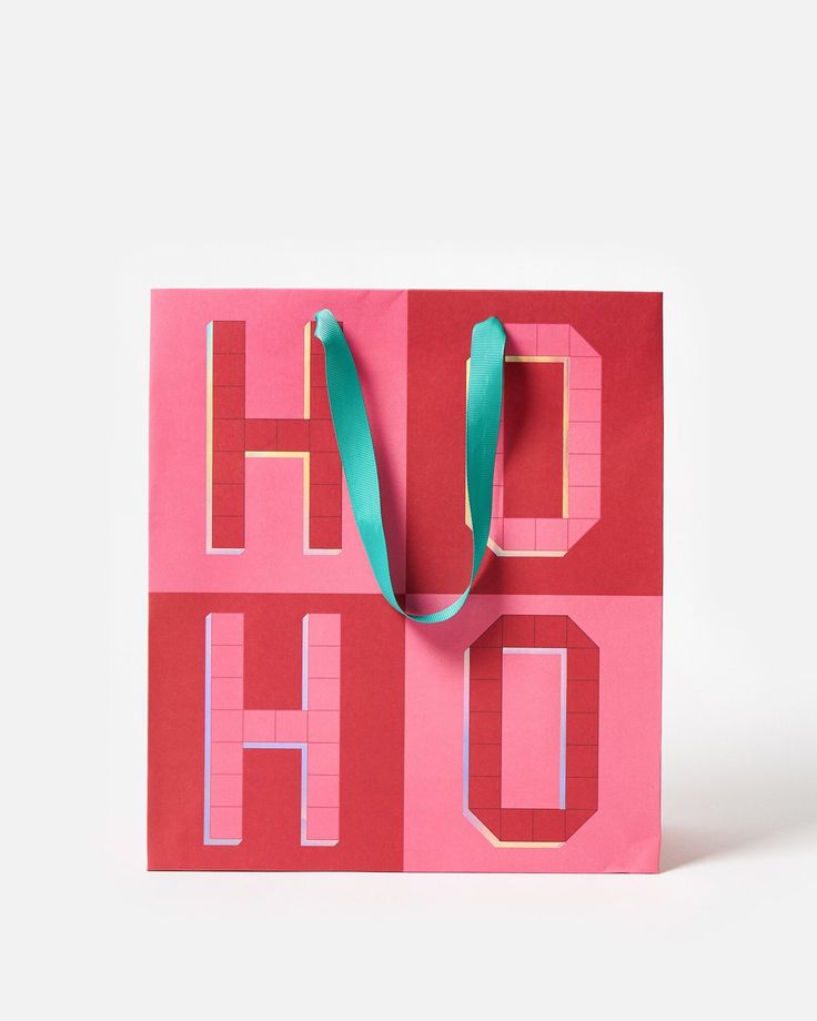
If you still love farmhouse, keep it. I have nothing against it. What I'm against is everybody doing the exact same thing because it went viral. Let's make being different go viral instead. Like this pink HO HO gift bag from Oliver Bonas: no red and green in sight, and it still says Christmas loud and clear. That's why I'm so intense about studying color palettes: so we can all be different and interesting, and still have good taste. Because good taste matters.
So be your own advocate. Learn your personality, then make it modern and relevant with your own twist. Not sure what your style is yet? Start with how to find your style (hint: it's more than one) and this guide to the styles.