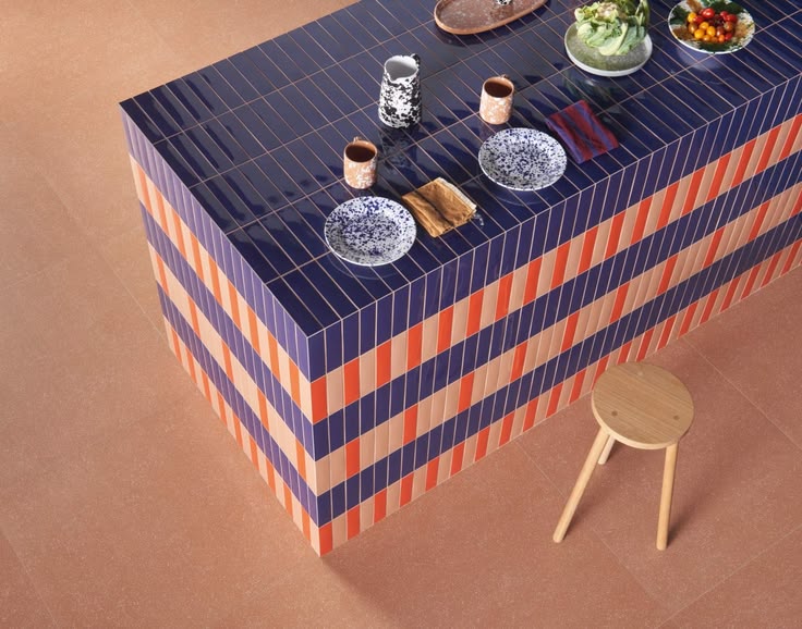
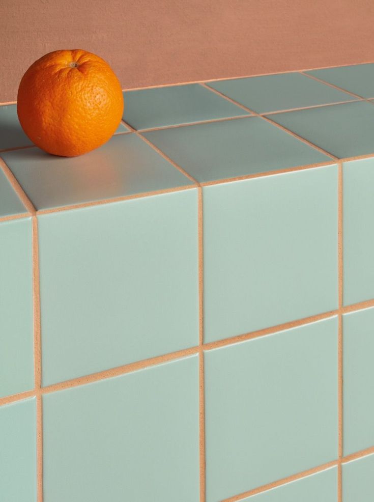
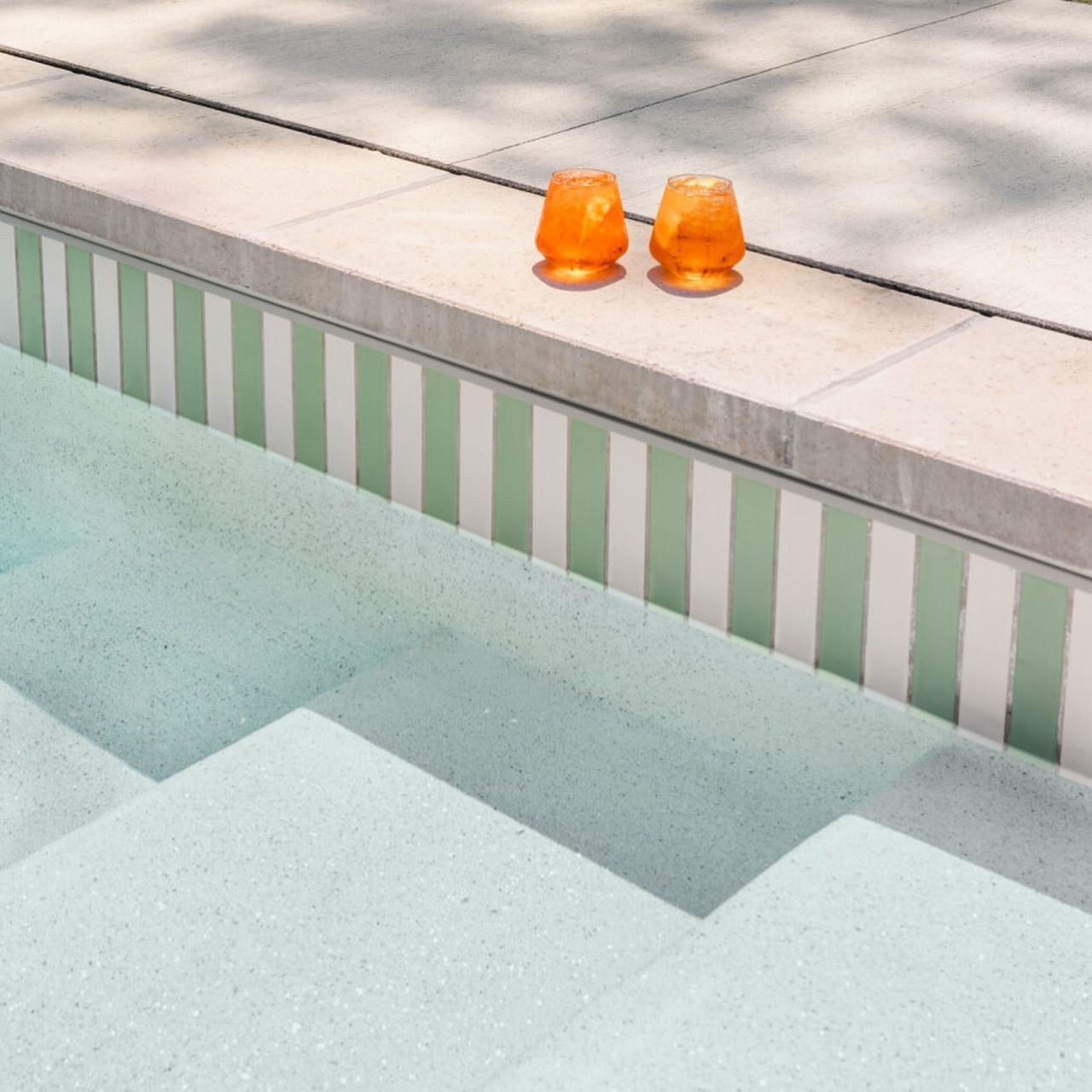
Tile is one of my favorite materials, because it can be so many things at once: a color, a pattern, a texture, a border, a picture, even a sign or a piece of furniture. It's where a room gets to play. And still, so many homes only ever get white subway tile with white grout. Nothing wrong with that, but there is so much more fun to have, like that navy and orange striped island up top, and the mint tile with orange grout a little further down, both from 41zero42.
So this post is all about the fun ways to use tile: the different styles and shapes, stripes, checkerboards, borders that work like trim, designs and even signs, the grout everyone forgets about, tiled furniture, and yes, pools. In bathrooms, kitchens, cafes and shops. Grab a coffee, this one is full of pictures.
Tile Is How You Create A Vibe
Tile isn't just a surface. It's one of the easiest ways to set the mood of a room. Change the color, the pattern, the grout and the shape, and you change how the whole space feels the second you walk in. So before you pick a single tile, pick your vibe:
- A little bit of history. Think of the medinas in Morocco, where zellige, tiny hand-cut pieces of glazed clay, covers fountains, courtyards and doorways in star patterns that shimmer in the sun. Or the Roman houses in Pompeii, with stories told in mosaic right under your feet (more on those below).
- Gatsby glam or Victorian charm. Black and white geometry, gold and deep green, fans and chevrons for that roaring twenties Art Deco look. Or the softer, older charm of a Victorian hall: encaustic patterns, little mosaic rugs and a border all around.
- Funky and fun. Bold stripes, checkerboards in colors you'd never expect, pink grout, a tiled island in candy colors. The room that makes you smile every time.
- Relaxing and calm. One soft color, tone-on-tone grout, handmade tiles that catch the light, a little texture. Like a spa you can live in.
- Beachy and easy. Blue and white stripes, sandy terracotta, a pool you can almost hear.
Same material, completely different feelings. The rest of this post is full of ideas for every one of them.
Start Bold: Colored Grout That Pops
Let's start with my favorite. Pink grout with mint tile, orange grout with pale green, rose grout with deep teal, red grout with plain white. This is where grout stops being a background and becomes the color in the room, and honestly it's one of the easiest and cheapest ways to make a plain tile look custom. The pale green with pink grout is Casa Scala in Florence by Sara Bucci and Fontego architettura (photo: Lorenzo Zandri), and the deep teal with rose grout is from Equipe Ceramicas.


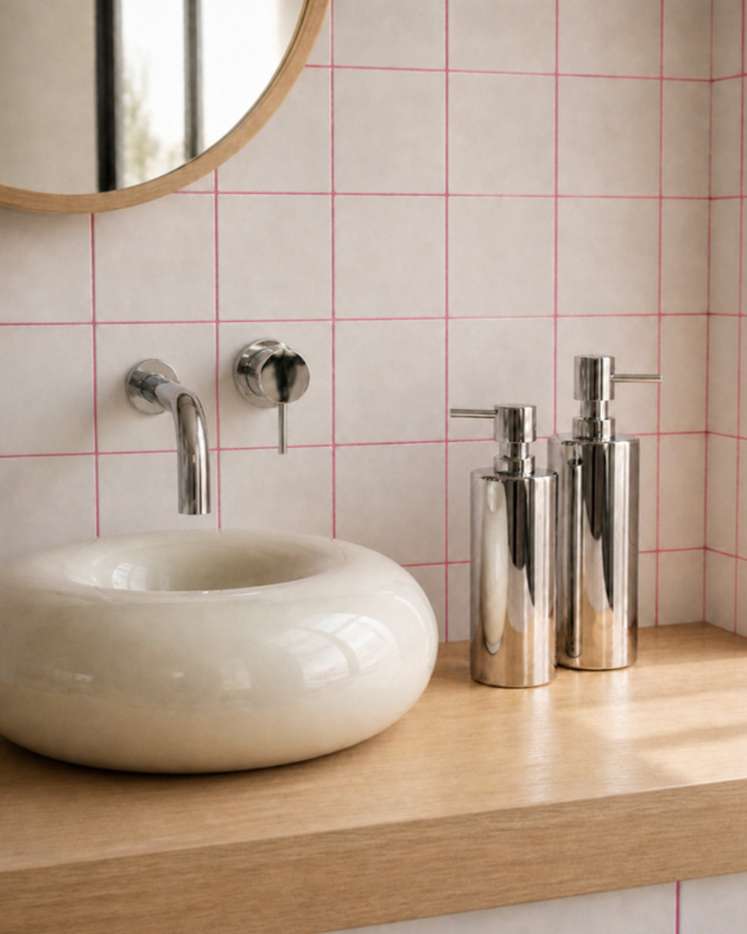
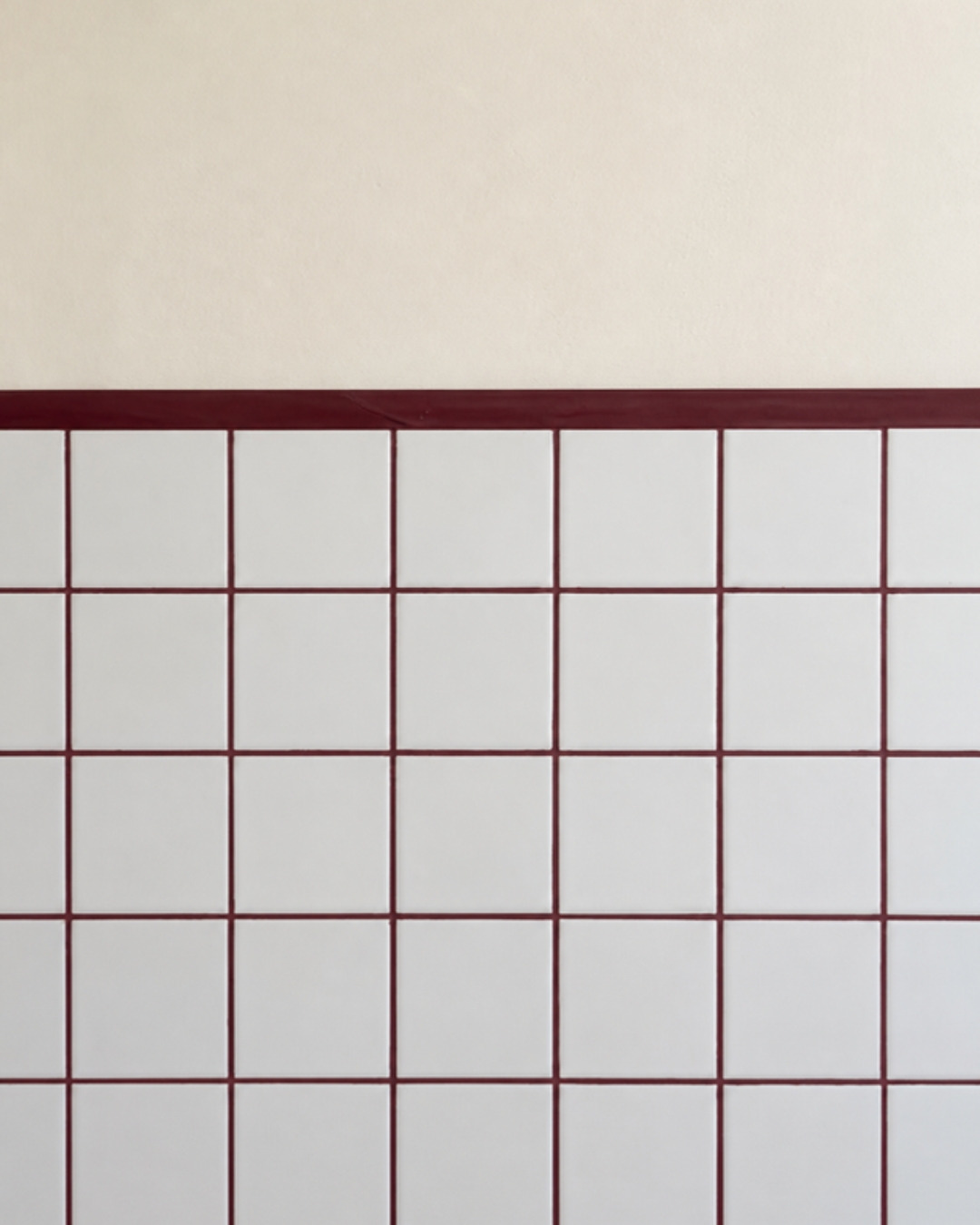
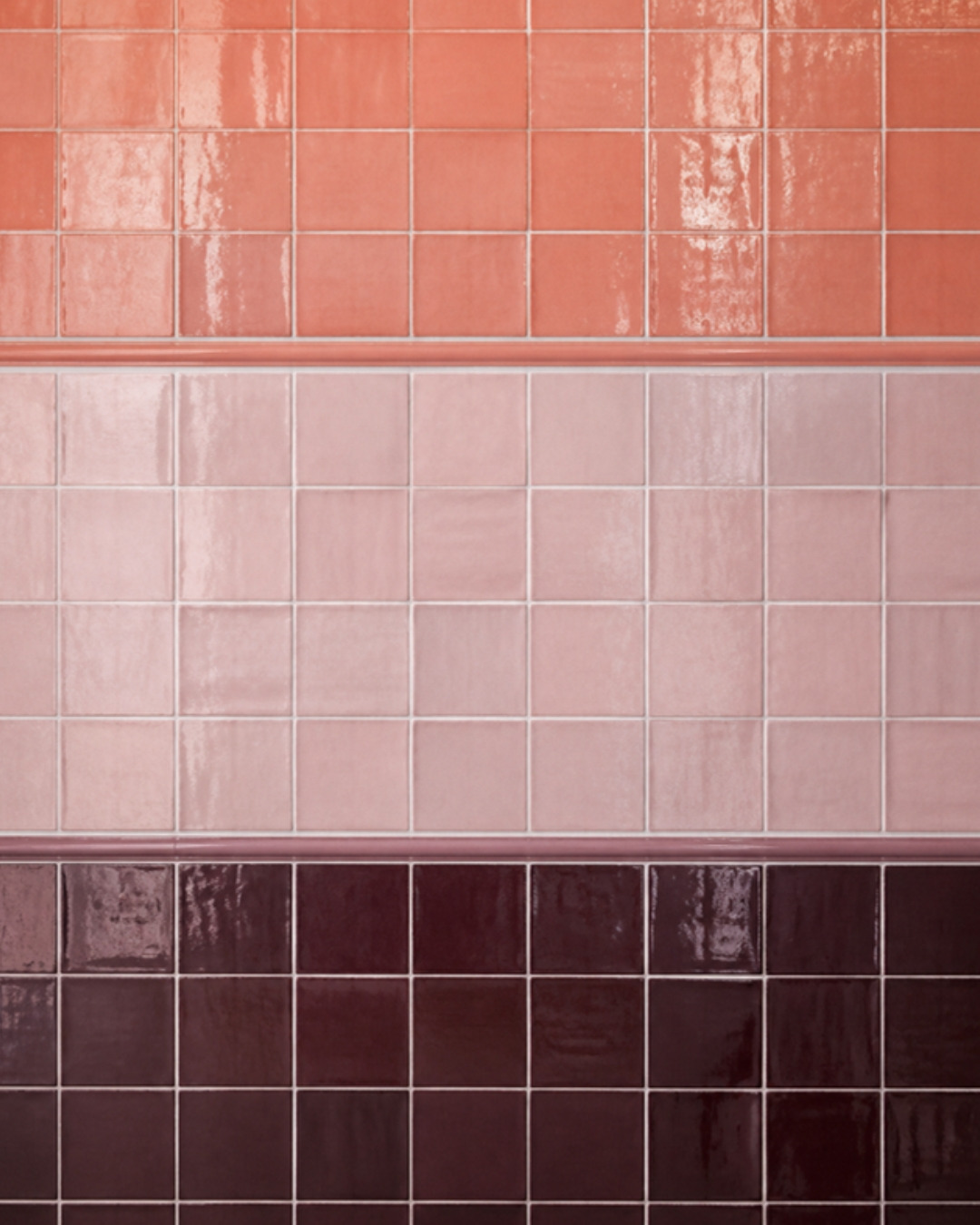
Plain white tile gets a whole new personality with hot pink grout (a puffy donut basin and a warm oak counter don't hurt either), and I love burgundy grout tucked under a skinny burgundy band. Then there's that stack of coral, pink and plum handmade tile, three shades in a row, with white grout keeping it fresh.
Start With The Tile: Styles And Shapes
Before the pattern, there's the tile itself, and every kind has its own personality.
- Handmade and zellige. Glossy, a little wavy, every tile slightly different. They catch the light and make even a simple wall feel alive.
- Glazed ceramic. Shiny or matte, in every color you can imagine. This is the playful one.
- Porcelain. Very hard and very practical, great for floors and busy spaces, and it now comes in amazing colors.
- Mosaics. Tiny tiles on a sheet: penny rounds, hexagons, little squares. Perfect for patterns, borders and curves.
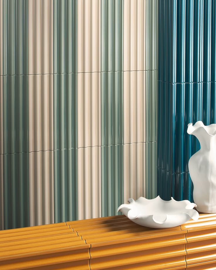
- Fluted and 3D tiles. Ribbed and sculpted, they add texture and shadow without any pattern at all.
- Shapes. Squares, long thin "finger" tiles, rectangles, hexagons, scallops. The shape alone changes the whole feeling.
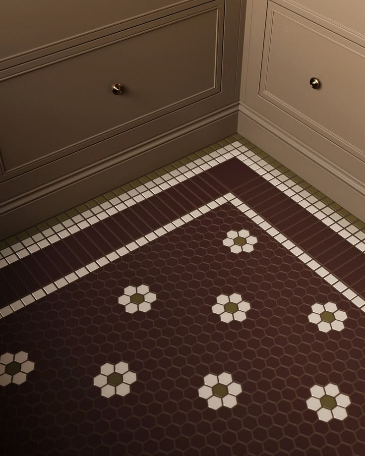
A few I love here: the random grid from Marazzi, the fluted Plinth stripes from Terratinta Group, and the little flower hexagons by Fireclay Tile.

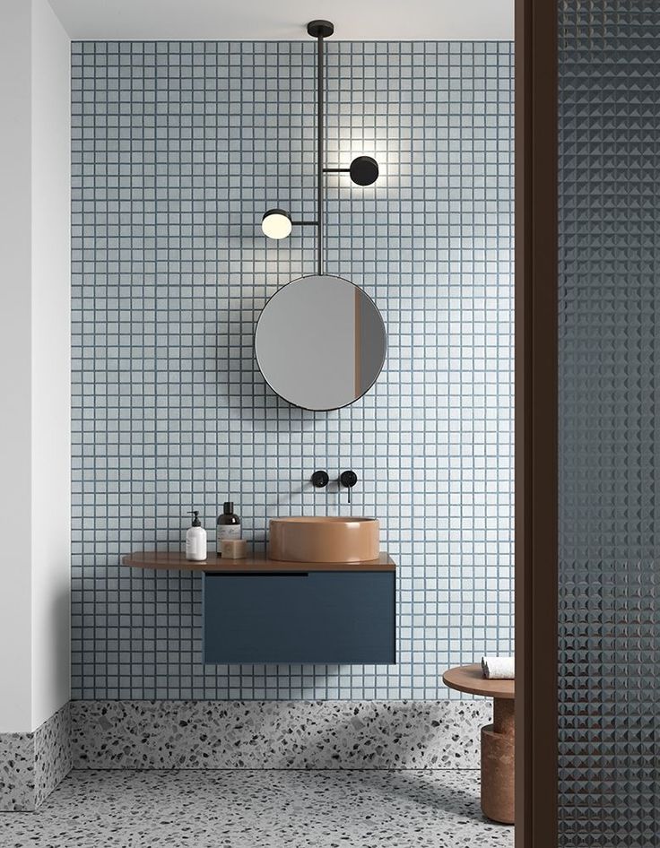
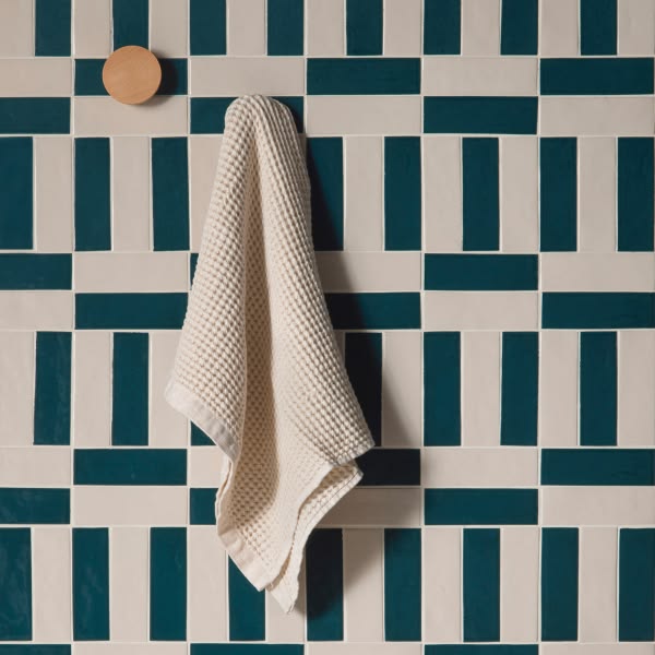
That dreamy pale blue mosaic bathroom was made by notooSTUDIO for Gibas, and the woven teal is Federica Biasi's Kimono tile for Decoratori Bassanesi.
A few more shapes I keep saving: Zellige Home's mosaics, a Gio Ponti pattern in cream, sage and forest green and a soft pink one with little plum squares. Sculpted terracotta tiles laid in a herringbone. Little green pill-shaped tiles from clé set into a pale floor. Pink arches outlined in navy, round ribbed columns, and a staircase wrapped in tiny red and cream stripes. Tile doesn't have to be a flat little square.


Play With The Layout
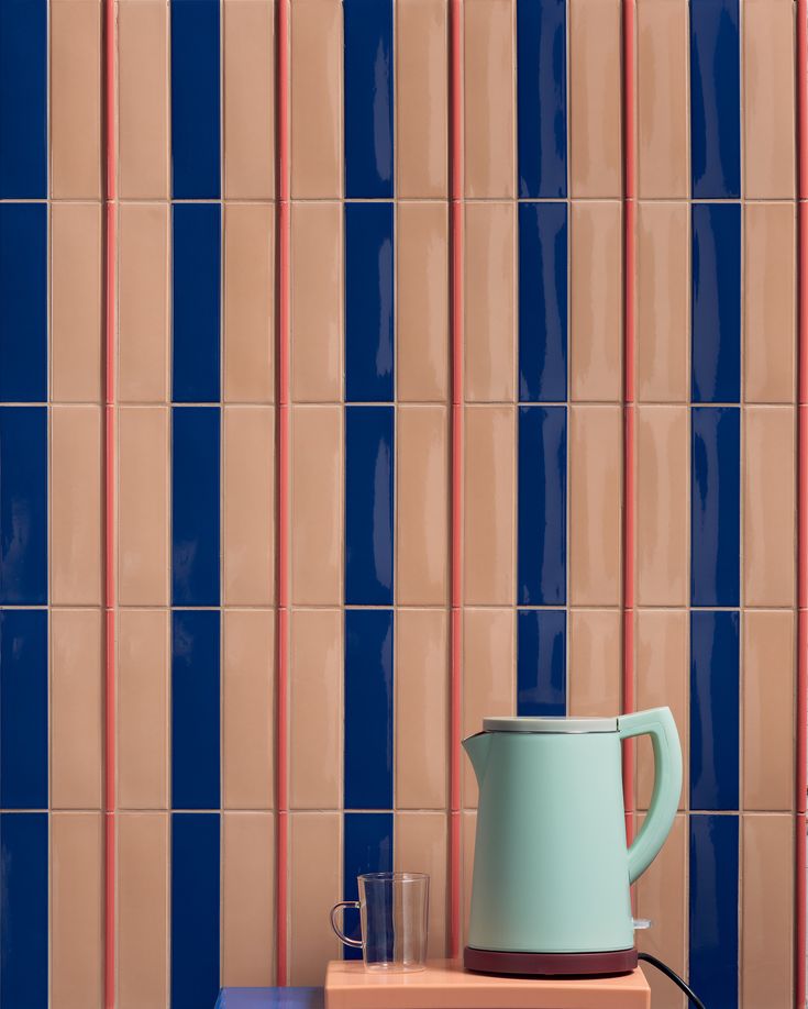
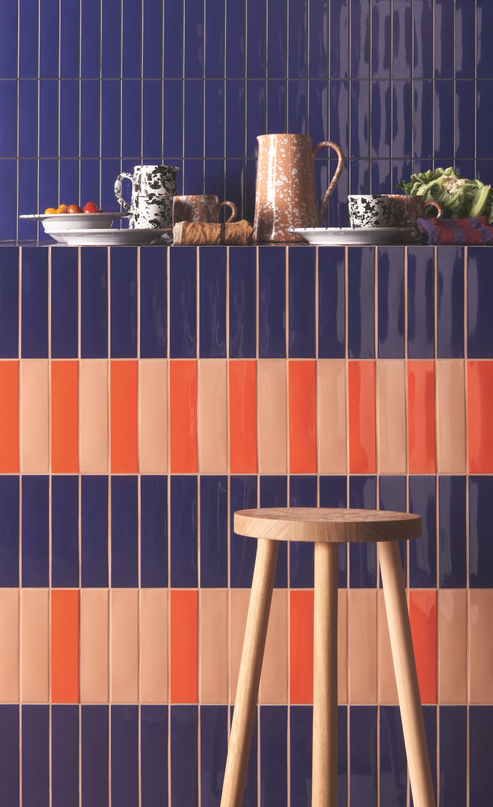
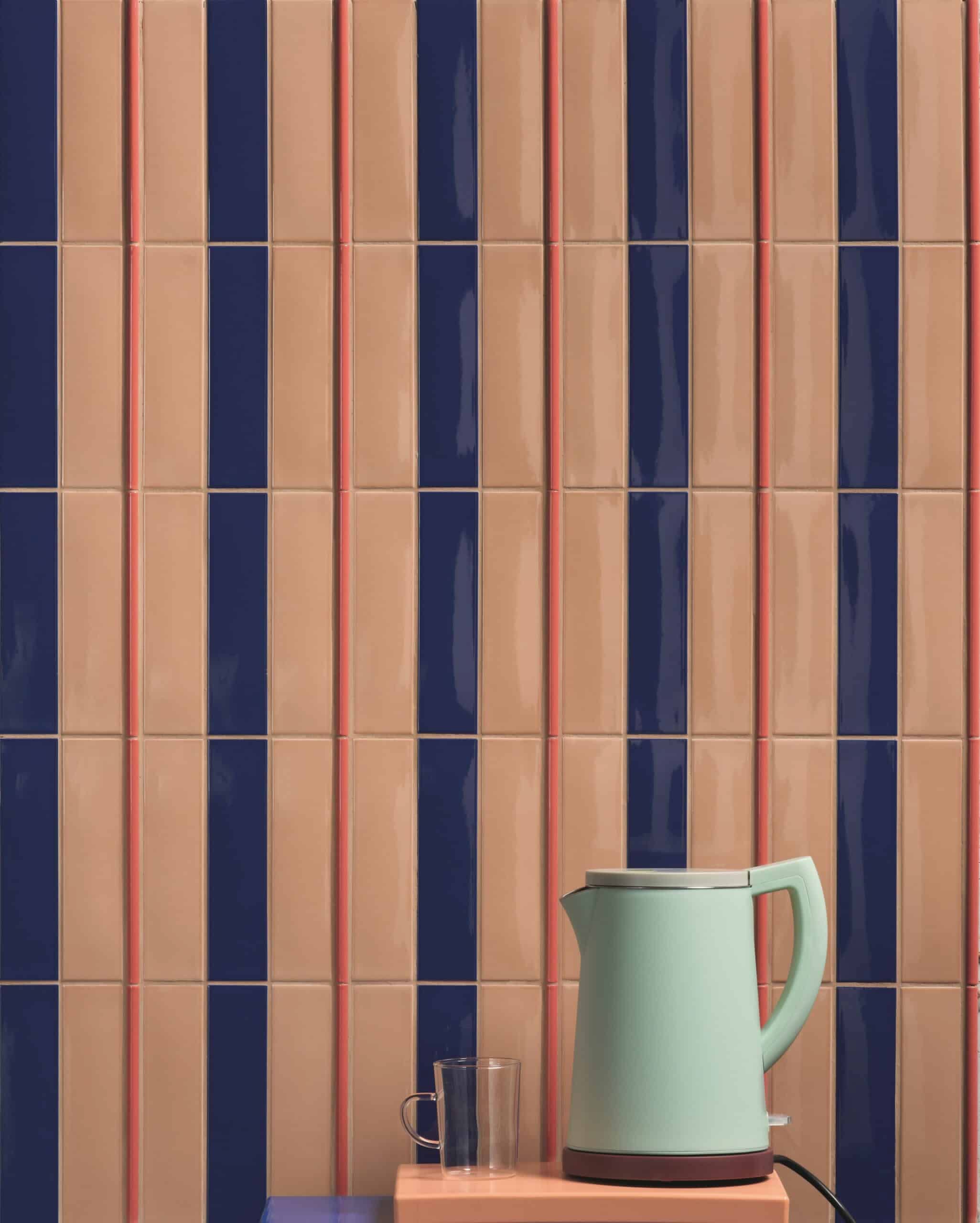
The same tile can look completely different depending on how it's laid. Stacked straight in a grid feels modern and calm. Running vertically makes a room feel taller, horizontally makes it feel wider (more on that in shapes, lines and patterns). Herringbone adds movement, and long thin tiles in two colors turn into stripes on their own. Before you buy, lay a few tiles on the floor in different ways and see which one makes you smile. Both of these are Kappa from 41zero42, navy and peach stacked up (hello, mint kettle) and navy and orange running across, and they feel like two different rooms.
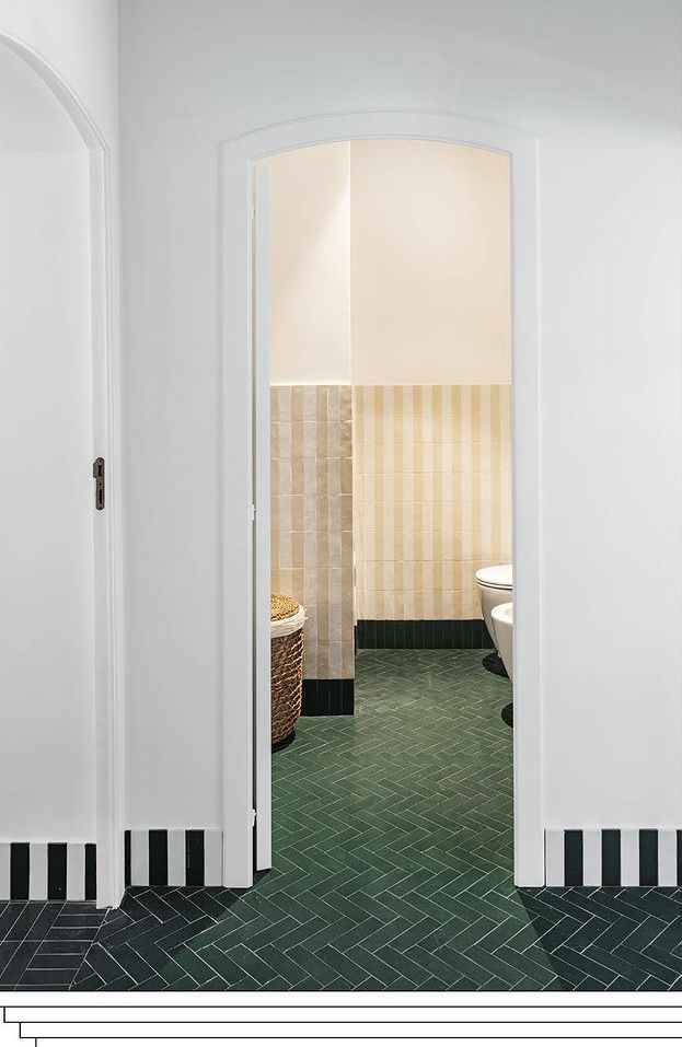
The green herringbone is Casa nella Pineta by Isabella Denora (photo: Pierangelo Laterza), and the striped marble floor is from Mandarin Stone.

You don't even need a pattern printed on the tile to get one. Take one long tile in three colors, cream, pale blue and brown, stack them in short runs, and the layout becomes the pattern.

And tile doesn't even have to be flat: these sculpted terracotta pieces catch the light so every row looks a little different.

Stripes
Two colors of tile, laid in stripes, and suddenly a plain bathroom feels like a beach cabana or a Parisian bistro. Run them up the wall, across the floor, around a tub, over a sink. Thin stripes are lively, wide stripes are calmer, and burgundy, navy or green with cream never gets old.
How cute is that pale blue and white striped sink with the bright red tap? Next to it, a burgundy and blush striped shower, and a navy and white one with a brass rain shower that's as close to a beach cabana as a bathroom gets.
And this one makes me want to run a bath: deep burgundy stripes in the shower and all over the vanity, a matching burgundy basin, and a big freestanding tub in the sun.

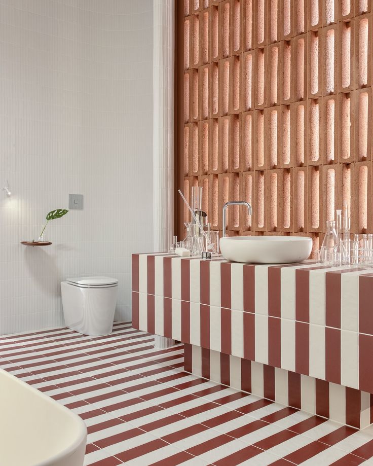
That dark green and cream striped sink is Kimono too, from Decoratori Bassanesi, the minty shower bench is from Ca' Pietra, and Jeferson Branco Arquitetura ran that terracotta stripe right over the floor and the bench, which is so clever.
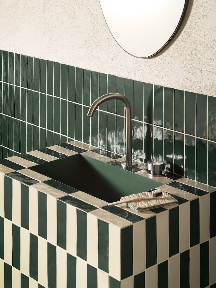

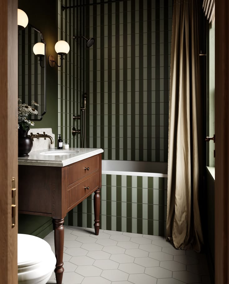
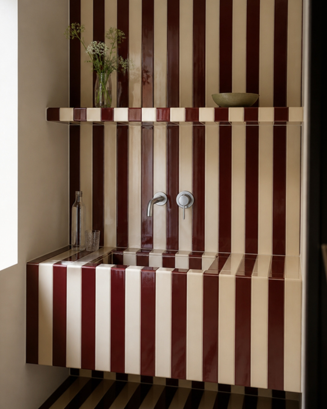
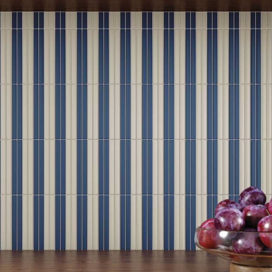
I love how moody sage and olive stripes get in that bathroom tiled by Fireclay Tile, with the wood vanity and the long silky curtain. And a tiny kitchenette wrapped in burgundy and cream stripes, from the shelf right down to the base, steals my heart (I made this one with AI). Those fresh blue and white stripes with the bowl of plums come from VIVES Cerámica.
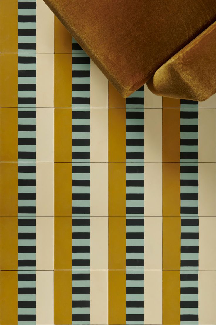
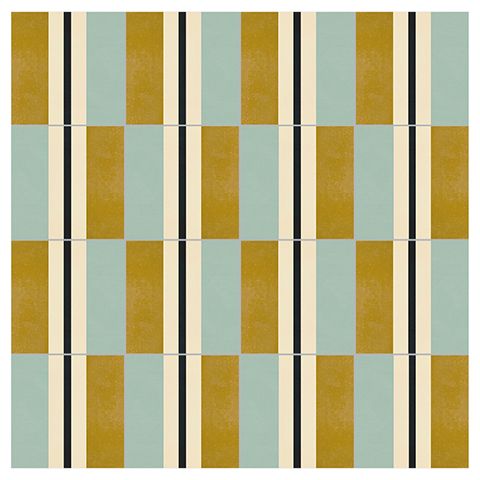
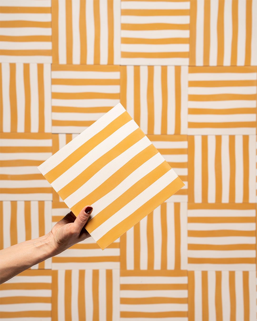
Stripes don't have to be straight lines, either. Look at these cement tiles: mustard and mint under a velvet sofa, ochre and sage with a thin black line, and a mustard and white stripe that turns into basketweave when you lay it in squares.
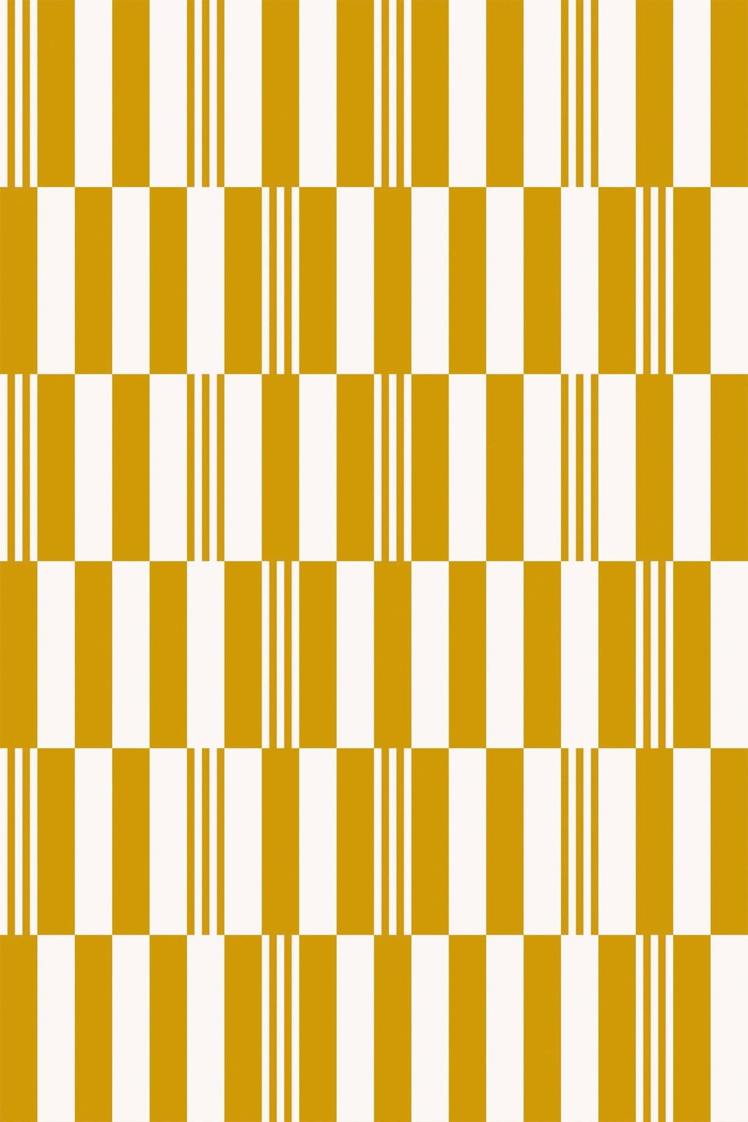
The same idea works in navy and tan with a little coral trim, too. And this mustard one isn't tile at all. It's a beautiful wallpaper from FancyWalls, a wallpaper shop in Riga, Latvia: tall stripes in two widths, shifted every row so they read like a checkerboard. This is exactly the kind of pattern we should be exploring with tile. Picture it in two colors of glossy rectangles laid just like this, on a kitchen wall or in a shower. And if tile isn't an option in your space, I'd highly consider this wallpaper. You get the whole look without a single grout line. Renting? Go for peel and stick wallpaper. It goes up without any glue or damage and comes right off when you move out.
Stripes in a bathroom feel so fresh: green and white tile running from floor to ceiling, a deep vintage sink and a brass mirror. A little bit glam, a little bit old hotel.

Checkerboards And Grids
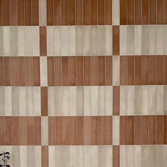
The checkerboard is back and I don't think it's leaving. On a floor, on a wall, up the steps of a terrace. Two colors that you love, laid like a game board. Mix in different tile sizes or a third color and it becomes even more playful, almost like plaid. LBF Homes did that terracotta and cream wall. And I can't get over that rust and white checkerboard running up the steps of a sunny terrace and right into a little pool.

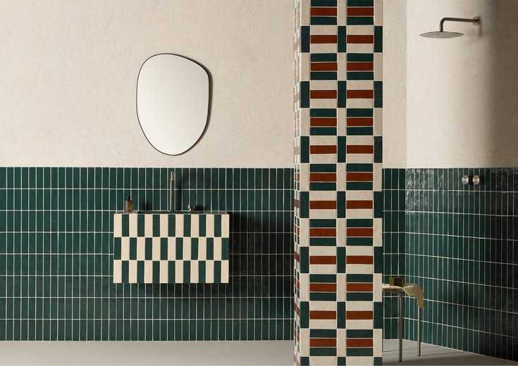
That plaid is Färgblock, designed by Tekla Evelina Severin for Quintessenza Ceramiche, and the blue and white mosaic bathroom is Viruta Lab's Cabanyal House in Valencia. Then there's that deep green bathroom with the red, green and cream column and a checkered floating sink, Kimono once more from Decoratori Bassanesi.
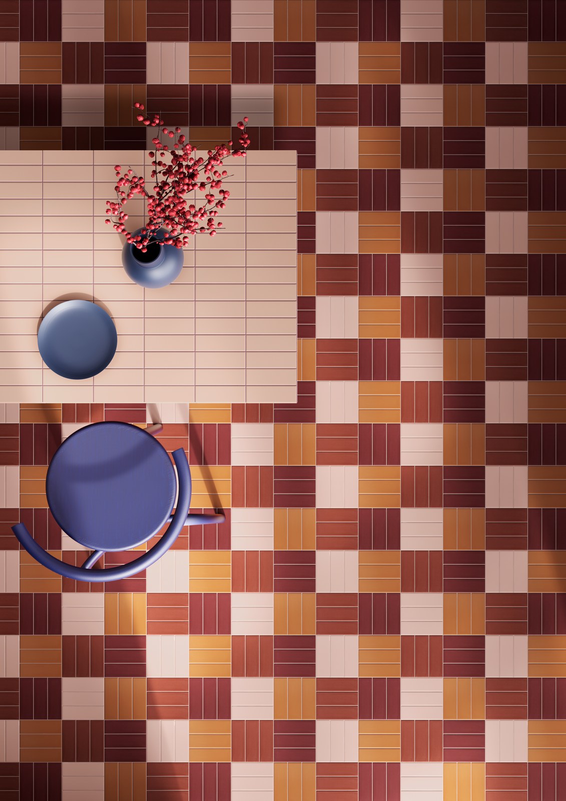

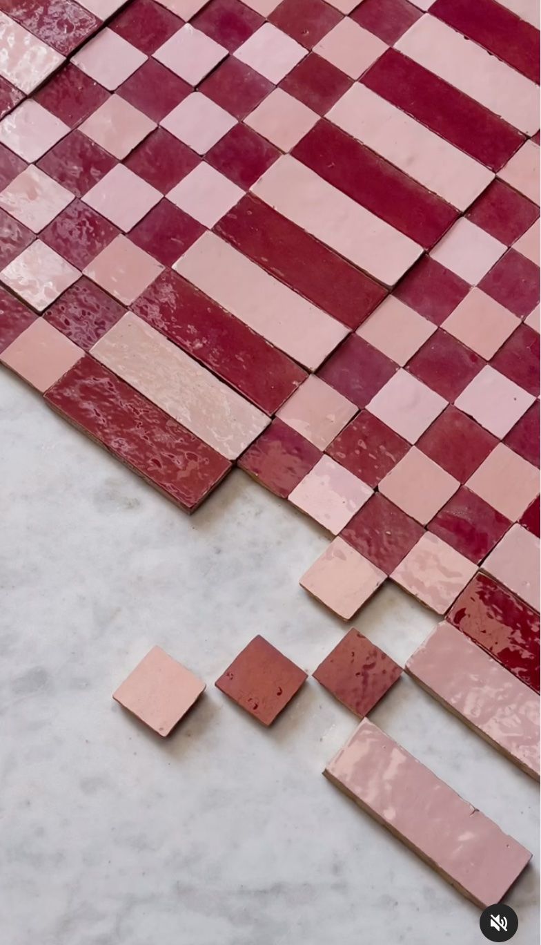
A few more checks I keep coming back to: a sunny yellow checkerboard and Popham Design's zellige in Jam and Dickinson, a deep raspberry and a pale pink, laid in checks and dashes.

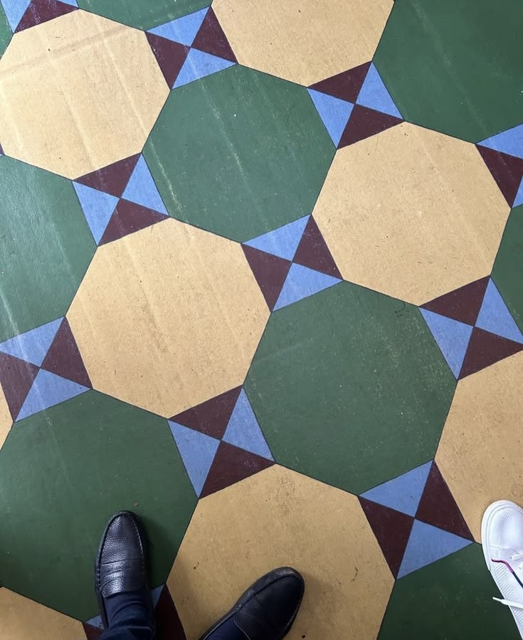
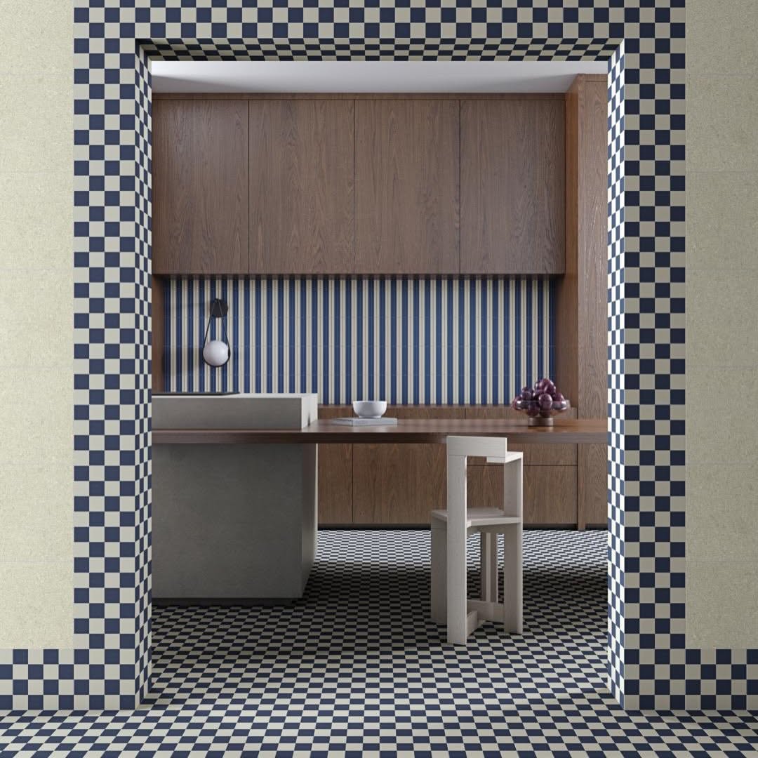
Checks work on the floor and around a doorway too, and you can play with the shape: classic black and white, an octagon floor with little blue stars, and a blue checkerboard framing a whole kitchen.

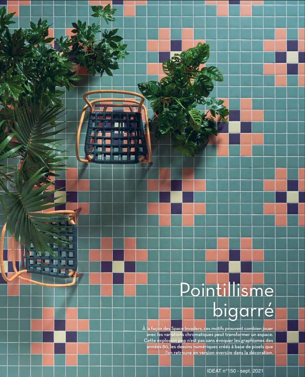
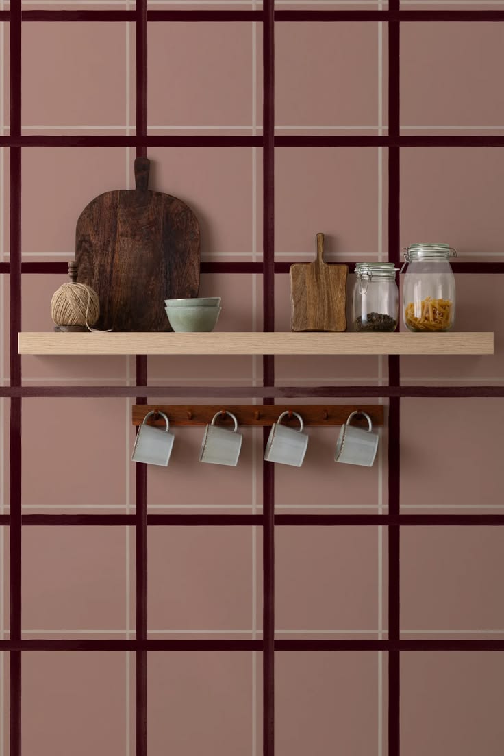
Or go smaller and softer: a teal mosaic with pink pixel crosses, and a dusty pink grid behind a kitchen shelf.
And if you want to see how far a check can go, look at these from Zia Tile. A rust and cream check that's just a little off, because the squares aren't all the same size. Their Perpetual Check, where a green zellige check turns into little cubes. And Atlas, big triangles in green and pale blue that look like a broken checkerboard. Same idea, three completely different moods.


And a few more checks: a colorblock floor in burgundy, blue and white from Reno Source, a little tiled cube in pink, sand and mustard, a green and white check under a pink courtyard, and a terracotta terrace with a check running up the steps.


Borders, Bands And Little Details
Not ready for a whole striped room? Use a border. A band of contrasting tile at the top of a wainscot, a checkered edge around a vanity, a little skirting of stripes where the floor meets the wall, a mosaic border on the floor like a rug made of tile. Small, affordable, and so charming.
Look at the black and white checkered edge on that mustard double vanity with the pill-shaped mirrors, and the skinny burgundy and sage band running under the arch (that one I made with AI). The deep green floor with its green and cream striped skirting is Superclassica from 41zero42, and yes, I want the cane chair too.

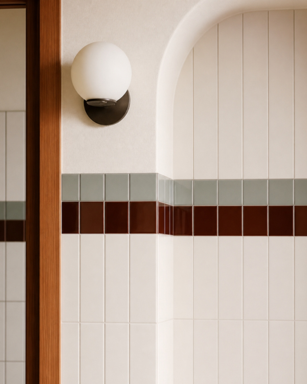
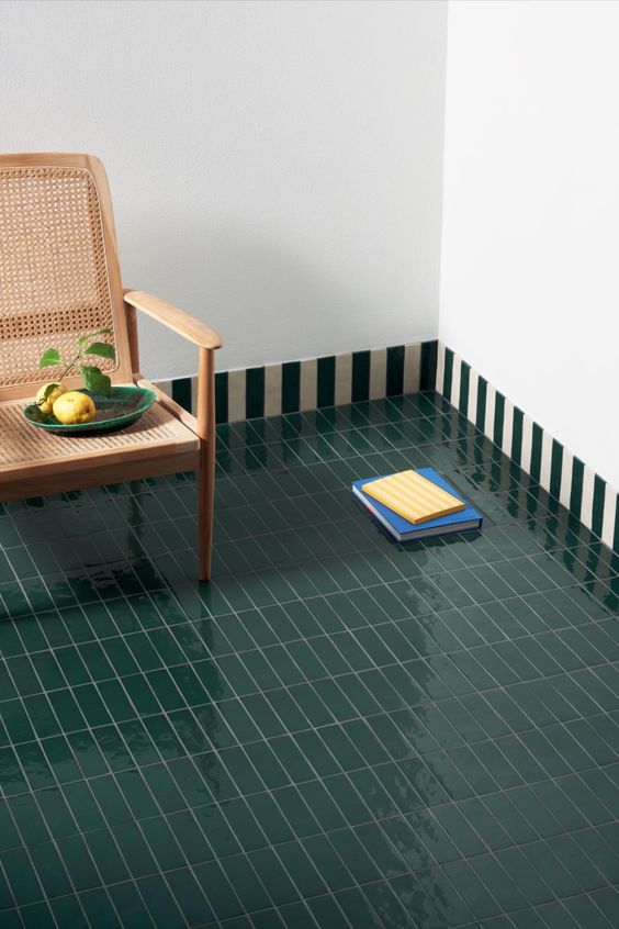
Creating a border is easier than it looks. Pick one or two colors already in the room (the wood, a rug, your towels) and run them as one or two rows of tile through a plain field. Keep the field simple, like white, cream or one soft color, so the border is the star. Use a different size or shape for the band, small squares in a wall of tall rectangles, and it reads as intentional, almost like trim. Then let it travel: wrap it around the corners, run it under an arch or a window, frame a mirror, a doorway or a range hood. On the floor, set a border a few inches in from the walls and the whole floor turns into a rug. A border is also budget friendly, since the special (pricier) tile is only a row or two, and the rest can be a simple, affordable tile.
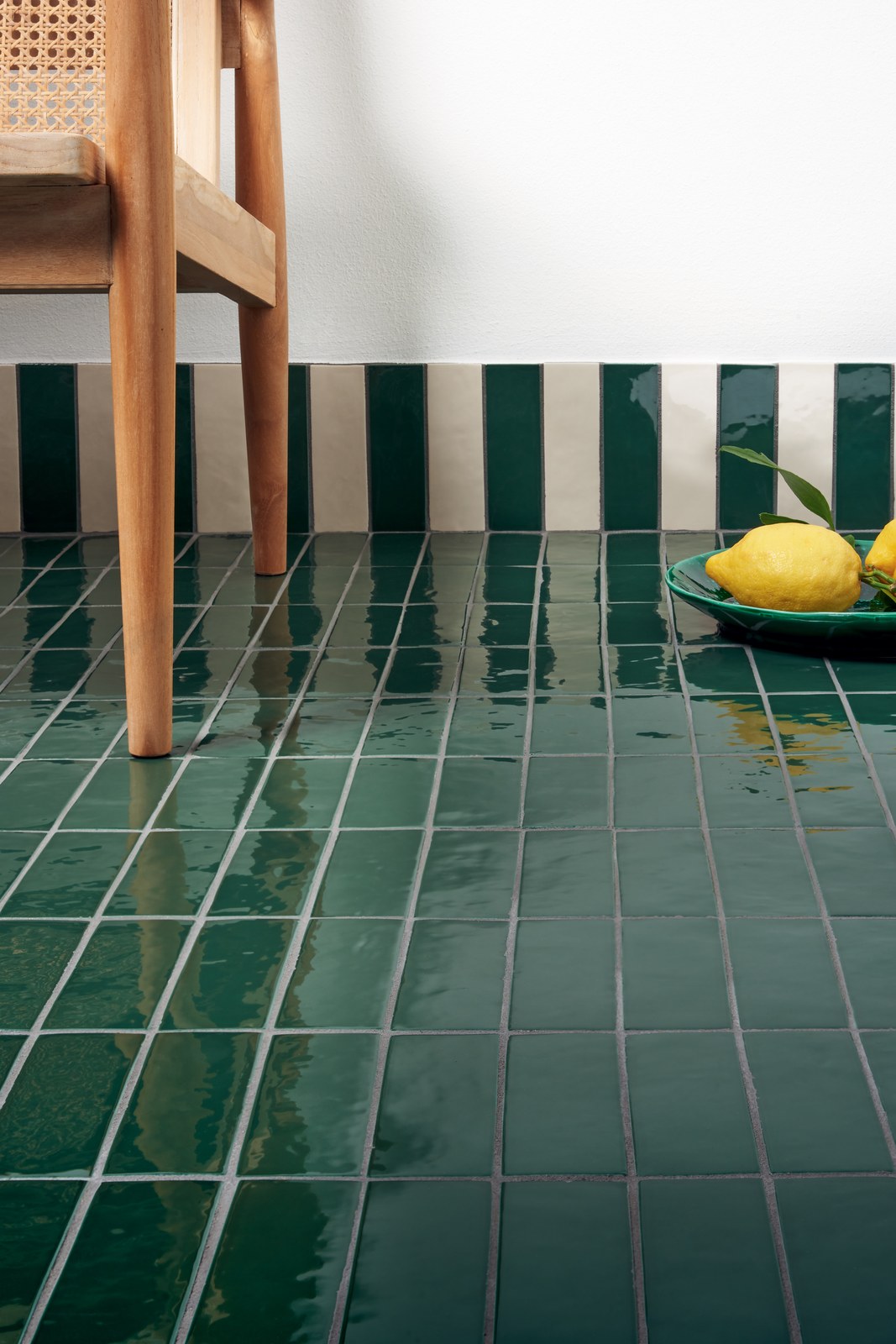
One more look at that glossy green 41zero42 floor, lemons and all, because the shine gets me every time. And that Greek key border is from Fireclay Tile, a rug made of tile if I ever saw one.
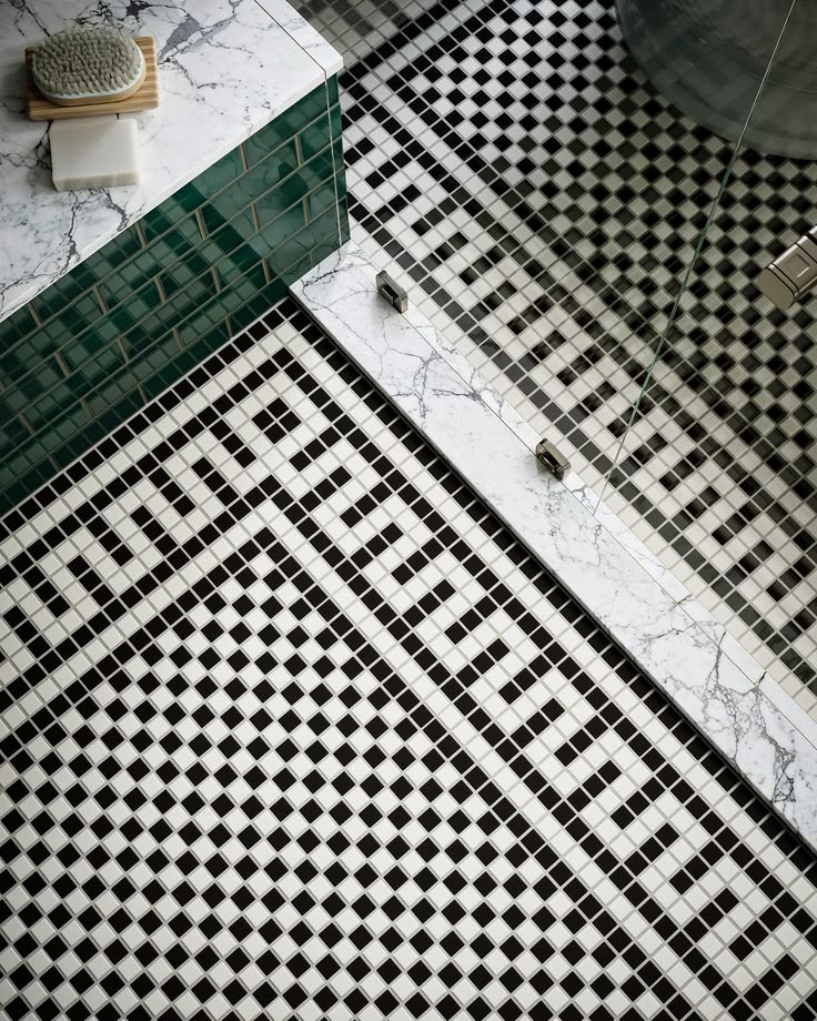
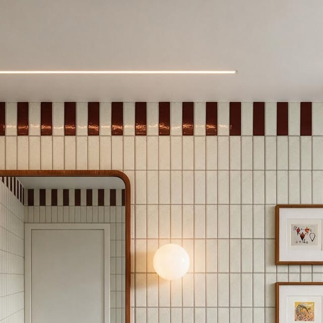
Borders can also do the job of trim, no carpenter needed. Run one row of tile at chair height and you have a chair rail: one color below, another above, and that little line ties the whole room together. Finish a tiled wall at the ceiling with a band in a deeper color, or a row of a different shape, and you get a crown molding look. And you can use tile to highlight what you love: frame a window like a picture, outline an arch or a doorway, wrap a niche in a contrasting color, or lay a rectangle of pattern behind the stove so it looks like a framed piece of art.
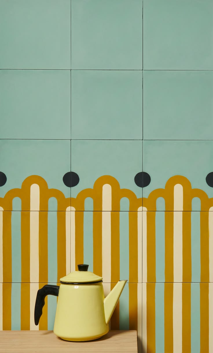
Borders are such an easy way to add personality. A black and cream triangle headboard, a single burgundy stripe running around a white bathroom, and mint tiles with mustard arches that make a teapot look like a piece of art.

Tile Can Tell A Story: Designs, Pictures And Even Signs
Tile doesn't only make patterns, it can draw. The Romans knew this better than anyone. They covered their floors and walls in mosaics made of thousands of tiny stones and glass pieces, and told whole stories with them: gods and heroes, hunting scenes, fish and octopus swimming across a dining room floor, a garden that never stopped blooming. They even made signs. At the door of a house in Pompeii there's a mosaic of a fierce dog on a chain with the words Cave Canem, "beware of the dog", the oldest welcome mat I know. If you ever get the chance, go to Pompeii and walk through those houses. Standing on floors that people laid two thousand years ago, still bright, still telling their story, is something you don't forget.
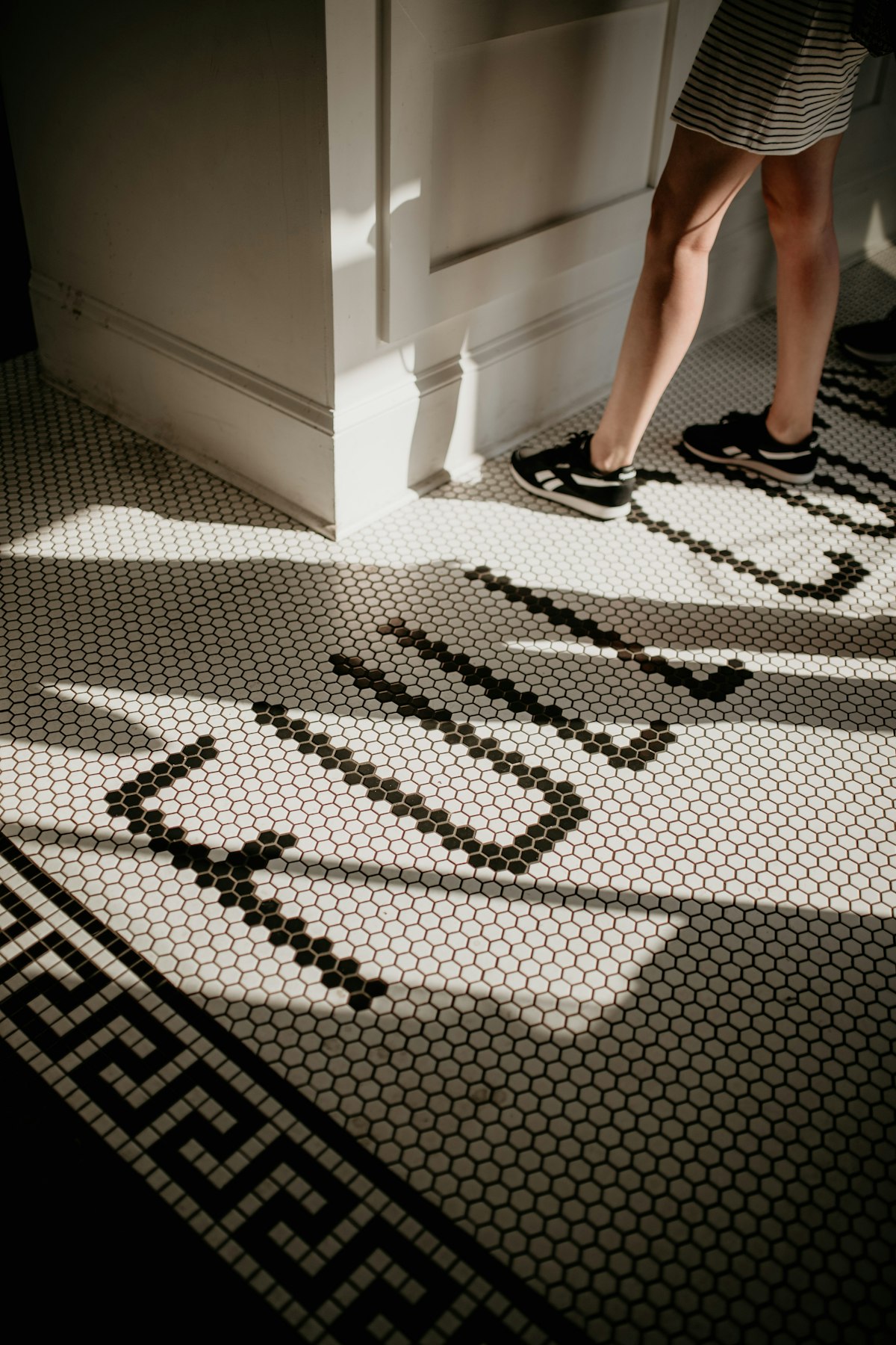
Somewhere along the way we lost that. Tile became the practical choice, the plain wall you can wipe, and the storytelling part got left behind. The Victorians brought some of it back, with encaustic tiles in rich patterns, little geometric "rugs" in the middle of a hall floor, and borders of flowers and leaves around a bathroom. Old coffee shops, bakeries and pharmacies set their name in tiny mosaic right in the floor at the door, so you stepped over a hello every morning. Look at this restaurant floor: a word written in black hexagon mosaic across a white floor, with a Greek key border around the edge. A sign you walk on.
And here is a page from a tile catalog from around 1900: tiny squares with little stars scattered across, and a woven border all around, like a carpet you'll never have to vacuum.
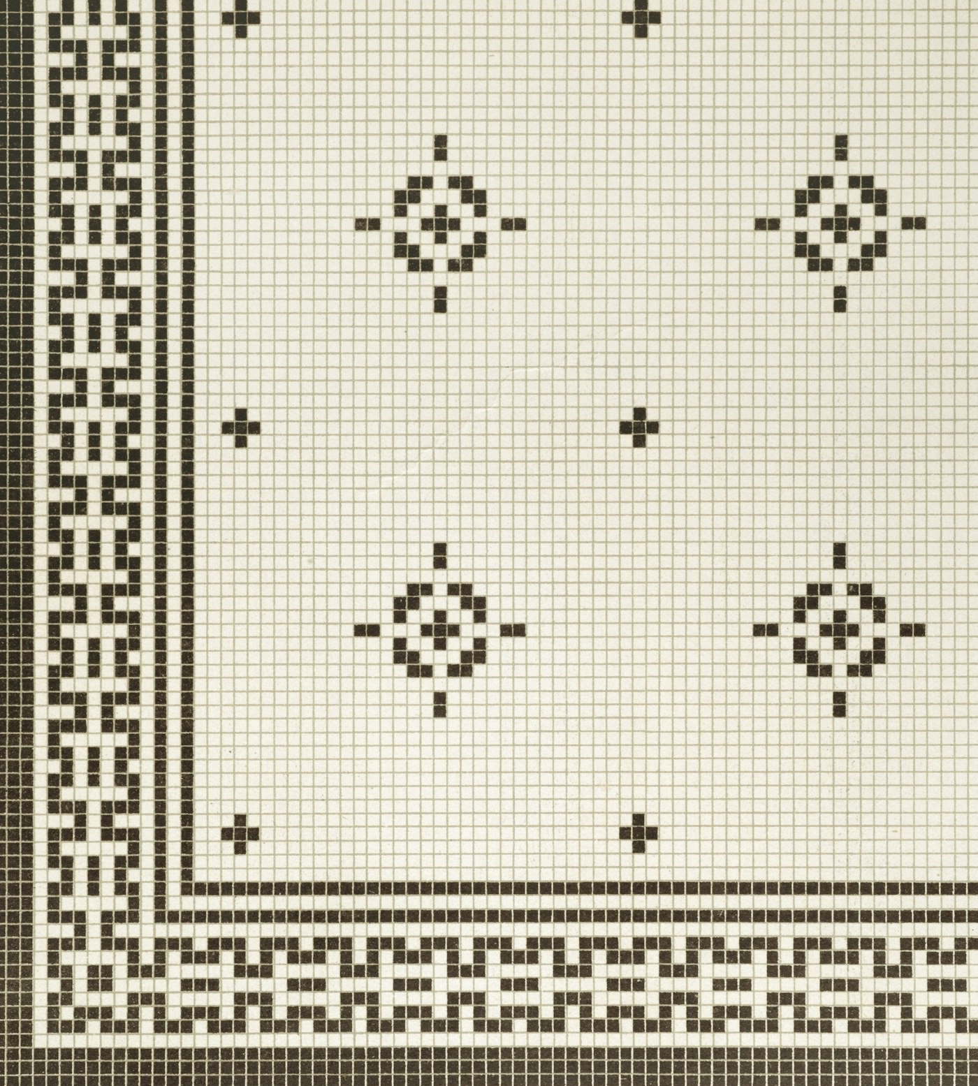
We can still do it today. A Victorian-style coffee shop with its name in black and white mosaic at the entrance, a Victorian bathroom with a patterned border and a little tiled "rug" in front of the tub, a house number by the front door, a date, a word you love, a sun, a wave or a lemon on the kitchen wall. It's the most personal tile there is, because nobody else has it.
Colored Grout: The Little Line That Changes Everything
Here is something I see all the time. People spend weeks choosing the perfect tile, and then the installer asks "what color grout?" and they say "uh, white?" in two seconds. But the grout is the line around every single tile, and on a wall of small tiles that's a whole grid of lines. It's one of my favorite small details that make a huge difference, and it costs basically nothing extra. You saw the bold way at the top. Here are the other three.
Match It: Calm And Seamless
Grout the same color as the tile and the lines almost disappear. The wall reads as one soft surface, and little wobbles in handmade tile don't show. That all-pink bathroom is from Eduard Eremchuk and EDxKAT studio, for the Moova Space dance school in Dubai. And how pretty is the patchwork of greens around that tiled sink, with pink hydrangeas on top?


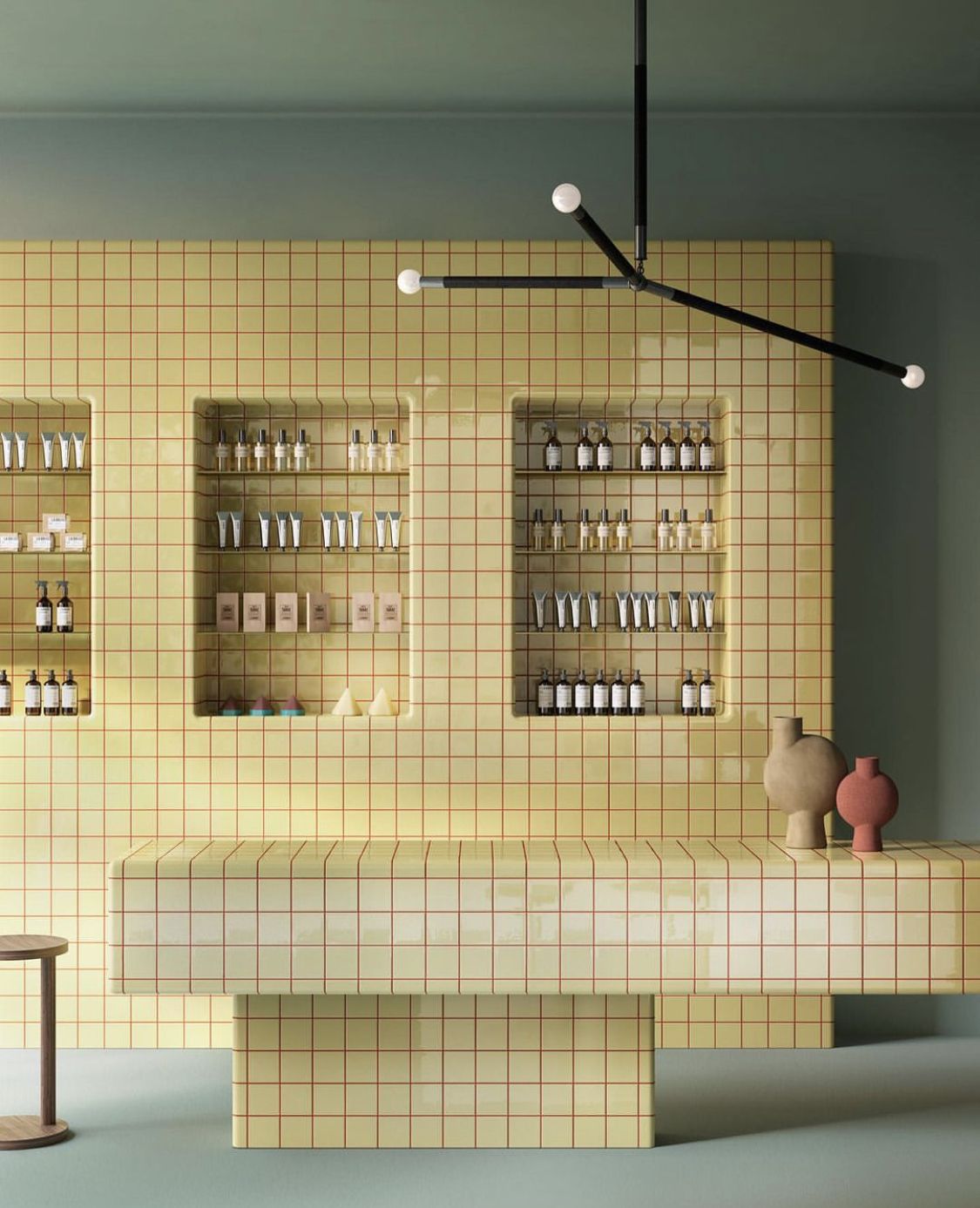
And this is matching at its most delicious. For Kerakoll's Fugabella Color campaign, a little shop is wrapped in butter yellow from top to bottom: the tiled counter, the tiled shelves, the walls, and even the grout, in Fugabella Color 42. Because everything shares one warm color, the counter and the shelves look like they were carved from a single piece, and the products on display become the only thing that changes. It feels soft, sunny and completely confident, and it proves grout can be the quiet hero of a room.
Contrast It: Graphic And Crisp
White tile with dark grout, dark tile with light grout. The grid becomes part of the design and the room feels graphic, a little retro, a little cafe. The catch: contrast shows everything, so the tile has to be laid really straight. Studio Prineas nailed it in Composition House in Sydney (photo: Chris Warnes). I also love the glossy white counter with charcoal grout under that teal swing-arm lamp.


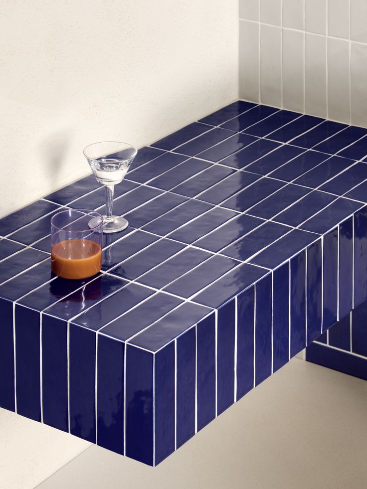
Contrast doesn't only work on white tile. Look at this deep blue bench with hot pink grout, or blush tile drawn in red lines like a grid. And on white, pink grout turns a plain kitchen or shower into something you smile at every morning. 41zero42's Kappa in deep navy with pale blue grout shows the same idea in a darker key.


Even plain white tile changes completely with a colored line: deep green grout from INAX looks like a drawing, and hot pink grout turns a girl's bathroom into the happiest room in the house.


Complement It: Opposites That Glow
Pick the grout from the other side of the color wheel: pink grout with green tile, orange with blue, yellow with violet, red with mint. Complementary colors make each other brighter, so the whole wall feels alive, almost like it's vibrating. Like that peach tile with a deep blue grout. Such an unexpected pair, and it works.
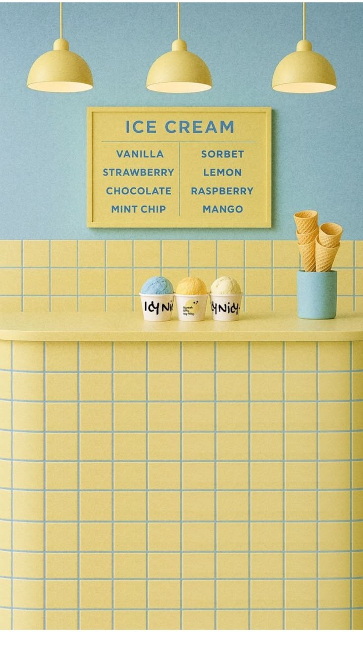
Or butter yellow tile with a soft blue grout, like this little ice cream counter. Yellow and blue are almost opposites, so the grid glows, and it's so sweet I want a scoop just looking at it.
And you can combine them. One grout color on the walls and another on the floor, a darker grout for the bottom half of a wall and a lighter one above, or switch grout colors partway across the same tile to draw a stripe without changing a single tile. Same tile, a completely different room.
Or flip it: dark burgundy tile with a pale pink line around every square, behind a soft white sink.

Thin Or Thick: The Width Of The Line
The width of the grout line matters as much as its color. A thin joint, just a couple of millimeters, keeps the grout quiet. The surface looks smooth and refined, and on zellige or handmade tile it lets the glaze and the little wobbles do the talking. A thick joint, a centimeter or more, turns the grout into a grid you see from across the room. It's bold, a little seventies, very cafe. Put a thick joint in a contrasting color and the grout becomes the pattern; put it in a matching color and you get a soft, chunky, handmade look. Big square tiles with fat grout lines, small mosaics with hairline joints: play with both.

Tone On Tone: Rich And Subtle
A grout one or two shades darker or lighter than the tile, in the same color family. You see the pattern just enough to give it texture, and it looks rich and intentional. NEUHAUSL HUNAL designed the pale pink AN Bistro & Cafe in Prague (photo: Studio Flusser), and the peach is Mandarin Stone again.


Tile As Furniture
Here is where it gets really fun. Tile doesn't have to stay on the walls. A tiled bench, a tiled counter, a tiled kitchen island, a tiled console full of books, even tiled side tables. Tile is tough and easy to clean, and it turns a simple box into a piece you remember.
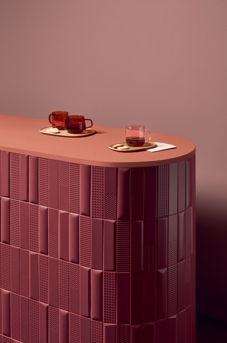
And the kitchen island is my favorite place to do it. Wrap the whole island in tile, like that navy and orange striped one at the very top, and it stops being a work surface and becomes the statement of the room. It's fun, it's a little bold, and it's an invitation: come sit, grab a stool, stay for a coffee and a conversation. Everybody ends up at the island anyway, so why not make it the piece everyone talks about? Stripes make it feel like a beach cafe, checks make it playful, one rich color makes it feel like a piece of furniture you'd keep forever.
If you love this playful side of tile, you'll love adding something unexpected to a room: quirky little things that make it feel like you. It's all part of the same idea: your home should look like you, and color is back.
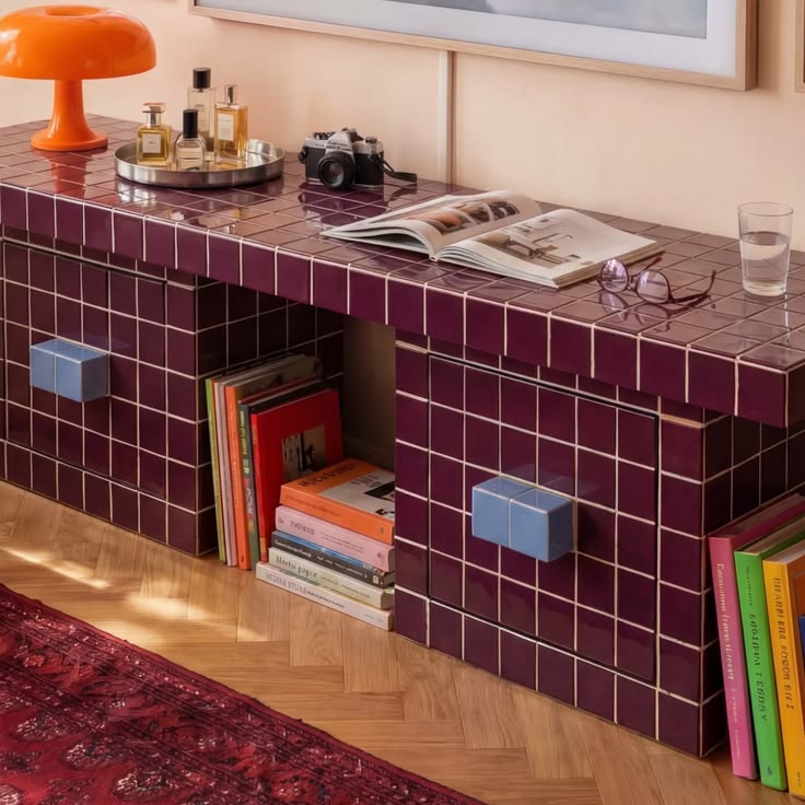
That burgundy console full of books is by Grid Design, a tile furniture maker in Istanbul, and the round counter and the striped island are tiled in 41zero42 again (I can't get enough of them).
The navy bench is more Kimono from Decoratori Bassanesi.
Or go all the way with a tiled dining table, like this mustard one in a Calella beach house by Isabel López Vilalta + Asociados.

Tile furniture can be a bench or a little plinth: a striped banquette under a terracotta breeze-block wall, and green tiled plinths next to a painted tile panel.
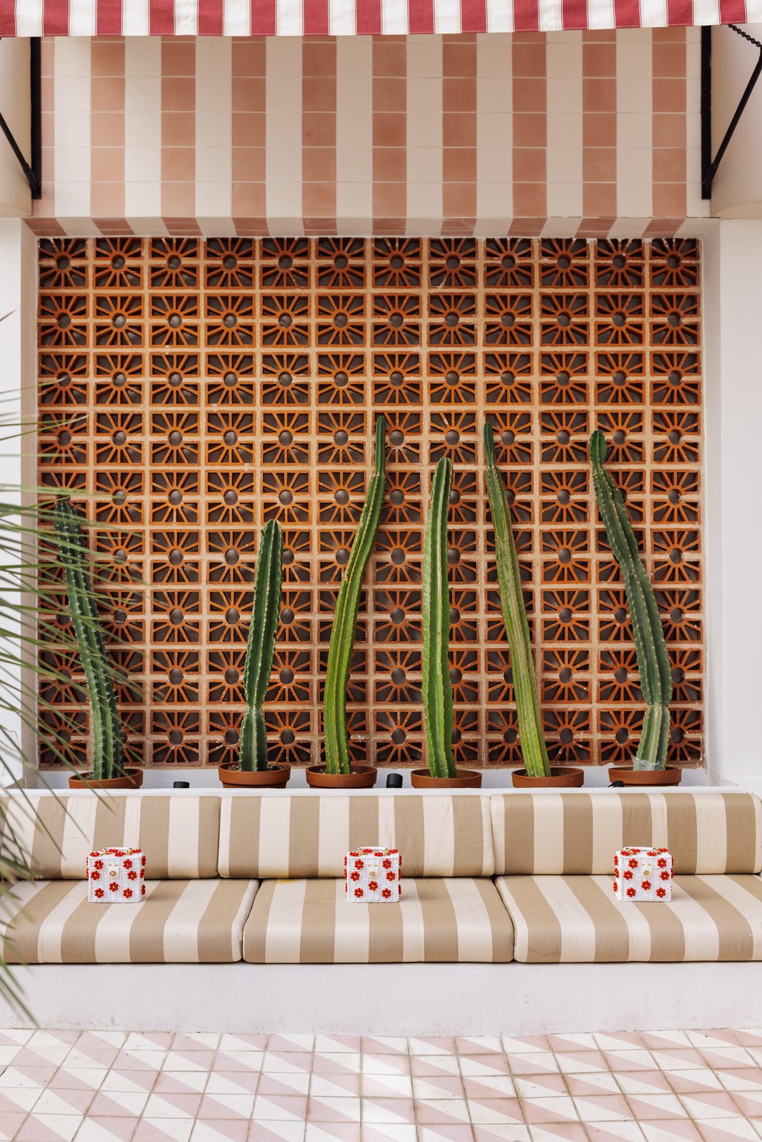
Tile can dress up a cabinet too, like this olive green tiled base under a cream tiled wall, or turn a whole outdoor seating area into one long striped lounge.


In The Bathroom
The bathroom is the perfect place to try all of this, because it's a small room and you can be braver. A burgundy tiled wainscot under striped walls, a checkered floor, a striped shower, a pink grout. Just keep it practical: on the floor, choose a tile with some grip, and in the shower, a grout that resists water and stains. Those burgundy stripes above the tile are a wallpaper by Samantha Santana Studio, the perfect partner for a tiled wainscot.

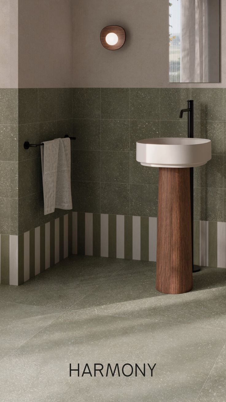
Or keep the stripes down low, like this green bathroom from Spanish tile brand Harmony.
Or go all in on one color. This bathroom by Hotbath wraps the walls, and even the shelf niche, in raspberry pink zellige, and the pink tub and black taps make it feel like a spa.
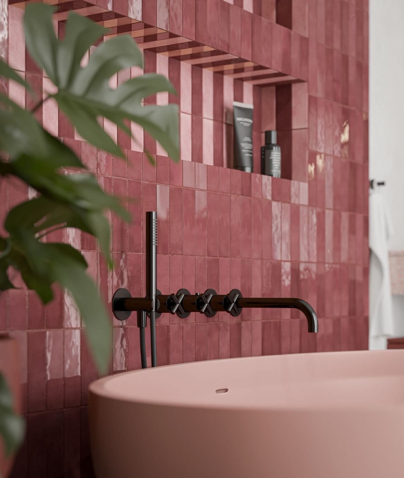
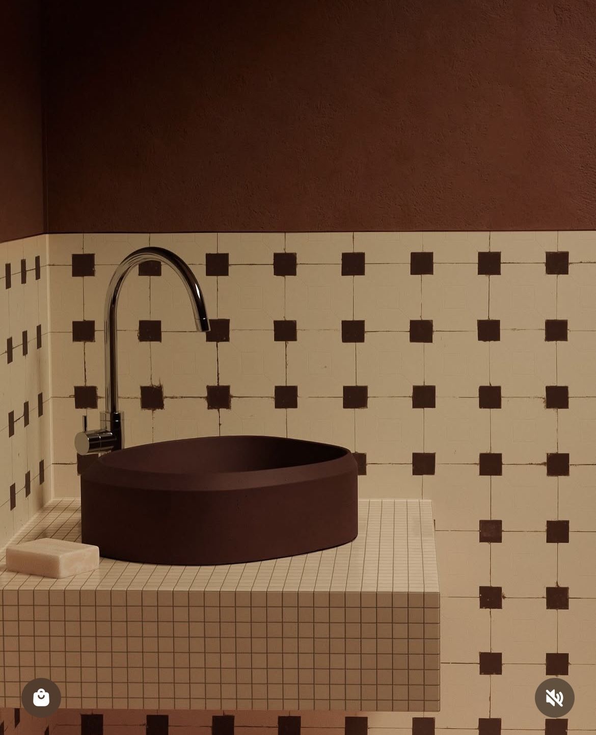
A few more bathrooms I'd love to get ready in: cream tile with little brown dots and a brown basin, a burgundy tiled bathroom with a striped mirror, and an arched shower in pink and burgundy Art Deco tiles.


Green is having a moment in the bathroom: green and white stripes around a sunken bath, glossy green finger tiles behind a basin, and a green checkerboard with a pink trough sink.


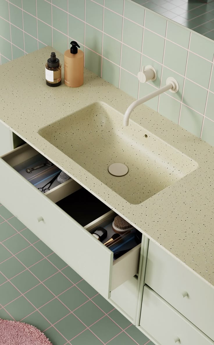
Three more bathrooms I can't stop looking at: stacked cream, blush and rust tiles behind a warm wood vanity, a pink bathroom with red grout and a red tap to match, and mint tile with pink grout around a mint vanity. In every one of them the grout and the fixtures are part of the color story.


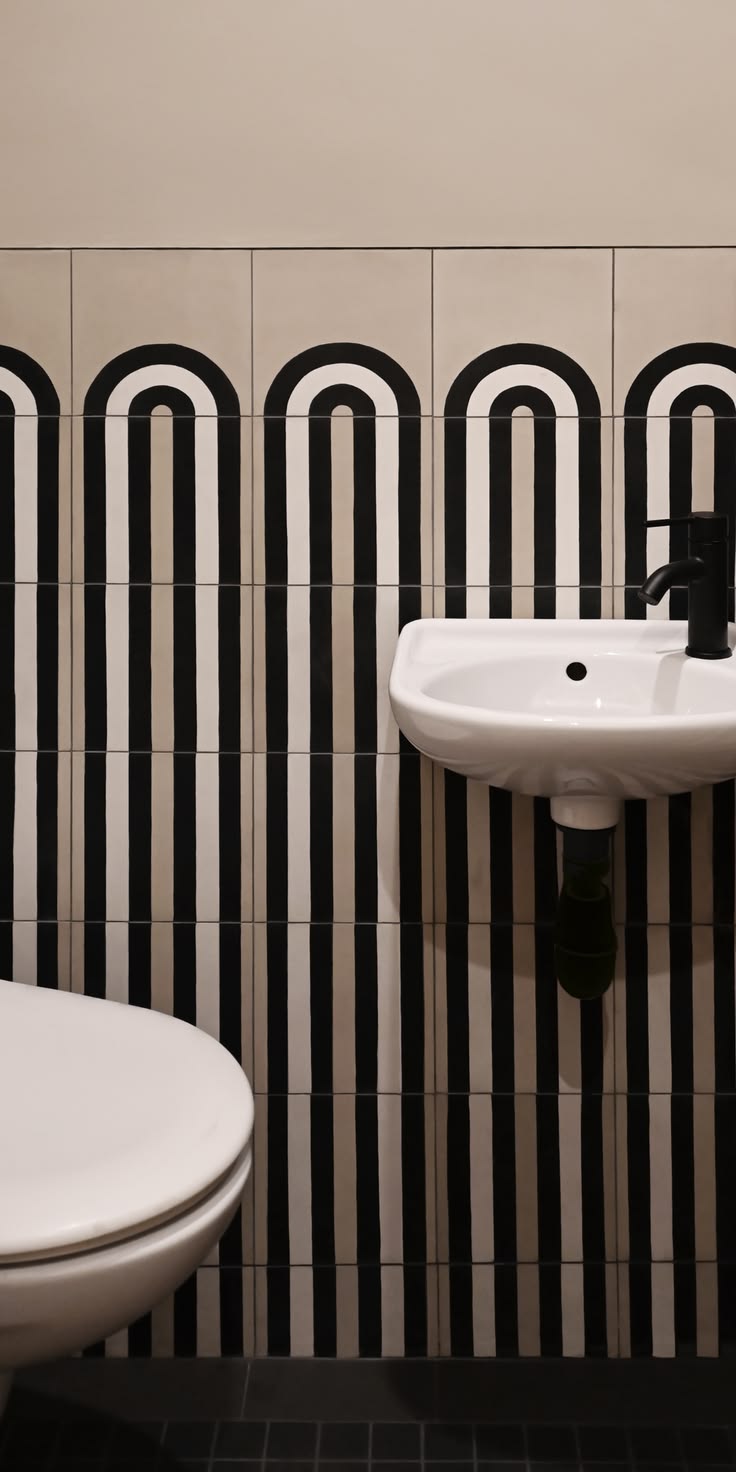
And white tile is never boring when it has a shape. These glossy arched tiles catch the light all day long.

Even a tiny powder room can be fun with black and white arched stripes, and an outdoor shower gets a red striped step.

A few more bathrooms I can't stop looking at: a blush tile wall with a little niche, peach tiles stacked tall behind a rose shower, a donut basin on deep brown tile, white scalloped tile under a terracotta wall, coral tile with dark grout, and an all-pink bathroom from Bad in Beeld.


And one more I love: a tiny black and white tile floor with little flowers, a dark marble vanity and a black framed shower, from the Apartamento Hortênsia by Kaique Alcantara.

In The Kitchen
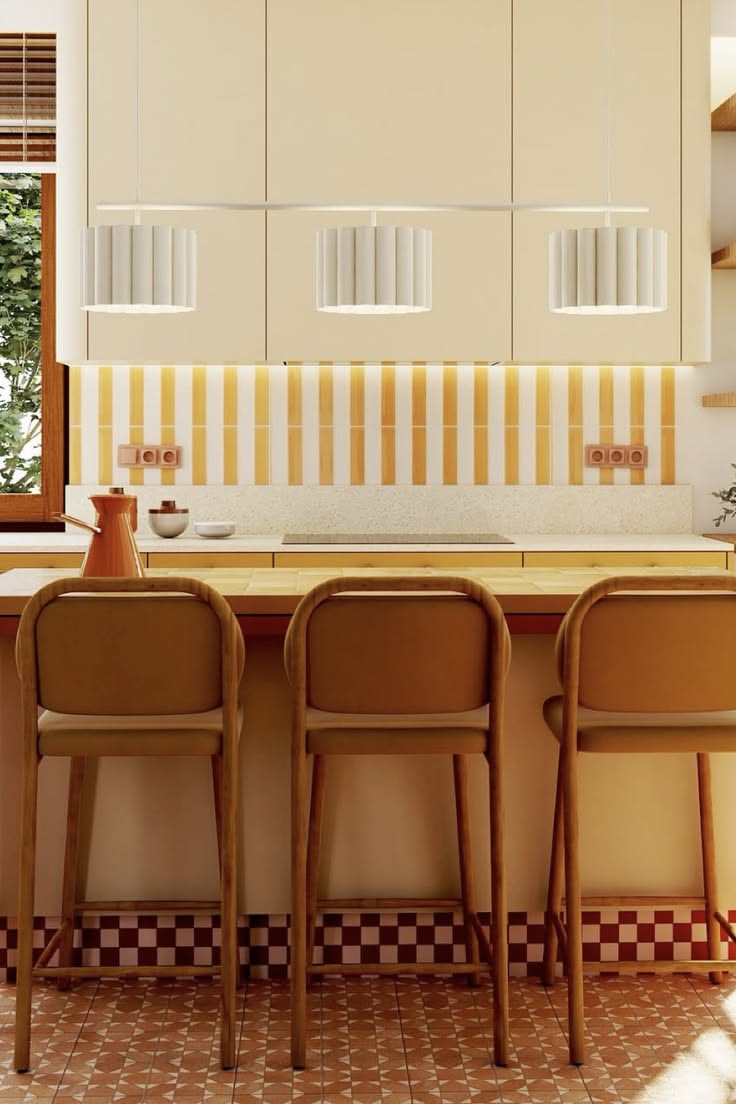
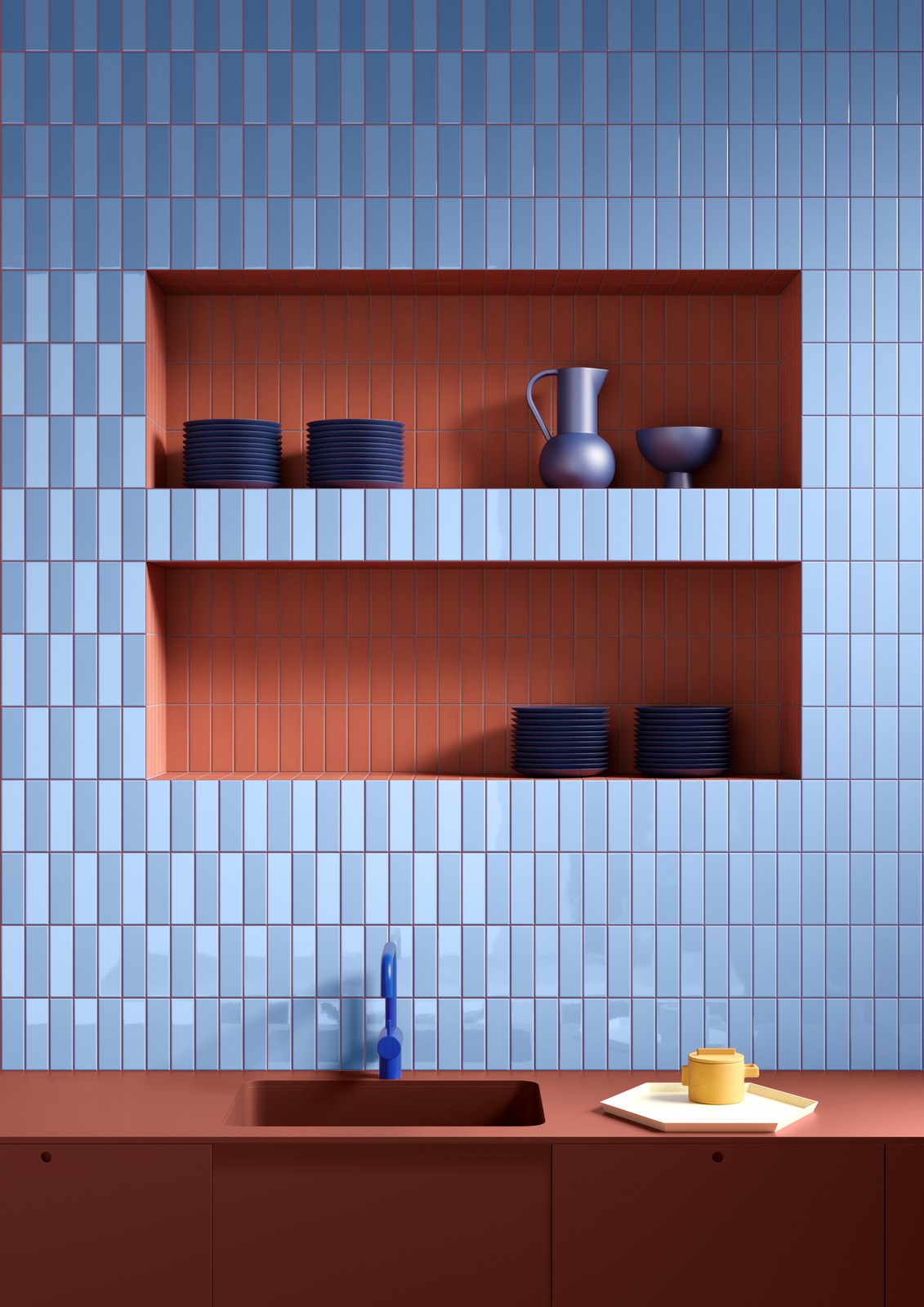
A tiled backsplash is the easiest place to have fun in a kitchen, because it's a small area that makes a big statement. A striped backsplash behind plain cabinets, a colored tile with a contrasting grout, a tiled niche in a fun color. The yellow pinstripe kitchen is by Butterfly Studio in Warsaw, and the pale blue wall with terracotta niches is Färgblock from Quintessenza Ceramiche (yes, again, I'm a little obsessed).
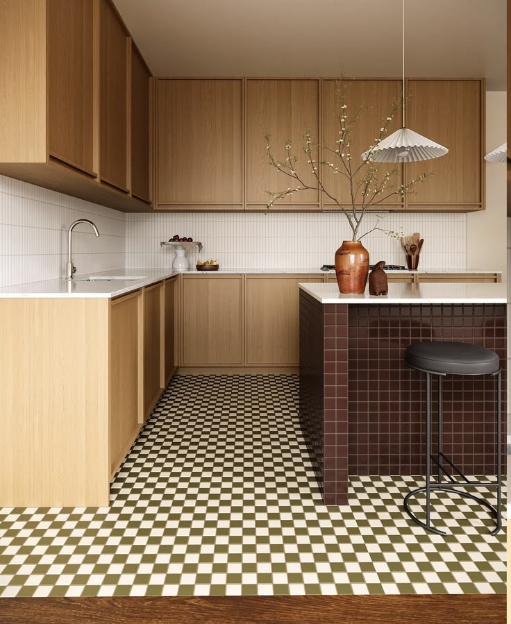
I'd happily cook every day at this island in garnet red tile from Fireclay Tile.
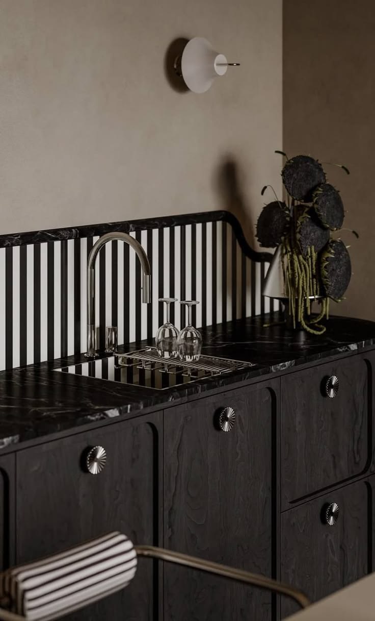
More kitchens with a little fun in the backsplash: black and white stripes behind a dark wood kitchen, and rust and cream checks in a small kitchen with curved cabinet doors.
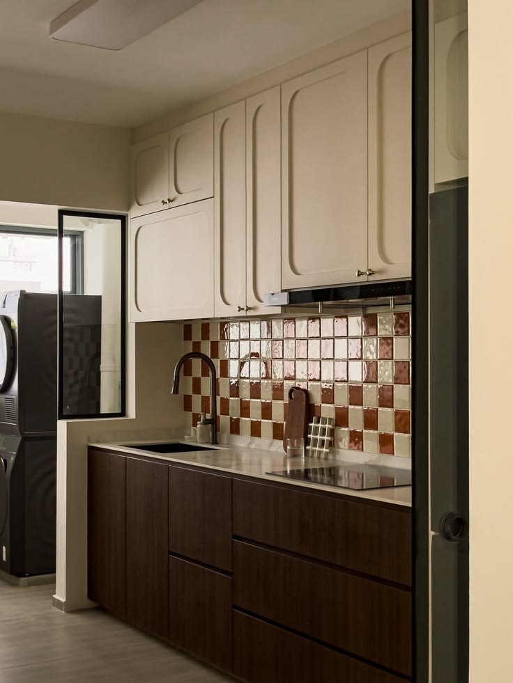
And two more favorites: orange, pink and black zellige over navy cabinets, and a striped floor that makes a terracotta kitchen feel brand new.

One more kitchen I'd love to cook in: navy tile with little cream squares under walnut shelves.

And in the kitchen: a pink tiled island with rounded ends, a plum backsplash from Nais in a color called Gooseberry, and pale blue tile shelves against a rust wall.


In Cafes, Bars And Shops
This is where tile really shows off. Restaurants and shops use it like a brand color: a striped counter, a yellow tiled wall of shelves, a green tiled bar you remember. It has to survive a lot of people and a lot of cleaning, and it still looks this good. If you're designing a commercial space, tile is one of the strongest and most durable ways to give it personality. Genesin Studio's Ban Ban in Adelaide is a great example, with that pale blue counter and green stools. And that mustard and white striped counter in a clothing shop, with a vase of fluffy yellow flowers on top, is the kind of thing you remember long after you forget what you bought.

A few more I'd happily walk into: a shoe shop where the display plinths are striped tile, and a cafe with simple white tile and a curved wood banquette.
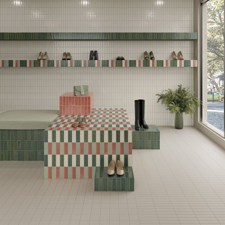

A few more spots that went all in: a pink bar with a plum tiled column, a bar front in glossy burgundy tile from Clay Imports, a little green tiled cafe, and a gelato counter in cobalt blue tile by GUR. Studio.


Tile can even dress a whole building: this shop front curves around the corner in pink tile with a mint green band.

Pools
And now my favorite: pools. A pool is just a big tiled box full of water, so all of these ideas work there too, and water makes every color glow. Striped steps, a checkered floor that wobbles in the sun, a band of color at the waterline. Those coral and aqua checkerboards are at Hotel Panamera in Tulum, with the pool designed by Mike Moser Studio.


The green checkerboard is TileBar's sage green tile, and I love what Studio Astolfi did with the terracotta pool at Casa Amarela (photo: Francisco Nogueira). And the slate and white stripes wrapping that raised pool by the tall hedge, turning into checks under the water? Dreamy.
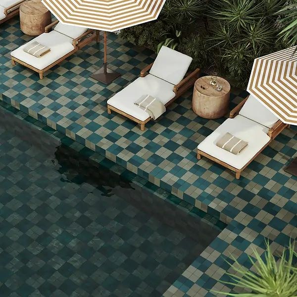
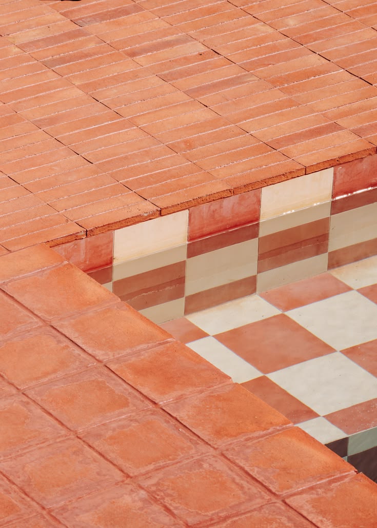

The green and white steps are Zia Tile, photographed by Diana Paulson of Vienna Creates, the blue and white ones are from Ceramic Connection, and that aqua striped pool among the palms is Hotel Tiki Tiki in Tulum.
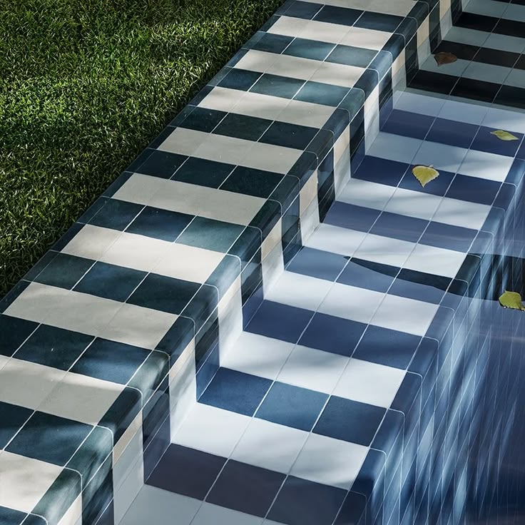

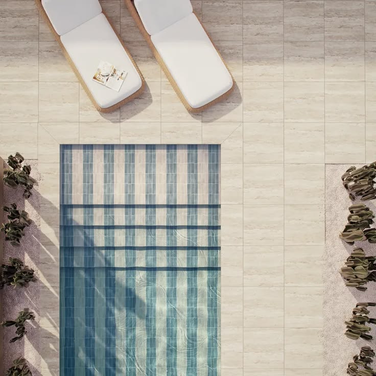
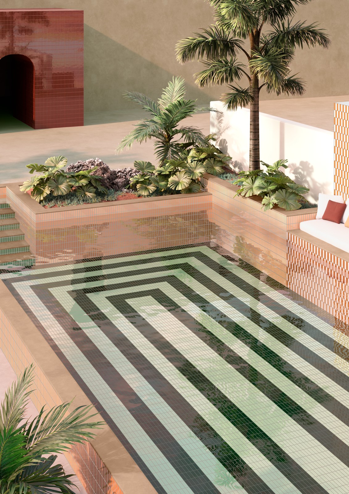
I love these blue stripes from above, made with Natasha tile from Edward Martin, and those pink, green and cream stripes framing the palms and planters are more Färgblock from Quintessenza Ceramiche.
A few things are different in a pool. Use tile and grout that are made for being under water and outdoors, and choose a slip-resistant finish for the steps and the edges. Water also shifts how colors look, so if you can, drop a sample tile in water before you decide.
And for a little dreaming: a terracotta pool at Hotel Humano in Puerto Escondido by Jorge Hernández de la Garza, plus two concept pools: a striped one from vos-vom, a porcelain tile workshop right here near Valencia (look at that green and white striped waterline, and the matching striped shower!), and artist Diango Hernández's wavy Pool Olaista.
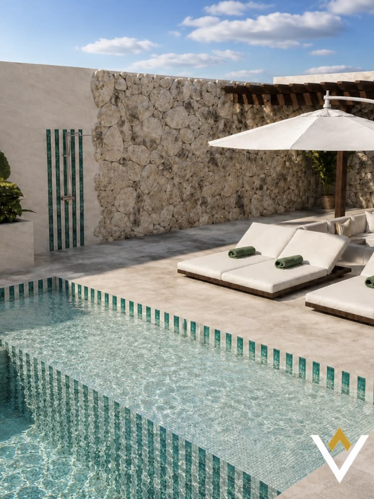

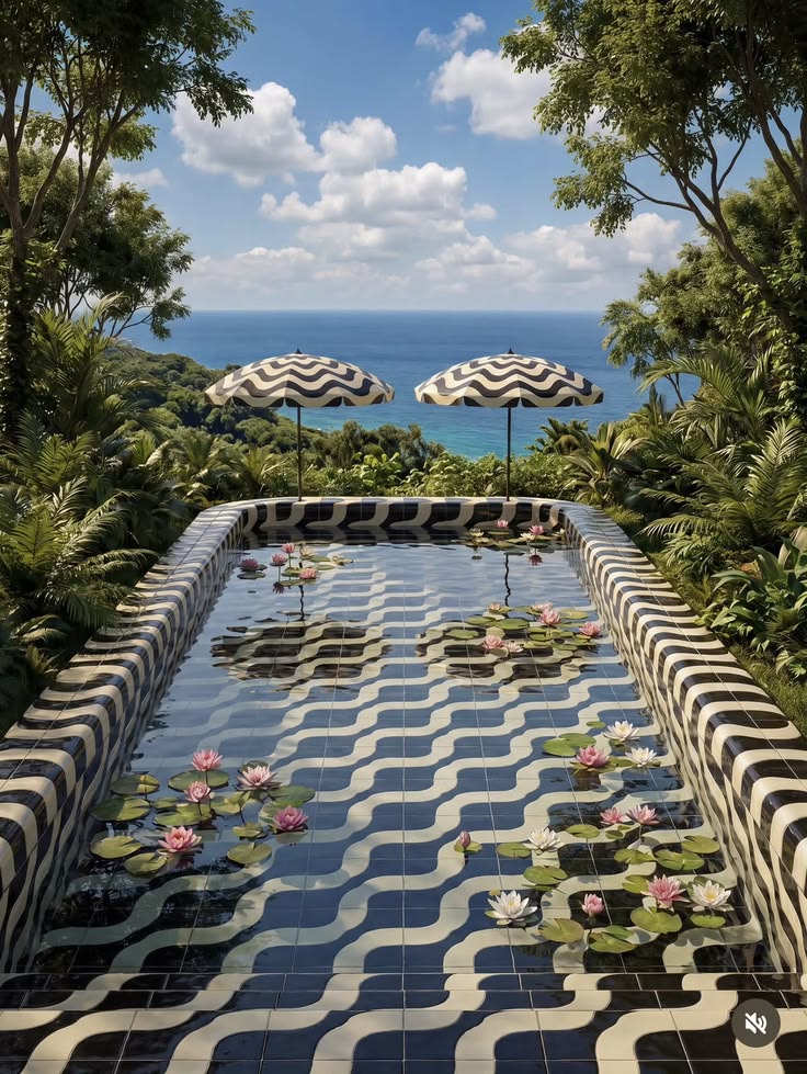
I saved so many more pools on my board, I couldn't leave them out. Stone houses and villas first: a green and white striped pool with floats, a Mallorcan terrace with an orange tree, and a courtyard pool in green and brown stripes.

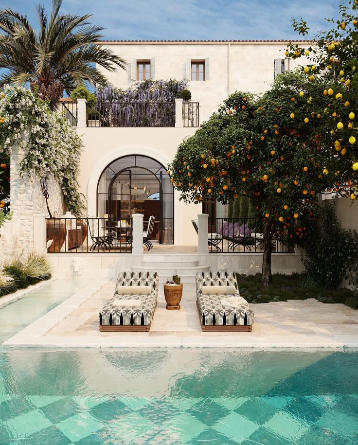

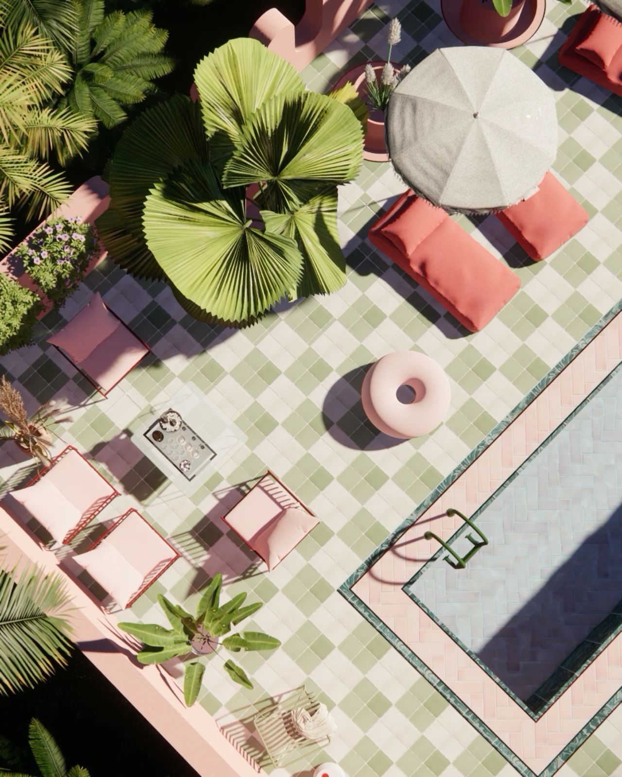
And please, don't underestimate the fun a pink tile can bring. Pink is a warm color, so it makes a space feel friendly instead of cold, and it's the most flattering color there is: everyone looks better standing next to pink. It sits right across from green on the color wheel, so it makes every plant, palm and leaf around it look greener and fresher. Next to blue water it glows, and in the sun it turns almost peachy. A dusty or terracotta pink feels grown-up and relaxed; a bubblegum pink feels like a party. Either way, it's impossible to walk past a pink tiled wall, a pink pool edge or a pink bathroom without smiling.
From above, the tile really shows: emerald parasols around a dark green pool, and a pool deck in sage checks with pink loungers.

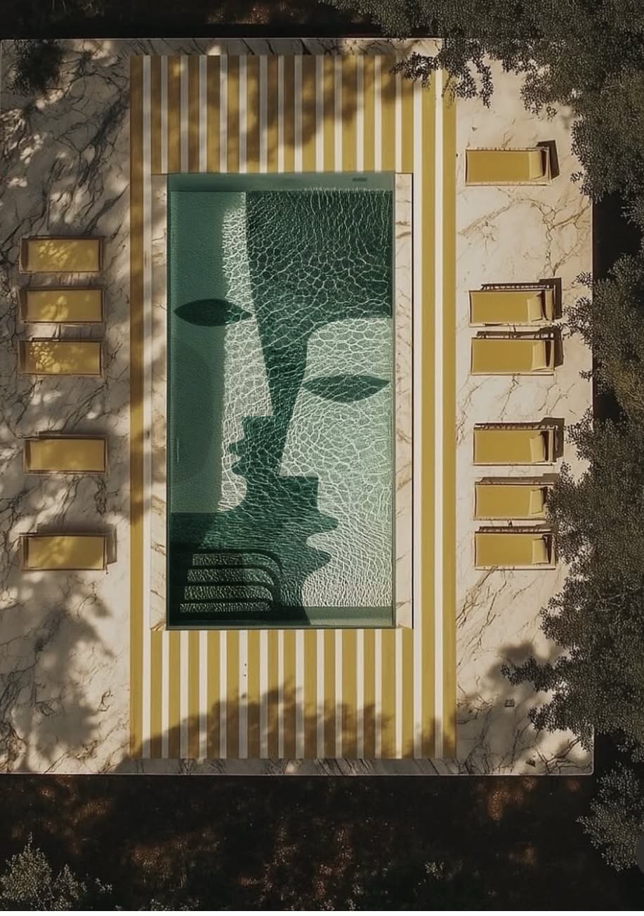
And this one is pure art: a pool design concept by artist Shira Barzilay of Koketit, with a giant face drawn in green mosaic across the floor and a deck of yellow and white stripes. It's an AI visualization of her artwork, not a real pool (yet!), but it looks like a painting you could swim in.
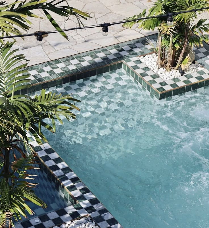
Checkerboards love water: black and white around a pool, and green and white around a spa.
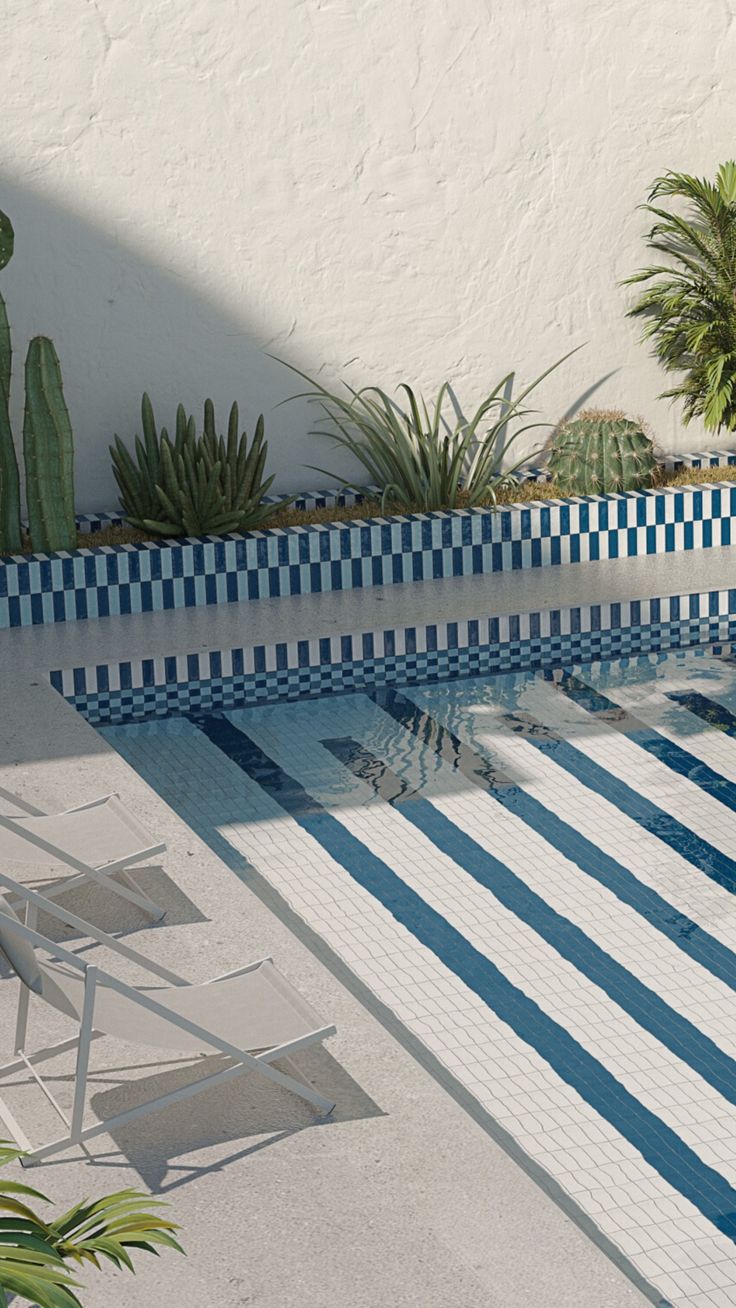
Red and white checks under the water, blue and white stripes along the walls, and pink and cream checks on the edge of a courtyard pool.
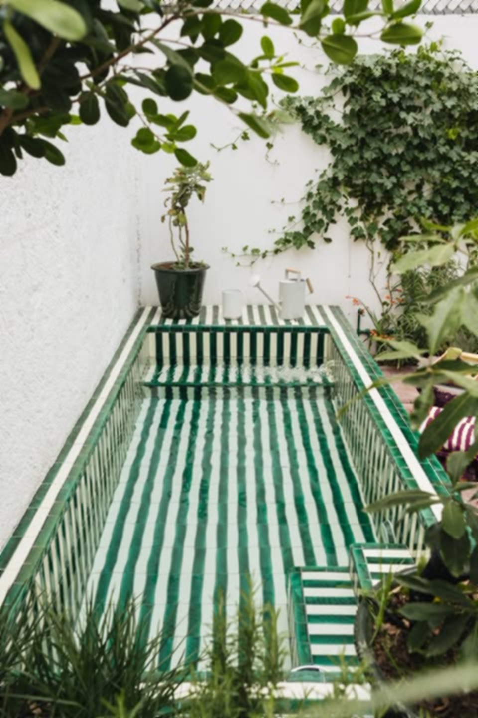
Stripes can wrap a whole pool, like this plunge pool at Villa Montes in Mexico, green and white from the walls to the very edge.
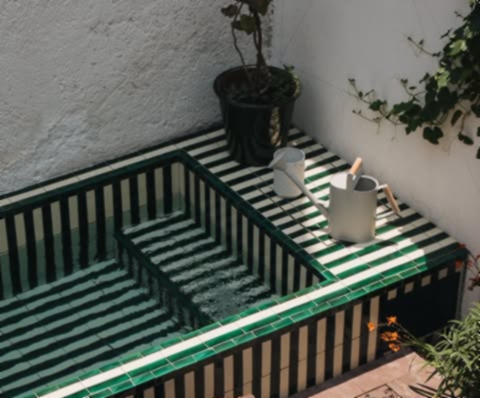
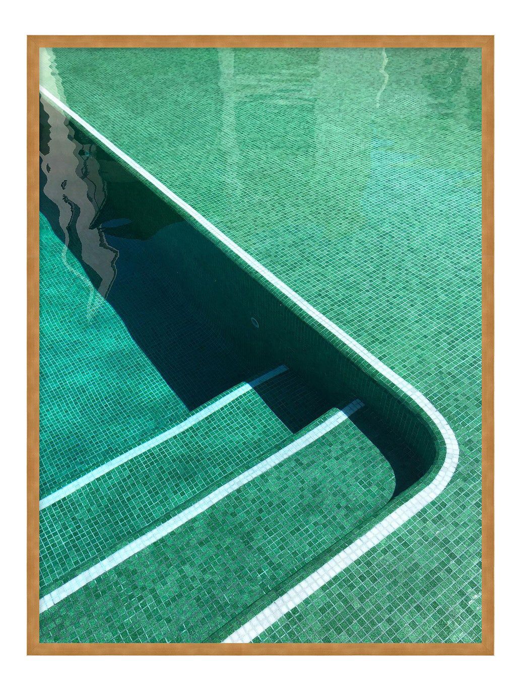
And three green ones to finish: a mosaic pool in the jungle, a little diamond tile border, and pool steps so pretty someone framed them.

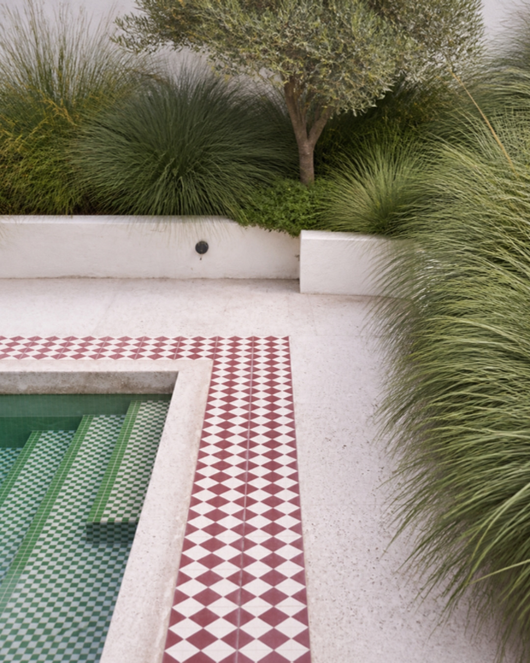
And a few more pools to dream about: a riad rooftop with a black and white zellige plunge pool, a pool edged in pink and teal herringbone with marigolds floating in it, a burgundy check under the water from MoorishCraft, and a long pool framed in pale green checks.


Renting Or On A Budget? Try Peel And Stick
If you rent, or you just want to play before you commit, peel-and-stick tile is your new best friend. Today it comes in zellige looks, terrazzo, checks, stripes, scallops, even little hand-painted-style patterns, and you stick it right over a smooth wall or even over old tile. A whole backsplash in an afternoon, no grout, no installer, and when you move, it comes with you (or comes off). It's the easiest way to try a bold checkerboard behind the coffee station, a striped wall behind a vanity, or a pop of color inside open shelves, and see how much you love it.
- Best spots: kitchen backsplashes, behind a bathroom sink, a laundry room, the back of open shelves, a little accent wall.
- Keep it to the dry side: it loves splashes and a wipe, not steam, so skip the inside of the shower, and check the heat limit behind a stove.
- Test a corner first: stick one tile somewhere hidden and peel it after a few days, and if you rent, check with your landlord.
- Try before you commit: it's also a cheap way to test a stripe, a checkerboard or a bold color before you buy the real thing.
It's not the same as real tile up close, but from across the room it can completely change a space for very little money. More ideas like this in my renter-friendly hacks.
How To Choose (So You Love It For Years)
- Get samples and look at them at home. Tile looks different in every light. Live with a few samples for a couple of days.
- Check it's made for the place. Floors need tile rated for floors, wet floors need some grip, pools and outdoor spaces need tile made for water and weather.
- Pick two or three colors, not ten. Fun tile looks best when the palette is clear. Repeat the colors somewhere else in the room, like a towel, a cabinet or a lamp.
- Choose the grout with the tile in your hand. Never from a little chart alone. Ask your installer to grout a few tiles on a board first, because grout dries a different color than it looks wet.
- Order a little extra. For cuts, mistakes and future repairs. Handmade tiles especially can vary from one batch to the next.
Already Have Tile You Don't Love?
You don't always need to retile. Sometimes the tile is fine and the grout is the problem: a deep clean, or a grout colorant or grout pen, can refresh it or change the color completely. You can also add a tiled border, a tiled niche or a tiled backsplash without touching the rest. (Renting? Ask your landlord first, or go with peel and stick.)
The Short Version
- Tile is so much more than white subway.
- Start with the tile: handmade, glazed, porcelain, mosaic, fluted, and the shape.
- The layout changes everything: stacked, vertical, horizontal, herringbone.
- Stripes, checkerboards and borders turn plain tile into a pattern.
- Colored grout: match it, contrast it, tone on tone, or go bold.
- Tile works as furniture too: benches, counters, islands, consoles.
- Bathrooms are the easiest place to be brave. Cafes and shops use tile like a brand color.
- Pools love pattern, just use tile made for water and non-slip steps.
- Renting or on a budget? Peel and stick is cheaper and comes off again.
So next time you choose tile, have some fun with it. It might be the best decision in the whole room. And if you want help choosing, send us a few photos of your space.